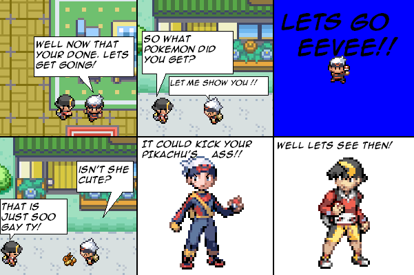
TIME FOR MULTIPLE PERSONALLITINESS
Nice Qijun:
I'm pretty impressed, but if you centre the text, it'll be even better! =D
Mean Qijun:
Pannel one's dialogue is lacking horribly in grammar and punctuaion. Not to mention that that textbox wastes so much space it doesn't need to.
Pannel two is the exact same as pannel one.
Pannel three's background is oh so horrid,the colour is too fucking bright.
I don't even want to bother with the rest.
Judging by this page only, I don't even wanna read anymore. It seems fucking clinche and unoriginal. Unless you- nevermind. Just do the opposite of all the bad things I pointed out and maybe I'll read the previous pages. =0


JC3 at 3:12PM, Oct. 16, 2009
its better when the sprites are big
suciue at 11:19AM, Oct. 16, 2009
its ok its just alittle foggy dont you hvae smaller sprites and thing to make it look better
JC3 at 5:53AM, Oct. 16, 2009
well damn im a begginer and my old comic wa alot worse. but i will try to get better. ^_^"
qijun at 10:44PM, Oct. 15, 2009
TIME FOR MULTIPLE PERSONALLITINESS Nice Qijun: I'm pretty impressed, but if you centre the text, it'll be even better! =D Mean Qijun: Pannel one's dialogue is lacking horribly in grammar and punctuaion. Not to mention that that textbox wastes so much space it doesn't need to. Pannel two is the exact same as pannel one. Pannel three's background is oh so horrid,the colour is too fucking bright. I don't even want to bother with the rest. Judging by this page only, I don't even wanna read anymore. It seems fucking clinche and unoriginal. Unless you- nevermind. Just do the opposite of all the bad things I pointed out and maybe I'll read the previous pages. =0