


Chapter One Page 8
D0m on June 8, 2007
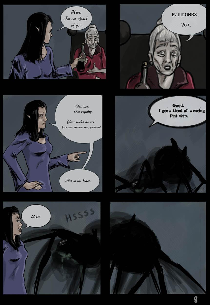
I did a lot of experimenting with this one… Starting with the straight inking of her hair and the shadows on her face, and I took some liberties with the design of her face and all. I can't say it's my favorite page, but I did take time to make it and I like it overall.
What do you guys think of the shiny new fonts? Should the Queen's go back to a regular one?
Be sure to visit our forum!
—————————————————————————–
VOTING INCENTIVE IS A SKETCH OF A HENCHMAN WHO WILL BE IN THIS COMIC SOON!!!
—————————————————————————–
Thanks for all the comments, everyone!
Silentkitty: Yeah, I need to work on that… I made an edit, so hopefully it meshes together better? Do you put down text before speech bubbles?
Dueeast: Welcome! Hopefully, things'll start making a lot more sense soon!
Jules: Thanks a lot! We hope you'll continue to love the story- it's only gonna get better, trust me. ;-)
Tantz: Thanks so much, and welcome! You're gonna like where the story goes. i assure you the spider-woman's name is not Shelob. ;-) It does, however, have two syllables…


katyas at 9:12PM, May 10, 2008
*ahem* Fitz, are you accusing me of not being a "real" woman? B/c I'm not "afraid" of spiders. Nor am I afraid of snakes. Nor am I afraid of mice, rats, what have you. Now, that's not to say I want a big ol' spider walking around on me - I'd prefer not being bit, thanks anyway - but I do enjoy seeing them and we purposely don't disturb them here in the household (which you can tell by the huge numbers of cobwebs hanging off all over the place). And last time I checked? I had all the appropriate parts and chemistry to be classified as "female".
salasvexx at 8:04AM, Dec. 18, 2007
good stuff
Fitz at 10:21AM, Oct. 16, 2007
I really like her figure on this page. Those shapely breasts... LOL had to say that ;) And those lose sleeves. And royalty or not, every real woman is afraid of spiders. But she asked for it, didn't she? :)
simonitro at 11:20AM, Oct. 14, 2007
Are you afraid now?
MrSynnerster at 4:45AM, July 24, 2007
she might wanna rethink that peasant comment. lol.
Ladyknight17 at 12:32PM, July 21, 2007
Ew. Spider. EW. Good comic though.
TheMidge28 at 7:47AM, July 21, 2007
Lovely page. the fonts though hard to read...
jissai at 12:21PM, July 13, 2007
spider o.O
matteblack at 3:07PM, June 13, 2007
Great style to this, and the coloring really helps set the mood.
Tantz_Aerine at 3:38PM, June 12, 2007
This is really good work. It promises to be sinister and intriguing. Well done with your forms and layout. I hope the old woman's/spider's name is not Shelob, though ;) hehe. Well done!
silentkitty at 6:19AM, June 11, 2007
Yep, the bubble looks much better now. :) And yeah, I usually lay the text down first, and then put the bubble behind it. It's just easier for me to fit the two together that way.
Jules at 6:06AM, June 10, 2007
I like where this is going, so keep at it! I just read throught the archive of this and I love it.
The World of Witt at 6:54PM, June 9, 2007
Very well done.
Wyrvvn at 4:02PM, June 9, 2007
ah, that looks much better. Beautiful as usual, D0m. =D
dueeast at 12:04PM, June 9, 2007
Nice work! Enjoying the mysterious story thus far.
silentkitty at 6:22AM, June 9, 2007
I think the fonts are alright, but like SilverWordz mentioned, you may want to watch out for how they're laid out in the bubbles - for example, the text in the first panel runs right into the edges of the bubble, and then there's a whole lot of extra room around the words in the second panel. Anyway, text bubble crisis aside, the rest of the page looks great! :D Really nice work with the expressions and body language of the Queen in particular. Keep it up!
CharleyHorse at 6:04AM, June 9, 2007
A classic case of,"Perhaps I spoke too soon?" I have absolutely no idea where this plot is headed, and I think that's great. As for the fonts; as long as you keep them large enough for my treacherously middle-aged eyes to read, then they are fine. The problem with fonts is that they are a personal, subjective call. I personally prefer normal 'toon' fonts, but these gothic fonts certainly do not offend me nor put me off the reading. As usual, excellent work!
ZoeStead at 3:34AM, June 9, 2007
Really impressive work! Keep it up!
MetalLuigi at 2:40AM, June 9, 2007
I like the way you used 2 panels to show the size of the spider and the way she's approaching the Queen. The new fonts are great, they show a little of each character's personalities.
SilverWordz at 10:21PM, June 8, 2007
I have to say, I really like the line work and the shading of the queen on this page. I think it may be my favorite page so far when it comes to how you've really defined the shape of her, and the folds of the clothing. And the spider is very awesome. :D The fonts are getting better. I think I'd just work a bit more on laying the text out in the bubbles. Great work guys!