


Page 5
gullas on May 8, 2009
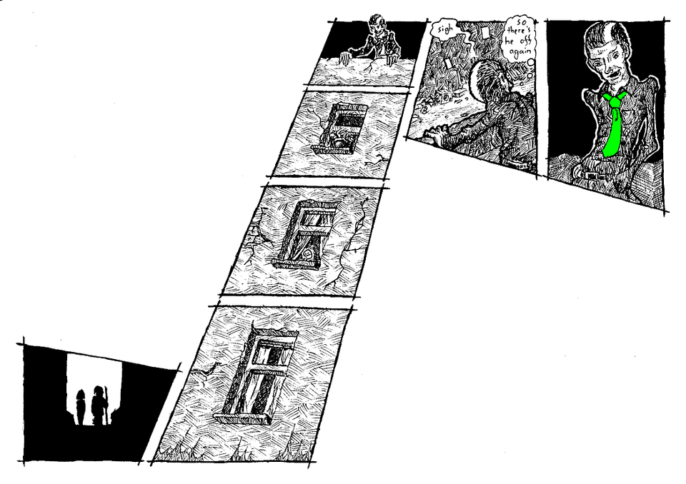
Gullas : well I had imagined this like a movie scene, the camera moves up with the building and you can see this new strange character -.0
I like how Lemniskate made it into a double-page :P
Lemniskate:
Through the unwritten contract between creator and reader the reader is used to moving down a page. It needs some tricks to get him reading upwards. That's why there are those big white spaces… if I filled them, it wouldn't work.
And contrary to what Gullas stated, it is no double page, it's a regular DIN A4, but landscape format. Since this is a webcomic, we're not obliged to keep all the pages the same shape :)


Lemniskate at 11:01AM, May 12, 2009
If the script/story encourages it and if it benefits the story, yes. There are, however. many situations, in which "standard" paneling is simply the best.
threeeyeswurm at 9:13AM, May 12, 2009
I LIKE THIS. Great inking style and as DAJB, very interesting layout! I would love to see more of such plays at panel layouts!
Lemniskate at 11:49AM, May 11, 2009
I have the solution: everybody get bigger screens! ;P
Emily Elizabeth at 2:34PM, May 10, 2009
Faved. I really like the layout, but I agree with DAJB, it would work better in graphic novel form. I also love the contrasts between the white spaces and the intense detail of the panels.
Lemniskate at 5:05AM, May 10, 2009
ARGHL! You're right! But it made so much sense when I concieved the idea sitting at the drawing table :/ And if I made the picture smaller? Nah, would be [i]too[/i] small...
DAJB at 4:10AM, May 10, 2009
Interesting layout! Not sure it works as intended on the web. Should be okay in print but having to scroll [i]down[/i] to get to the first panel kind of works against the idea of forcing the reader to follow the movement [i]upwards[/i]. Nice attempt at doing something different, though. Keep it up!