


Ch4 Pg21 (Part 3: The Change)
Cheeko on Jan. 3, 2008
I want to make one fact perfectly clear, here:
The dialogue in the next few pages disgusts me. It's awkward, stilted and forced, but I really couldn't think of any other way to put in terms that sounded more fluent or natural. For that, I apologize, and if you want to complain about it you can.
Anyway.
I hope everyone had a very Merry Christmas, Hanukkah, etc. and a Happy New Year. I'm really excited for all the things that are supposed to happen in 2008, are you? It'll be the first presidential election I'll be able to vote in and Super Smash Brothers Brawl comes out in February. I can't wait!
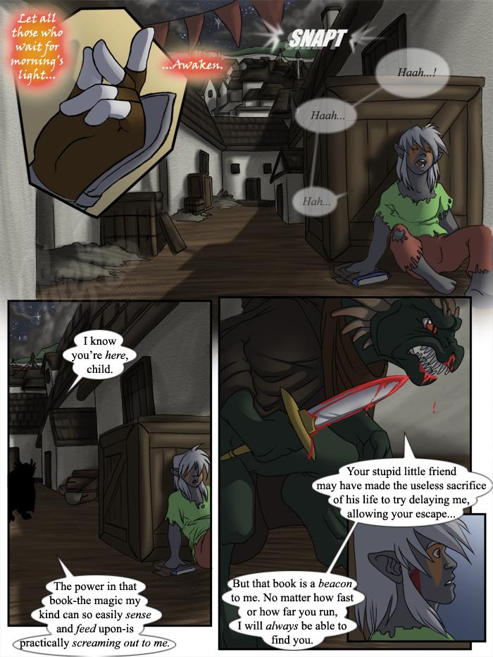
This year and update also marks the BEGINNING OF THE SCENE I'VE BEEN LOOKING FORWARD TO EVERY SINCE STARTING THE COMIC THREE OR FOUR YEARS AGO. I've spent so much time using this part as motivation to get through all work required for the previous 100+ pages. I really hope I don't mess it up or disappoint you guys. I'm quite excited. I took everyone's suggestions on the last few pages and put them into practice here. I tried making the shadows darker and more intense per a night-time setting, and tried making everything a little darker. Does anyone have any further suggestions? Are there any places I've made improvements? I find these comments helpful and they DO NOT HURT MY FEELINGS. Feel free to speak your mind.
Backgrounds and setting is also going to play a huge role in this scene, so this page also (hopefully) marks the beginning of detailed, intricate backgrounds for the comic. Feedback on those are also appreciated.
Additionally, THERE WILL BE ANOTHER UPDATE ON MONDAY. Be sure to check back then for the next page. Coincidentally, Monday will also be the first day of the new semester. There are a bunch of classes I'm really looking forward to taking, as my courseload finally has classes that have something to do with my major and are not just GenEds.
On that note, I'll see you all Monday.
Cheeko out.


Foaly123 at 6:28PM, March 20, 2009
All I can say is if its a night strip that most things sorta turn into a black and white movie during a night with strong light from the moon... and AWW Dart was to cool to die so young.
nekodragon at 2:40PM, Nov. 29, 2008
no! not dart! he was too cute to die!
Poul at 11:31AM, Aug. 23, 2008
NOOOOO DAAAART!!! Pleace don't be dead! You are to to cool to die too
DCraig at 8:59PM, Jan. 5, 2008
Wow! I'm speechless.
Potato U Princess at 3:36PM, Jan. 5, 2008
Dart is dead? No way, I don't belive it. I agree with blaster219. I'm not believing it until I see the body. Anyway, I think you're doing very well on your backgrounds. However, you might want to make the shadows a bit darker with some bluish tints, like somebody else mentioned...Also, a few of the colors (like the red blood) probably shouldn't be so bright. At night, we usually have trouble seeing in color due to the lack of bright light. You might want to make the blood on Mister Lizard's knife somewhat darker. It should probably have started drying by now, so maybe a darker shade of red? (Of course, I'm assuming that he attacked Dart a while ago because Ranu had time to get away and hide somewhere. However, if he attacked Dart only a few minutes ago, then the blood is still fresh and shouldn't be changed. Either way, you might want to make it a tiny bit darker because of the shadows from the nearby buildings and stuff. Somehow it doesn't seem to match the rest of the shadowed things in the panel around it).
silverblades2 at 3:10PM, Jan. 5, 2008
OMGEDNESS You can't kill Dart!
Nega Link at 12:18PM, Jan. 5, 2008
Miss Cheeko, I bow before you, humbled by your ability to relate a story. I have been meaning to read through the tale you've been relating to us, the peons of Drunk Duck, and today, as I flipped from page to page with unbridled fervor I fund myself wondering why I hadn't done so long ago. I'm giving this a 5/5, only because Drunk Duck won't let me rate it 10/5. I can't wait to read more.
blaster219 at 5:08AM, Jan. 5, 2008
Rule #1 of death in comics: If you don't see a body, then the character ain't dead. Not permanently anyway. I'll believe he's dead only when I see his rapidly cooling corpse.
Argent_Nightmare at 12:08PM, Jan. 4, 2008
Dart can't be gone! =( *sniffle* Love the detail in the backgrounds here. You should really just stop puttering around and go professional, Cheeks. ;)
Black Dove at 10:50AM, Jan. 4, 2008
... Dart's dead?... o_O
lennan at 8:42AM, Jan. 4, 2008
I second what Kelly says, but also, at night, there's going to be a lot less colour, so you may want to shift everything more and more towards the greys and the blues (jiminycricktX's example is really good), because as it is right now the light on the buildings are too light and it is quite jarring, but Kelly really covered that really well. But I think that more greys, since our eyes don't process color too well in dark, nor do we really see all that well, so I wouldn't be too worried if all the details aren't clear, just clear enough on the characters so we at least know what they're doing. The backgrounds are looking awesome. =) Although in panel 1 the window frame isn't following the same perspective as the roof so it looks jarring. But I can't wait to see the next page, and on monday no less. Good luck on your classes and yay for major related course work! =)
jiminycricketX at 8:11AM, Jan. 4, 2008
Oh yeah, if you want some really good reference to work off of for night scenes, you may want to check out this webcomic: [url]http://dreamwalkerchronicles.smackjeeves.com[/url] This guy really knows what he's doing when it comes to using colors. It might be worth looking into. Take this night scene page for example: [url]http://dreamwalkerchronicles.smackjeeves.com/comics/246332/anasazi-ancient-ones-page-07/[/url]
littletrinks at 7:51AM, Jan. 4, 2008
I thought that there was something different about this page... it looks amazing! I thought your other pages were really good, but this one is just exceptional! I love it!
RhianConway at 7:49AM, Jan. 4, 2008
No!! Darts! T_T That's so sad! The lizardman must die!!!
Maverik at 7:47AM, Jan. 4, 2008
Oh noes!! D: Beautiful backgrounds in the first two panels! As for suggestions, well, I think everyone else has covered anything that comes to mind...
kjanuary at 6:57AM, Jan. 4, 2008
Also: Ranu, climb on the roof or something!!
kjanuary at 6:57AM, Jan. 4, 2008
Hmmm... Night shadows? In the top panel, I would recommend making the shadow across the ground and the buildings in the background LESS intensely outlined, because while it certainly is nightlike, it also gives the impression of a very strong light shining down, to create such sharp shadows (think football stadium lights.) I'm assuming this is lit by moon and stars, not flood lamps, so a more blurred edge, or darkening the lit part, might help. Something else you can do is put a night layer over everything, to bring down the brightness and saturation of all colors, and then erase it or put highlights where the light actually hits. At night, the amount of shadow would be greater than the amount of lit parts anyway, so once your brain adjusts to working in negative space, it goes faster.
Draco109 at 6:43AM, Jan. 4, 2008
Darts dead.... oh man....
jiminycricketX at 6:13AM, Jan. 4, 2008
Well, It looks really good, way better than usual even. The backgrounds are probably the best I've ever seen you draw. One crit is that the lighting on Ranu and the box he's leaning against makes him look like he's under a street lamp or something. Frankly, if I was hiding from some psycho with a big knife, I'd hide somewhere dark. Aw, poor Dart. It takes serious determination to kill off a fun character like that. Or is he dead? I guess we'll have to see.
Wazaga at 3:15AM, Jan. 4, 2008
shadows should be slightly darker on the ground, other than that, you're doing a fantastic job with the setting detail. great work Chee, hope you'll be inspired to keep it up. I know how BG can be a pain to make or work with.
kumatsu at 11:22PM, Jan. 3, 2008
Well, I found you last week, but now I feel comfortable saying hi, awesome comic. So, yeah... Hi!! Awesome comic!!!
JillyFoo at 11:06PM, Jan. 3, 2008
For suggestions dark shadows always make night. If there is artificial light near by, the areas where there isn't light is very dark (sometimes to the point where it is hard to see). If there is no artificial light, people's eyes adjust to the night and things appear not as dark. I think you got that though. Try to think of the mood of the situwation when making your backgrounds too. Really contrasting dark shadows that hide objects are scary. Areas where everything is easy to see, not as scary. Looking forward to your big scene. I'm betting it's going to have something to do with our big OQ dragon friend.
BIueBoy at 10:57PM, Jan. 3, 2008
OH NOES NOT THE CAT BOY