Wow, I can't express how appreciative I am for your feedback and banner.
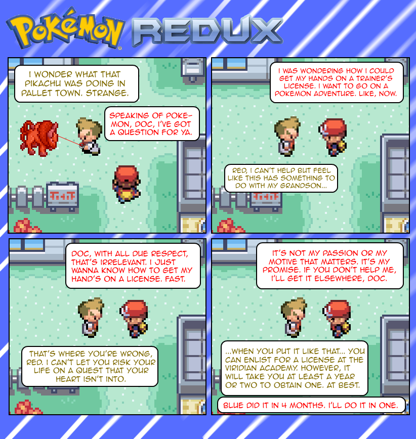
I'll work on making the comic more original as well. It's a "as-close-to-canon" retelling of Red's adventure through the Kanto region, so naturally some stuff like the Silph Co. Crisis, etc, will be somewhat obvious and expected, but I'll still try to make the story my own.
Again, thanks :D
The comic is quite nice; However it seems slightly degraded due to the Un-feathered Pokemon sign in the banner. Therefore I fixed it.
Here; [url]http://img819.imageshack.us/img819/5577/newbannerc.png[/url]
It was the first thing I saw when I visited the comic, and I thought it was a shame that something so insignificant actually influenced my opinion before I even saw the page. Therefore now, it will be clean and nice to look at.
I like to look out for apsiring creators as I recieved the same service 4 years ago when I joined.
If it still needs a little bit more refining give me a shout. :)
Anyway onto the page. It's very clean, well presented and easy to read. It has a good font, and the vocabulary and Grammar is perfect. Therefore there is no reason why not to give the comic a five. However, I must suggest that you try to make the comic loss generic.
A couple of years ago I had a Pokemon comic and it got into the top 5 sprite comics, because I used a really unique concept that hasn't been copied to this day.


Stunna at 6:35PM, April 11, 2011
Wow, I can't express how appreciative I am for your feedback and banner. I'll work on making the comic more original as well. It's a "as-close-to-canon" retelling of Red's adventure through the Kanto region, so naturally some stuff like the Silph Co. Crisis, etc, will be somewhat obvious and expected, but I'll still try to make the story my own. Again, thanks :D
omegaman at 4:47PM, April 11, 2011
*Sigh* I mean less Generic, not loss.
omegaman at 4:44PM, April 11, 2011
The comic is quite nice; However it seems slightly degraded due to the Un-feathered Pokemon sign in the banner. Therefore I fixed it. Here; [url]http://img819.imageshack.us/img819/5577/newbannerc.png[/url] It was the first thing I saw when I visited the comic, and I thought it was a shame that something so insignificant actually influenced my opinion before I even saw the page. Therefore now, it will be clean and nice to look at. I like to look out for apsiring creators as I recieved the same service 4 years ago when I joined. If it still needs a little bit more refining give me a shout. :) Anyway onto the page. It's very clean, well presented and easy to read. It has a good font, and the vocabulary and Grammar is perfect. Therefore there is no reason why not to give the comic a five. However, I must suggest that you try to make the comic loss generic. A couple of years ago I had a Pokemon comic and it got into the top 5 sprite comics, because I used a really unique concept that hasn't been copied to this day.