
pg15-double battle!
Avalon on Oct. 31, 2006
Sorry for not updating yesterday, I went trick-or-treating and then I had homework :_: stupid school!


Avalon on Oct. 31, 2006
Sorry for not updating yesterday, I went trick-or-treating and then I had homework :_: stupid school!


Avalon at 4:20PM, Nov. 1, 2006
Thanks vagabond, I did have a hard time dong the second panel, because There aren't any sprites of the backs of buildings, unless you meant flipping it or something? Megaman sprite? you mean the solar beam? I've never played megaman, so I woulcn't knowI don't exactly know what's off with the pacing, could you explain that further? I was thinking of writing up a character page, but I don't know how.
Vagabond at 2:33PM, Nov. 1, 2006
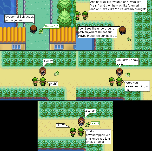
Hm. Intriguing. I'm actually not sure what I can say about this comic. I mean, I guess you're not going for a 24/7 ha ha funny comic (but if you are... well, then you're in a bad situation) so I guess I'll just have to go for seriousness, I guess. - You need to think about perspective/camera angles. There's no need to keep it static all the time. I think that for the most part you have an understanding of that concept, but you need to go further with it. Take for instance, the first panel of this comic. You've got the girl talking to Bulbasaur, who has to reply with an emoticon because its face is turned away from the camera. What you could have done here was change the perspective. As in, rotate the background so everything's flipped vertical. This way, your characters are still leaving the town, but now you can use sprites that face the camera, giving you a chance to use more expressions. - Going onto graphics for a second... they're ok, I guess. Nothing really exceptional about them, but they get the job done. Just, um... don't use another Megaman blast as a substitute. Ever again. Please. It looked really weird. The custom made things (like the Vine Whip) could use a little better shading, so keep practicing. - The plot's... again, ok I guess. It kinda feels like not enough happens in the panels. Or there's too much happening. The pacing just feels off. I think you should maybe polish the dialogue in order to develop the characters. Right now, they just feel pretty juvenily done. Think about what you want each of them to be, hell, even write up your own personal character pages. Then when you do that, try to reflect what you wrote down in your later comics. - Watch out for the occasional spelling error/grammatical error/extra random space. I only caught a few and they all looked accidental rather than lazy, so don't worry too badly about this. - Work on your ordering of your text bubbles. It's pretty confusing now when more than one character talks in a panel simply because they're not spaced far enough from each other. You typically aren't using 100% of the panel, so don't be afraid to space them ou t a little more. All in all... this comic's pretty much average. Nothing dazzling yet, but you're not making really ugly errors. Keep up the practicing.
Tamao at 12:19PM, Nov. 1, 2006
wow o.o random... but nice ^__^-