


Page 3
Chibi Pickles on Nov. 22, 2006
Yay and hurray, an update.
Scanner is still broken, but I scanned Pages 3-6 and emailed them home, so I shall be updating with actual pages
Also, what do you think of the inking, does it make it look better, worse, no different, personally I think it makes at least some differance and is the new font more readible, less readible, or about the same?
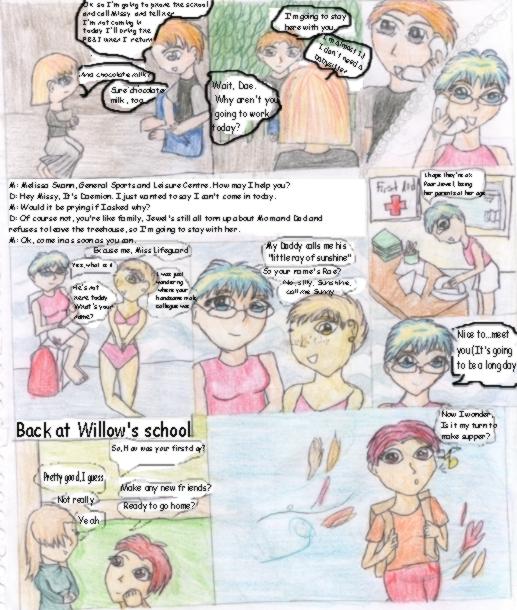
P.S. The reason there is a box exclusively for text is while I was drawing I noticed ther was no room for text in panel 3, so Missy and Dae's phone convo is beneath panels 1 and 2


CreativeInsanity at 11:13AM, Dec. 13, 2006
The colours and the inking are nice but the text really lets the page down. I think half of your text issue lies with the fact that your panels aren't large enough to allow for as much text as you've tried to fit in there. Maybe you could try to have fewer panels to a page? That way you'd have more room for text and finer detail in your art work. Tables are horrible expensive computer graphics thingies... I want one lol
PlayerOne at 10:08PM, Nov. 27, 2006
I cannot read your text, it's horribly smalll. As in "One letter is two pixels" small.
Chibi Pickles at 7:54AM, Nov. 24, 2006
Thank you for the squee's Dementia Praecox and I do have a script written, it just went missing XD I need to find a good font *sighs* Hmm...a tablet, I'm not sure where one would get one of those, and aside from that I barely know what a tablet is
incognito-mystery-person at 9:45PM, Nov. 23, 2006
Two things before I smother you with 'squees' and colour-related hysteria. Try to make some little speech bubbles on paint and make the font a bit bigger. Place the bubbles in different places if you must- just to make it cleaner. Whenever you do the lineart, just don't include the bubbles. I suggest that you have a script written so you can plan your pages around that. Then whenever you're finished with the colouring and lineart, scan it and add the bubbles and text in paint. Also, try saving your files as pngs. They come out looking so much cleaner than bmps or jpegs. ^^- I use pngs all the time. Anyways-- *squeee!* Pretty colours! ^^- And that lifeguard has pretty hair. I agree with DancingChaos- great start! I wish you good luck with the rest of your comic, and I look forward to more pages! ^^-
deleted-byrequest-03 at 8:53PM, Nov. 23, 2006
The inking makes it look 10x clearer, but make the font to the way it was, because I can't read some parts. Hmm... Have you ever considered getting a tablet? You woudln't need a scanner, and everything would look a lot cleaner. It's a nice start. Just work on some stuff. But I still think it looks pretty good. Keep it up! :D ~DancingChaossssssss