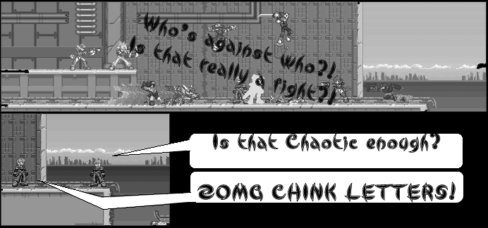
The text is touching the edges of the text bubbles, and the font your using, while interesting, doesn't make for an easy reading experience. Times New Roman or Comic San MS would suit this much better. The extra black space seems unnecessary, and it off-sets the work due to the thin gutter size used throughout the rest of the comic.
I'm still unsure just why you decided to use a grayscale in this, but it just doesn't seem... right... I can't complain about it, really. Just doesn't see to fit though.
The sprites are way too small. It renders "emotion" useless. Try zooming in. It's hard to give your character adequate expressions why they're this far out. Enlarge them by 150 or 200 pixels, it will help in the long run.
The text in the first panel... not sure why it's running through the middle. But because this is in grey scale it's a bit hard to see. You should use some sort of shadow cast, or perhaps a stroke, they always seem to help.
This isn't too bad. I haven't read the whole archive, but I'm not too impressed by this issue.
It's only 2 worthy due to the major design errors.
The Good: Clean and smooth presentation. Grayscale kinda' works.
The Bad: Gutters are mismatched, characters are too small, and the text is difficult to read and mixes into the sides of the bubbles.


lefarce at 1:15PM, Oct. 30, 2006
The text is touching the edges of the text bubbles, and the font your using, while interesting, doesn't make for an easy reading experience. Times New Roman or Comic San MS would suit this much better. The extra black space seems unnecessary, and it off-sets the work due to the thin gutter size used throughout the rest of the comic. I'm still unsure just why you decided to use a grayscale in this, but it just doesn't seem... right... I can't complain about it, really. Just doesn't see to fit though. The sprites are way too small. It renders "emotion" useless. Try zooming in. It's hard to give your character adequate expressions why they're this far out. Enlarge them by 150 or 200 pixels, it will help in the long run. The text in the first panel... not sure why it's running through the middle. But because this is in grey scale it's a bit hard to see. You should use some sort of shadow cast, or perhaps a stroke, they always seem to help. This isn't too bad. I haven't read the whole archive, but I'm not too impressed by this issue. It's only 2 worthy due to the major design errors. The Good: Clean and smooth presentation. Grayscale kinda' works. The Bad: Gutters are mismatched, characters are too small, and the text is difficult to read and mixes into the sides of the bubbles.
aznboii01 at 5:24PM, Oct. 29, 2006
Because I felt like it, and stay away from my comic. I don't want you to make me feel like Wraith. We sprite comic maker don't want of you. Go away.
lefarce at 4:40PM, Oct. 29, 2006
If I may ask... Why is this in black and white?
aznboii01 at 10:43AM, Oct. 29, 2006
I made it that way so no one could understand what's going on, look.. "Is that really a fight?!"
zero20xd6 at 10:41AM, Oct. 29, 2006
What the hell is going on and why is Model Shadow standing on a wooden stump.