


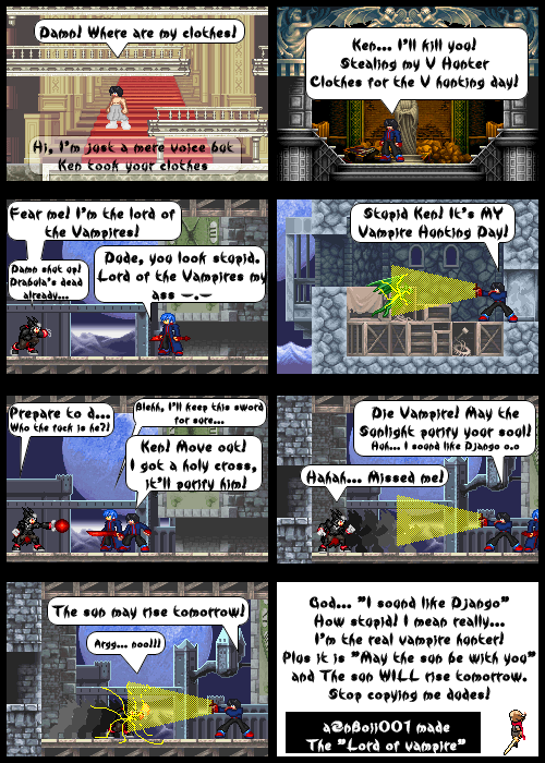
Halloween Filler
aznboii01 on Oct. 29, 2006
It's a halloween filler this time, enjoy.
As for Lefarce… I will be zooming when ever I feel like it suits the case. I'm using that weird font only for fillers. I'll stick with Arial for the regular issues and I know it was a big mistake, I made ‘em touch the edge & left alot of spaces in the text bubble. I wasn’t takin' attention to it.


aznboii01 at 6:43PM, Oct. 31, 2006
What ever.
lefarce at 11:38PM, Oct. 30, 2006
Many of the same problems exist in this one. The text is really hard to make out at this size... I could direct you to some better fonts if you just tell me what your looking for. But personally, I think Comic Sans would look great with this. The comic is too far out. Again, all emotion is lost due to the current pixel ratio. Don't be afraid to zoom up. This is comic, not a card. The FX in the 7th panel is just cheap. I'm sorry if that's blunt, but I just can't word it any other way. The clear text bubble in panel one... yeah... no. The opacity is way to low, and the text gets lost in the detailed background. Turn your opacity up. I've tested this myself, and it seems 80% is a good ratio when you want a see through effect.
Earthdivine at 4:53PM, Oct. 30, 2006
...Halloweens tomorrow...