


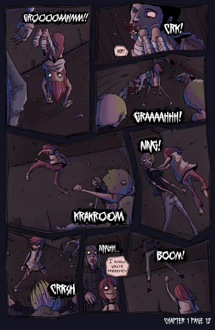
Chapter 1 - Page 12
Kiah on Feb. 29, 2008
So…you may notice some differences here…hopefully you like them. Personally, I feel really good about this page. After doing that illustration of Petre and Mia, I seem to have a better handle on colour and whatnot and I wanted to apply that to the comic.
Basically I changed the panelling style, used a paint style brush instead of hard colour, used more colours to accentuate dark areas, made more fluid actions with more dynamic camera angles, and took the new frames and bent them to be more in line with the action. Whew!
I had some setbacks on this page, unfortunately…It took me forever to work the thumbnail out, I wasn't going to do another page of zombie fights but without it, things would have been confusing. So I'd started a different page and then had to go back to do this one. I spent like 4 hours trying to work out camera angles, got my inks mostly done, sized it down to show to Ashwara from Para-Ten to get his opinion and…BLAM…saved over the file and closed it. I had to go back and re-ink EVERYTHING and then colour.
Let's just say I'm glad I got it done and I'm pretty happy with it. Thanks to everyone offering constructive criticism! This is what makes a better comic artist :)


Annie2495 at 12:14AM, July 26, 2009
Whoo!
giovanni at 5:18PM, Oct. 12, 2008
much too strong
MY NAME IS NL at 10:59PM, June 17, 2008
I love that they're barefoot. :D
simonitro at 1:11AM, March 31, 2008
Every panel looks amazing with great action... I love it...
dreamwatcher at 5:08PM, March 4, 2008
always looking fantastic, i like the color transition
TheMidge28 at 6:04AM, March 3, 2008
the new angles look great! well doen incorporating them and the action shots look like little polaroid shots of the fight. the panel designs are sweet as well. keep it up!
Ashwara at 6:07PM, March 2, 2008
Nice dood. Mia looks really lifelike in panel five. The blue lighting is a nice touch too.
Short_Circuiting at 9:40AM, March 2, 2008
excellent action poses on this page!
harryq at 6:02AM, March 2, 2008
Really enjoy your work.
DAJB at 1:30AM, March 2, 2008
I just think it looks cool. Not clever enough about them artsy things to know why, but ... yeah. What the others said! Never known characters who can look so cute and creep me out at the same time. Masterful!
JustNoPoint at 7:05PM, March 1, 2008
Hell yeah. I keep telling myself I need to lean the camera as well. Your description taught me something I never considered... leaning the camera in the direction of reader travel. Agh why did I never think of that? This is really cool here! I learned a lot viewing this page. I hope you do not mind one more "personal" appeal of mine in action scenes... Another dynamic usage to add to certain scenes/flow is panel breaking. Let some of the action jump into the other panels at times. I've took it so far that I've been told it looks like a graphical "shoots and ladders" where every image flows into the next guiding the readers eyes. It is best used for fast paced fluidic scenes. Probably not for this scene here. I really really like the way you did this scene. But for some fast paced action scenes thinking of the flow as water helps out. If you are interested I can PQ you some of the scenes I did that I think worked out well. I tend to think that my stronger point is my action layouts and would love to see you get even crazier with some of them later on! You just encouraged me 10 fold for my next big action scenes! This finally makes 2 comics I can view for great action scenes, layout, and choreography ^_^
CoyoteLongshot at 6:53PM, March 1, 2008
I think it's definitely an improvement. The fact that you took some more time on it really shows through.