


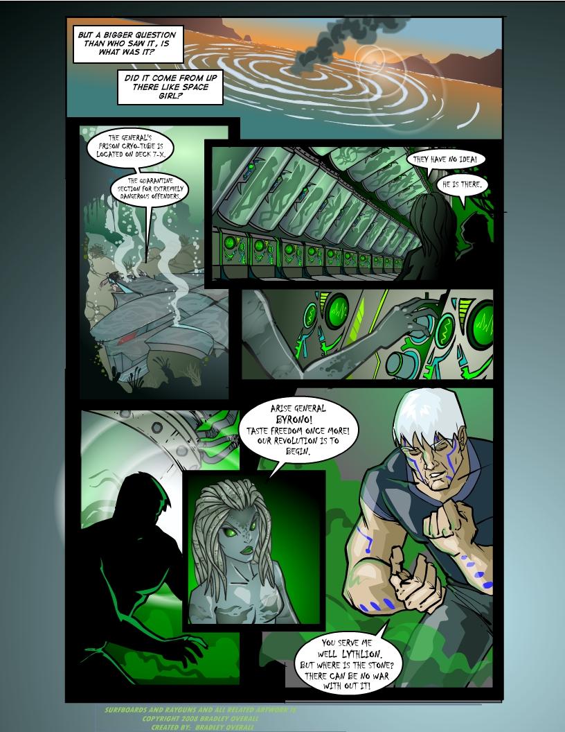
pg. 14 Villains
Bradleyo on May 20, 2008
Here we finaly get back to that big space ship that crashed, causeing the massive wave. Friends of space girl?
not likely.
Don't worry we'll get back to Wizer, Reef and space gal soon enough. But untill then I hope you don't mind checking out some
Villains.
I hope you dig, let me know what you think.
Cheers.
~Brad


harkovast at 1:55PM, Dec. 9, 2008
I like the alien chick. The tentacle hair is a fun touch.
Gwalihir at 3:27PM, July 9, 2008
The bad-guy font is really cool: it works everywhere but the second panel, and there it might be more a matter of it being too small for that particular style. Just enlarge it a tad, and it's great! Now we suddenly have clear that this is a prison ship where friends of the prisoners have gained control: suddenly plot elements are emerging. The General's tats have many of the same qualities as Denaria's: obviously functional products of the same tech. Getting reminded of the tats worn by the Clans in Mechwarrior. But now we have Lythlion, alien anphibian girl thrown into the mix, too. A real cutie in that bad-girl way: how fortunate for us Earth-bound males that in spite of her obvious cold-blooded heritage, her species nonetheless emulates secondary mammalian sexual characteristics, hey?
OfftheGrid at 7:54PM, June 6, 2008
Stunning artwork once again. Glad to hear your using a different font in the future as that was my only minor issue. Fantastic!
Moondog at 5:27PM, June 6, 2008
I'm sticking around fo sho
Baloo at 9:59AM, May 28, 2008
Dundunduuhhn! War! Anyhoo, I'm enjoying it =D The girls are purdy (always a plus), can't wait to read more =)
inki at 7:49AM, May 26, 2008
niii-iii-iice!! lythlion poster! stat!! and maybe her own comic while yer at it. back to fx hell...
Bradleyo at 6:05AM, May 23, 2008
No I have'nt SomaX, but thanks for coming back. We missed ya.
SomaX at 7:34PM, May 22, 2008
So I've been gone for almost 2 months and obviously missed a lot, so I'll go catch up now. By the way, have you been featured yet?
Bradleyo at 9:27AM, May 22, 2008
Hey, Thanks so much for coming back and for the great comments and critics. For everyone who pointed out the bad font, you're right. It's not as legible as it needs to be, especially in the second panel. Sorry about that. I will make sure I adjust it for the next page. JustNoPoint- Thanks man, and thanks for the support. Midge- You're definately on the right track. Thanks dude. Amanda- Thank you, and yes the General is a pretty mean dude, just wait and see. Hero-Thanks buddy. Albone-Thats a great suggestion, thanks. And don't worry they'll get out of the water in style. Fenn-Thanks a lot, I hope you keep coming back, and I hope you're digging the yarn so far. LoudG-You rock buddy, Thanks. And yes they may just release them all. Brock dude, thanks man, point taken. HarryQ-Thanks for the support buddy. reboundcomic-I agree that second panel is the worst font offender. Thanks a lot. DOM buddy, she's an alien not an android dude. No worries though, honest mistake. Wait till you see what she can do. Thanks. Moondog-Wow, you rock, thanks for finding us and for scoreing every page. Thats awesome. I hope you stick around. Cheers everyone. Seeya soon. ~Brad
D0m at 8:51PM, May 21, 2008
I love the ambience, and the android girl. Fantastic colors!
reboundcomic at 6:03PM, May 21, 2008
Dig it, my only problem with the font is on panel two. the rest is very legible.
Priest_Revan at 3:01PM, May 21, 2008
This comic looks awesome, but I have to agree with JustNoPoint on this one, the font is a little small and hard to read.
Brock at 12:36PM, May 21, 2008
Oh, very nice page. Love all the sci-fi locales and your anatomy continues to impress. One negative for me on this page is the font you've chosen for the dialogue. Very hard to read.
Loud_G at 11:49AM, May 21, 2008
This page is absolutely awesome! I like what is happening. I wonder though, are they going to release ALL those capsules? That would be scary!
Fenn at 11:32AM, May 21, 2008
There goes the neighborhood!
albone at 11:07AM, May 21, 2008
Bring on the bad guys! Hope they don't mind swimming to the top, unless their ride can get fixed. A beautiful looking page as always. Dynamic page layout, awesome art. I do have to say that the bad guy font is a little tough to make out. Maybe a contorted or different colored balloon instead? Just a quick thought. Vunderful!
amanda at 10:25AM, May 21, 2008
JNP's comment seconded - it's legible, but borderline ^.^ A shame too - it's such a good villain-font. Yay for villains! The General looks like he'll be tons of fun - I like his tattoos/markings.
TheMidge28 at 10:23AM, May 21, 2008
always digging your updates. so was she a prisoner on the ship or a guard transporting these prisoners?
JustNoPoint at 9:36AM, May 21, 2008
A small critic. This font is a tad difficult to read on this page. May want to try and tweak it a little for future pages. And villains are always welcome! They tend to become my favorite parts of most stories =D