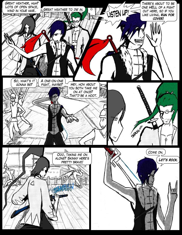
So. So so so. Let's see. FUN FACT: When I was typing in the dialogue for that last panel, Blue Oyster Cult's “R.U. Ready 2 Rock?” started playing. *nod* Completely true. Qingting is kind of a talkative son of a bitch, isn't he?
So, earlier, I had a brief discussion with the amazingly talented alexds1 of deviantart, where my non-TnK artwork is. I had never talked to her before, but I admire her work, and she seemed “accessible” enough that I thought I might ask her opinion of my work here. The criticism was harsh, but largely justified- in any case, I'd like to ask YOUR opinions on some of her points. 1) The font; the font, she claims, may be a little difficult to read. Personally, I see no problem with it, but then, I use this font a LOT, so I may just be acclimated. 2) The shading; the jet-black high-contrast stuff, while distinctive, makes things look as though there's a constant, blinding ambient light. I'm inclined to agree, but I think it's sort of a “signature” technique. 3) Backgrounds; too busy? 4) Textures/tones; I may be using too many. I'm (clearly) trying to cut down on this, with a newly-adopted “keep it simple, stupid” policy. and 5) Color; the erratic use of color may be jarring to some readers, and it was suggested I either go with grayscale or full-color. I'm not too sure either way, honestly.
Anyway, I'd like to hear YOUR opinions on this. I may be doing some experimentation in fixing these problems and trying new techniques, and these experiments will likely end up on my deviantart account. In any case, this may postpone next week's comic for a while, but that depends on how productive I am. 'Til next time, folks- keep on rockin'.
Okay, here goes...
1. I don't find the font hard to read. I think it's very clear. Looks like a pretty typical comics font to me 0_o;
2. A little more tone would help balance things a bit and add depth to the backgrounds, but don't go overboard, most Western-made manga seem to go waaay overboard with tones and turn into a mass of sludgy greys. Maybe use bit of grey in the BGs for depth?
3. Not really, but you could do with drawing attention to them so people don't just miss all the detail, see above about tone.
4. I like the dot tones, but you're right on keeping pattern tones to a minimum. I've found personally that with bold styles like mine or yours, big, bold patterns look better than little fancy ones.
5. I like the colour! It's cool! Like Sin City! It gives your comic a really individual pop-arty look. Okay, so admittedly, I am a bit of a pop art fan, but still...
Heh. Your iTunes is being prophetic again, isn't it? I swear that program has a mind of it's own. A cruel, ironic, horrid little mind.
You already know the counter-critique I'd give, so I'll skip retyping it for now. Just let me say that Qingting's manic banter is one of his more endearing traits (along with his love of buffalo wings) and I'll be on my way.
Enjoy your weekend of lazitude! ^_^
Hmm, I'll put my critique on her critique if you like.
1) I don't see anything wrong with the font. It looks like the font you get in published manga, so somebody must be able to read it (what is it, by the way?).
2) The bright white backgrounds don't always work with the content of the comic. It makes the characters stand out, but it makes the backgrounds seem more like a backdrop rather than an inhabited world.
3) You have to have some busy panels, some less so. As long as the backgrounds don't detract from the action in the foreground, it's good to have some panels looking like they'll pop with backgroundy goodness.
4)I'm no expert on tones, but I haven't seen any page with such a large amount that it looks odd. I'd suggest experimenting with some different types though, most of them seem to be standard character shading ones. Maybe try some toned backgrounds for atmosphere?
5) Stick with the style you like. Odd colour works for things like Sin City so it can work for this too. It'd be nice to maybe have some full colour pages once in a while (so I can get colour reference for fan art =3)
Um, yeah. That guy has some mouth on him.


Darth Mongoose at 2:53PM, July 6, 2008
Okay, here goes... 1. I don't find the font hard to read. I think it's very clear. Looks like a pretty typical comics font to me 0_o; 2. A little more tone would help balance things a bit and add depth to the backgrounds, but don't go overboard, most Western-made manga seem to go waaay overboard with tones and turn into a mass of sludgy greys. Maybe use bit of grey in the BGs for depth? 3. Not really, but you could do with drawing attention to them so people don't just miss all the detail, see above about tone. 4. I like the dot tones, but you're right on keeping pattern tones to a minimum. I've found personally that with bold styles like mine or yours, big, bold patterns look better than little fancy ones. 5. I like the colour! It's cool! Like Sin City! It gives your comic a really individual pop-arty look. Okay, so admittedly, I am a bit of a pop art fan, but still...
Lady Andromeda at 7:06PM, July 5, 2008
Heh. Your iTunes is being prophetic again, isn't it? I swear that program has a mind of it's own. A cruel, ironic, horrid little mind. You already know the counter-critique I'd give, so I'll skip retyping it for now. Just let me say that Qingting's manic banter is one of his more endearing traits (along with his love of buffalo wings) and I'll be on my way. Enjoy your weekend of lazitude! ^_^
confusedsoul at 9:22AM, July 5, 2008
Hmm, I'll put my critique on her critique if you like. 1) I don't see anything wrong with the font. It looks like the font you get in published manga, so somebody must be able to read it (what is it, by the way?). 2) The bright white backgrounds don't always work with the content of the comic. It makes the characters stand out, but it makes the backgrounds seem more like a backdrop rather than an inhabited world. 3) You have to have some busy panels, some less so. As long as the backgrounds don't detract from the action in the foreground, it's good to have some panels looking like they'll pop with backgroundy goodness. 4)I'm no expert on tones, but I haven't seen any page with such a large amount that it looks odd. I'd suggest experimenting with some different types though, most of them seem to be standard character shading ones. Maybe try some toned backgrounds for atmosphere? 5) Stick with the style you like. Odd colour works for things like Sin City so it can work for this too. It'd be nice to maybe have some full colour pages once in a while (so I can get colour reference for fan art =3) Um, yeah. That guy has some mouth on him.