Is using just that light gray for their haori a good choice? Or do you guys prefer the tone I was using for it before? I'm a little torn, personally. And whatcha think of the site design now? I know I asked last week, but you might not've seen the message. Not too late to change it.
…boy, I really did not plan word bubble placement properly on this one. My bad, guys. I'll do better on the next one, promise. This's gonna be a fun chapter.
EDIT: ACKTHP! Uploaded the wrong page! Is fixed now.
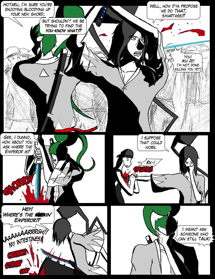
I love that first panel. I especially love the angle of Hotaru and the fact that you only bothered to ink in the main characters, leaving the rest of the crowd in what looks to me like pencil. Very nice!
:D This page makes me giggle too.
Also, about the site, it's a nice change from the standar layout. I am a sucker for character pages and extra info pages (even though I was a little sad when I found the character pages comprised of the bios you've already made. But oh well, 'cause they rock too!)
All in all, yay! And by 'fun chapter' do you mean super bloody slashy fun time? :D I can't wait.


NonExistent at 10:56PM, Oct. 27, 2008
I love that first panel. I especially love the angle of Hotaru and the fact that you only bothered to ink in the main characters, leaving the rest of the crowd in what looks to me like pencil. Very nice! :D This page makes me giggle too. Also, about the site, it's a nice change from the standar layout. I am a sucker for character pages and extra info pages (even though I was a little sad when I found the character pages comprised of the bios you've already made. But oh well, 'cause they rock too!) All in all, yay! And by 'fun chapter' do you mean super bloody slashy fun time? :D I can't wait.
confusedsoul at 1:06PM, Oct. 27, 2008
Could be a Hellsing title page. Minus lanky armed vampires.