
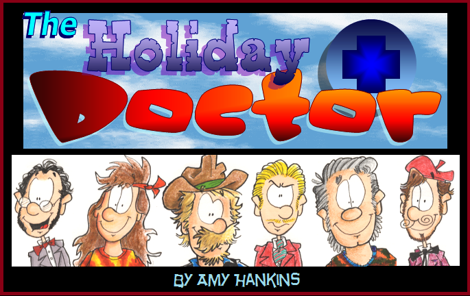


Episode 1. pg. 3
antcomics on Feb. 1, 2008
Sorry it took so long to update this…
Scanning it is a little bit of a pain since the pages are just a tad too large to scan in one piece.
So here is page three. If it looks different than pages one and two, here is the explanation for that:
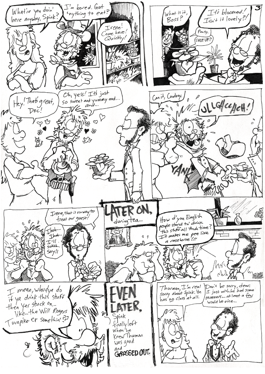
Back in 1998, when I started this thing, I had intended to color it. I started coloring it by hand with colored pencils. So there were bits of colored spots on pages 1, 2, and 4 where I had sort of begun ‘experimenting’. I soon realized I didn't like how it was coming out. Also, I decided that this was probably going to be a long-ass story and there was no way i was coloring all of it. Just no time for it.
Also, I hated how page one originally came out. So, in about 2000 or 01, I re-drew pages 1,2, and 4. My style had already changed from my 1998 one by then. So here you have seen the re-vamped pages 1,2, and 4. Three was okay so I left it alone.
From 5 on, it's all in chronological order…
As you can see, this thing is not historically accurate (hence the Will Rogers Turnpike reference). I set it in victorian times, but took a lot of liberties–mostly to make it funnier. I always found non-historically accurate stuff to be pretty humorous for some reason.
I'll try to start updating this more. It seems people wanna get this story moving along! :o)


Flup at 8:24AM, Aug. 3, 2008
I like the use of the dry-ish texta
n_y_japlander at 7:47AM, Feb. 4, 2008
Amy, your art is awesome enough!!!! so, up-date when you can!!!! (^O^).... seems like we have the same up-date sched (when we can)!!!! (^_^)
antcomics at 11:17AM, Feb. 3, 2008
Wow, guys. I appreciate all the compliments. I have improved so much since I did the early H-Doc pages, so I figured I would get some more critical comments (heck, I would critique my older stuff pretty harshly at this point). It will be fun I think, for you guys to see how my style evolved. I really think it's all due to this comic that I really sort of reached the 'apex' of my comic style. Anyhow, glad you are enjoying it!!
GTLB at 5:15AM, Feb. 3, 2008
It wasn't hard to read. I mean, it doesn't have the same awesome lettering style that you do with Antcomics but it's still very readable. At any rate, you have another enjoyable comic on your hands here. My favorite panel is the second to last. I really like how the tea is dripping from his mustache.
The World of Witt at 7:19PM, Feb. 2, 2008
Another drive down Holiday Dr.!!! Yeah!!
Kikaru at 2:58PM, Feb. 2, 2008
But..but it IS a pretty flower! Is a man not allowed to appreciate the simple beauties of nature like a flower? 9.9
Chameleon Kid at 12:59PM, Feb. 2, 2008
*ROFL* XD Spink...what a great character...*LOL* I just LURVE that 3rd panel! ^_^ *snicker* Man, imagine trying to color all those pages. (0_0) Good thing ya went with black & white! I also really like the header. (awesomesauce stuff!) (^o^) *W00T*
johnkeating at 11:20AM, Feb. 2, 2008
Great work Amy! I'm falling in love with your art style!
harryq at 11:09AM, Feb. 2, 2008
I just loved this right out of the gate. It just feels right.
antcomics at 10:21AM, Feb. 2, 2008
Bocaj: I used to make my words a lot smaller. Plus I couldn't get this damned thing to scan right today for some reason. I agree, the words look horrible to me... Thanks guys!
crocty at 10:06AM, Feb. 2, 2008
And the plot thickens!
Kimhura at 10:03AM, Feb. 2, 2008
Love the 3rd panel xD 1998... I was only 7 years old! Now I feel like a baby 8[
Bocaj at 9:58AM, Feb. 2, 2008
A bit difficult to read, but other than that, amazing!