


Dreams - 01 - 002
BlackDagger on June 11, 2009
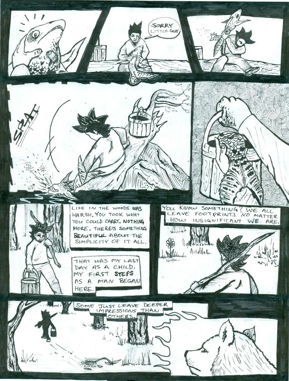
this page looked a lot better on paper, oh well. lemme know what you guys think.
thanks slackmaster, i can't wait to see your comic man! Dark Matter, thank you for your comment. istaerlus, thanks, i'm liking your comic a lot so far! and last, but certainly not least, thank you Pit_Face for your criticism and comments, especially the criticism we all need it (especially me lol).
i know my anatomy was way off on the first page, and there's no excuse for that. i penciled it like that and it fit my image of Odin as being slightly off in general so i left it. as for the background being flat on that page, i completely agree. i was experimenting with my own impressionistic view of trees, but i'll do better. i swear.


BlackDagger at 9:38PM, June 12, 2009
9 panels seem like too much on a page? my philosophy is, the more panels on a page the better (with exceptions). unless of course it's a full page spread, than the more detail the better. your suppose to only look at one panel at a time anyway lol, so as long as you can see it clearly more panels in a single post seems like more bang for your buck to me. thanks for the comment though Dark Matter. anyone else think this is too much?
Dark Matter at 8:52PM, June 12, 2009
The page seems compressed (perhaps trying to get to much on one page). But I think it still came out good. It's just that it at least would seem better if there was less panels.