fladam thanks for all the advice throughout these pages. The doodling on the upper left on this one was invisible to me on my monitor at home, so I'm so glad you pointed that out to me. And agreed, it is too much
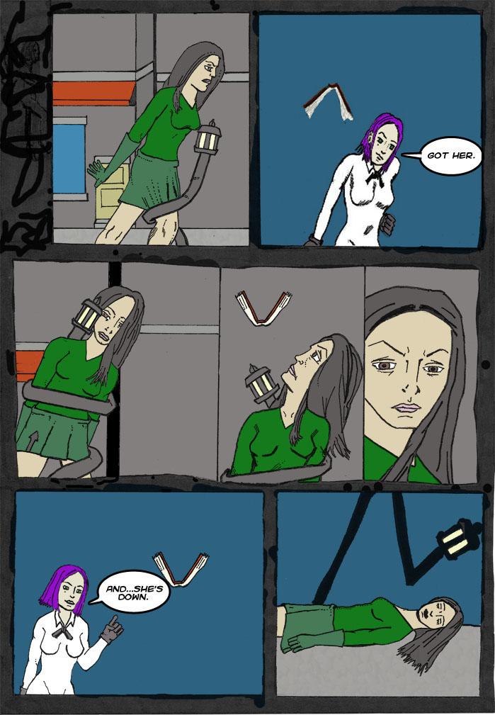
You've added a new page. I do prefer the layout of the previous page more. Although the art here is very good and descriptive (the middle panels are excellent), I feel that Gretchen has been short changed with more barren backgrounds. There's too much space being wasted in those panels. Perhaps close ups of Gretchen's face may eradicate that problem.
Also the panel borders don't feel as loose as they did in the page before. There's perhaps too much doodling in the upper right portion. However, I'm loving the un-eveness of the middle row of panels.
I still like how you have transformed the look of this comic. For all my nit picking I do like it very much. You've certainly upped your game.


parkbenchbook at 1:29PM, June 1, 2009
fladam thanks for all the advice throughout these pages. The doodling on the upper left on this one was invisible to me on my monitor at home, so I'm so glad you pointed that out to me. And agreed, it is too much
fladam at 1:48PM, May 31, 2009
I meant too much doodling in the upper left. Doh.
fladam at 1:13PM, May 31, 2009
You've added a new page. I do prefer the layout of the previous page more. Although the art here is very good and descriptive (the middle panels are excellent), I feel that Gretchen has been short changed with more barren backgrounds. There's too much space being wasted in those panels. Perhaps close ups of Gretchen's face may eradicate that problem. Also the panel borders don't feel as loose as they did in the page before. There's perhaps too much doodling in the upper right portion. However, I'm loving the un-eveness of the middle row of panels. I still like how you have transformed the look of this comic. For all my nit picking I do like it very much. You've certainly upped your game.