
Chapter 2: A Dream or a Memory 2
trevoramueller on Oct. 5, 2007
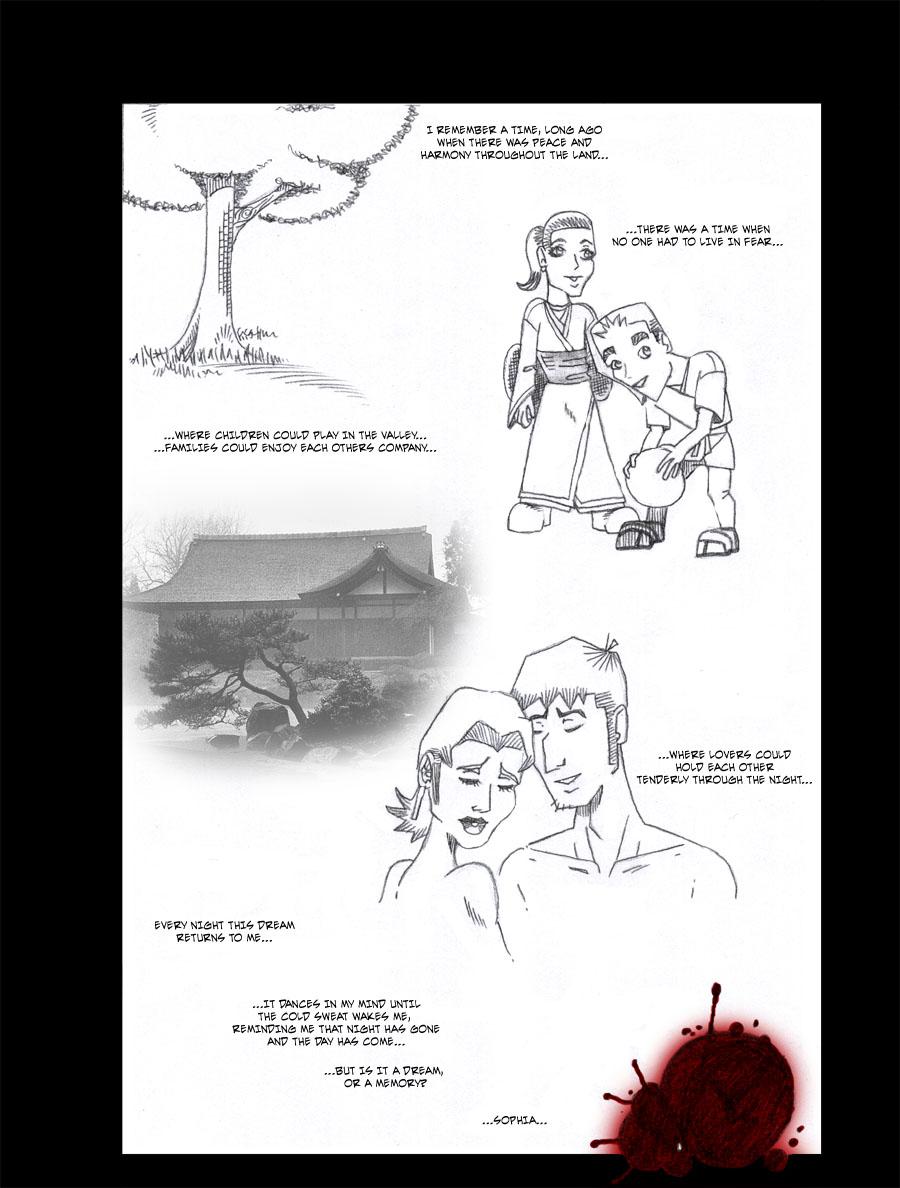
Montage flashback, which was my original way of dividing the chapters. I like the page dividers better, as this tended to confuse some readers. What do you guys think?


trevoramueller on Oct. 5, 2007
Montage flashback, which was my original way of dividing the chapters. I like the page dividers better, as this tended to confuse some readers. What do you guys think?


trevoramueller at 4:29PM, Jan. 14, 2009
Moondog: Thanks. Kids are tricky, because if you don't do them right then they look like dwarfs.
Moondog at 10:50AM, Nov. 22, 2008
I think the kids look cute - not frankensteiny. It fits with the style of the rest of the book
trevoramueller at 9:44AM, Feb. 18, 2008
CoyoteLongshot: He's also hunching over a bit too much. I'll try to work on it, thanks for the feedback. :D
CoyoteLongshot at 1:38PM, Feb. 9, 2008
I gotta say, the weird proportion on that kid make him look like Frankenstein. Watch out for that.
trevoramueller at 1:13PM, Oct. 16, 2007
There is a lot of negative space on this page, isn't there.... I guess, since this was a sizing issue at the time, I was trying to make sure that I had more than enough space to be my usual wordy self, and not over-crowd the images with text. It'll get better as it goes on. Less negative space, more balance between text and images.
TheMidge28 at 9:06AM, Oct. 7, 2007
split...the amount of white space gives the impression of a dream quality but at ths same time seems to much...I wonder if resizing the images and having them connect in a way may help connect them and allow for a more design that is more dynamic...the illustrations are well done but they seem too seperated...I love the blood splatter on the bottom of the page...the elements are here for a mind blowing page they need to be brought in together... I read throught the archive and left comments as well...so much potential and an interesting bloody intro..definitely looking forward to how this progresses and how your own style develops...
Fitz at 1:02PM, Oct. 6, 2007
The page looks good, especially the two lovers. And the red blood at the bottom is a really nice touch. Oh and btw, officially FAVED :)