


7.5 the redo
necrolichmon on May 21, 2010
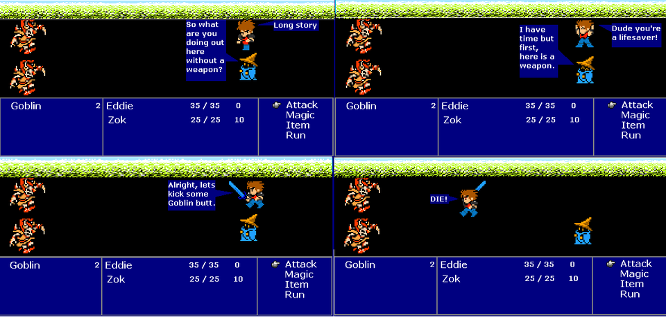
i make this one more like the game with the black background and small color at the top. i will do a vote to see which you guys like more. my original way of doing it or this way. just vote while you post. i will count them up tomorrow and see which is better. but as for me i think my original way of doing it was better cause you have a bit more color.


giovanni at 5:29AM, May 23, 2010
better!
Gaddick at 4:22AM, May 23, 2010
ACTUAL BACKGROUND HOLY HELL! trippy...
necrolichmon at 3:11PM, May 22, 2010
also i like to use the resolution from the game only. it it is 8-bit i am not changing that. also i dont use anything ot from the game. unless its filler.
necrolichmon at 3:09PM, May 22, 2010
yes i plan to have a lot more stuff going on soon. it just started people, need to wait. im only doing 1 to 2 comics per day.
ShadowScar Knight at 3:06PM, May 22, 2010
This is DEFINITELY a lot easier on the eyes. However, I didn't mean you just had to use the 8-bit FFs' backgrounds, since everybody who has played the game knows there's very little to work with, unless you get very creative. You can look for Castlevania backgrounds, or some from Zelda II, anything that has detailed backgrounds. If the 8-bit backgrounds seem a little too restricting for you, you CAN try to use higher resolution backgrounds (as in, 16-bit ones from other games), but those will need more care. Either way, it's looking better. I'm liking what I see already. My only gripe so far is that the comic itself is a bit too short for what's going on. I'd like to see some ass-kicking :( But I suppose that'll happen next strip. Keep it up
necrolichmon at 2:42PM, May 22, 2010
well if i did that then i wouldn't have much room for text. plus doing those are a lot more work just to have no talking.
Gustaa at 2:25PM, May 22, 2010
Starting to look better, but maybe the boxes should be more like they were in the NES-version of FF I instead of those SNES-style blue ones.