


34
oneminutecomics on Aug. 11, 2007
Okay,
cant say I'm too pleased with this page, i think i'll probably rework some stuff later on. Anyway Unchained's art is probably heading more towards an anime look, which should help me create pages quicker. If you think it's crap, be sure to let me know. I'm here to please :D Unchained's writer “Priest” however has been giving me some hints as to where the story is going and we're in for a ride! Yes, funny enough the story sometims is as surprising for me as for you.
As for todays' incentive I have a comparison up between thsi page's original layout and the one I used for this…


Priceman at 7:25PM, Sept. 23, 2007
Geez, I guess you can't tell someones strength just by looking at them. Baraka seems to be everyone bitch lately.
Ladyknight17 at 12:16AM, Aug. 22, 2007
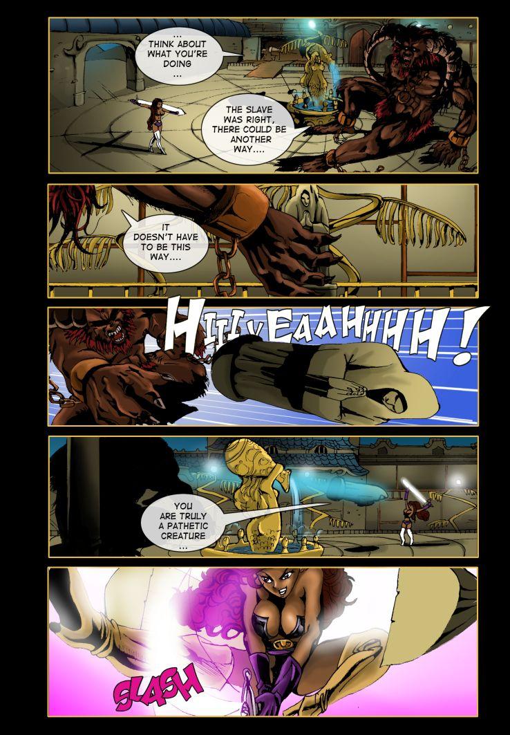
Cool statue.
simonitro at 10:10PM, Aug. 18, 2007
He he he! The big huge beast is afraid of tiny little dame but DAMN! She sliced that piece o' rock in half! Hmmm... BOOOOBIIIEEESSS!
polo at 7:22PM, Aug. 14, 2007
This is no where near crap!
slimredninja at 6:11PM, Aug. 13, 2007
Thats a great page and some amazing cleavage.
Villamar at 7:13AM, Aug. 13, 2007
Anime style shouldn't be too bad as long as it's more of Berserk, and not so much Ranma 1/2, that's just my own personal opinion. Heh, and love the shadow of the demon chick in the first panel, good stuff.
Snaga at 3:36AM, Aug. 13, 2007
The extra frame you added in the new page makes it flow so much better :D the first frame in the new page sets the scene wonderfully... there's nothing like a good environment to make the page believable ^______^ I liked the old, black boots though... they looked a lot more badass XD
Peipei at 11:40PM, Aug. 12, 2007
this is so beautiful :3
kyupol at 8:55PM, Aug. 12, 2007
wtf
LanceDanger at 7:14PM, Aug. 12, 2007
Lookin' great! =D
Derk Rage at 4:51PM, Aug. 12, 2007
nice
NekkoXIII at 1:34PM, Aug. 12, 2007
just read this from the start. all i gotta say is you got me hooked!
timlight at 12:02PM, Aug. 12, 2007
excellent!
Eddie Jensen at 10:52AM, Aug. 12, 2007
DING DONG.
J A F O at 10:29AM, Aug. 12, 2007
HIYEEAAH : )
Ozoneocean at 8:35AM, Aug. 12, 2007
Not bad at all! That last panel is especially lovely. And you just [i]know[/i] it is. Boobs, lovely pose, nice action image, lovely bright white slash, and that warm pink glow. Perfection.
DAJB at 8:21AM, Aug. 12, 2007
Making a note of this one so I can get into the archives later. Looking forward to it, though!
dragonrider at 8:04AM, Aug. 12, 2007
Ooops, The monster in this is better than the origional, the girl is better in the origional than in this.. so say a 5 for both pages 2.5 each.
RapidoBlue at 8:02AM, Aug. 12, 2007
slash! very cool, love the art
JustNoPoint at 7:42AM, Aug. 12, 2007
Liking the new style. The 1st and last panels are the best. Though I think the 1st angle you chose to show the last panel was more dynamic. The sword was off a bit to convey itself but that could have easily been fixed. Though you may have been conflicted at wanting to actually show her more instead of a far off shot/odd angle. Great work! Can't wait to see the future story arcs!
_T_ at 7:31AM, Aug. 12, 2007
Actually, I think this page is great! I voted, and the new design is definately superior to the old one. You make me want to draw line art so bad...