


Page 2: Go Shorty...
TheMidge28 on March 29, 2009
special bonus: 2 pages!
if you go back one you will find page 1.
and before that chapter cover and the new cover.
so let me know what you think.
any and all comments appreciated; negative or positive.
be critical.
its all appreciated.
See you next Monday with one or possibly 2 new pages!
also I'll follow up on comments as well.
replies:
dueeast: thanks for the welcome back!
cs3ink: I really appreciate that coming from you. I hope you like my new approach.
harryq:you know how we do my brudda! On the Gimp, I was so hesitant in downloading it and using it and now I look back think what a twit I was for not doing it sooner. Its great comprable pogram to PS and free! And yes we need to trade notes! drop me line for any questions or tips!
Orange: oh yes! you better keep an eye on him!
Starwolf: thanks silent one! no comment but that's okay. your silent support is much appreciated.
armandoB: Yes they are. Thanks. It means much from you who is stellar with the amount of detail you place in your scenes. Believe it or not but the original I drew was 2 page lengths and I was going to just use it as a smaller panel on a page but said screw that and decided to close in more for intamacy. I hope I made the right choice.
thefightingstranger: Thanks. ditto my comments for Starwolf!
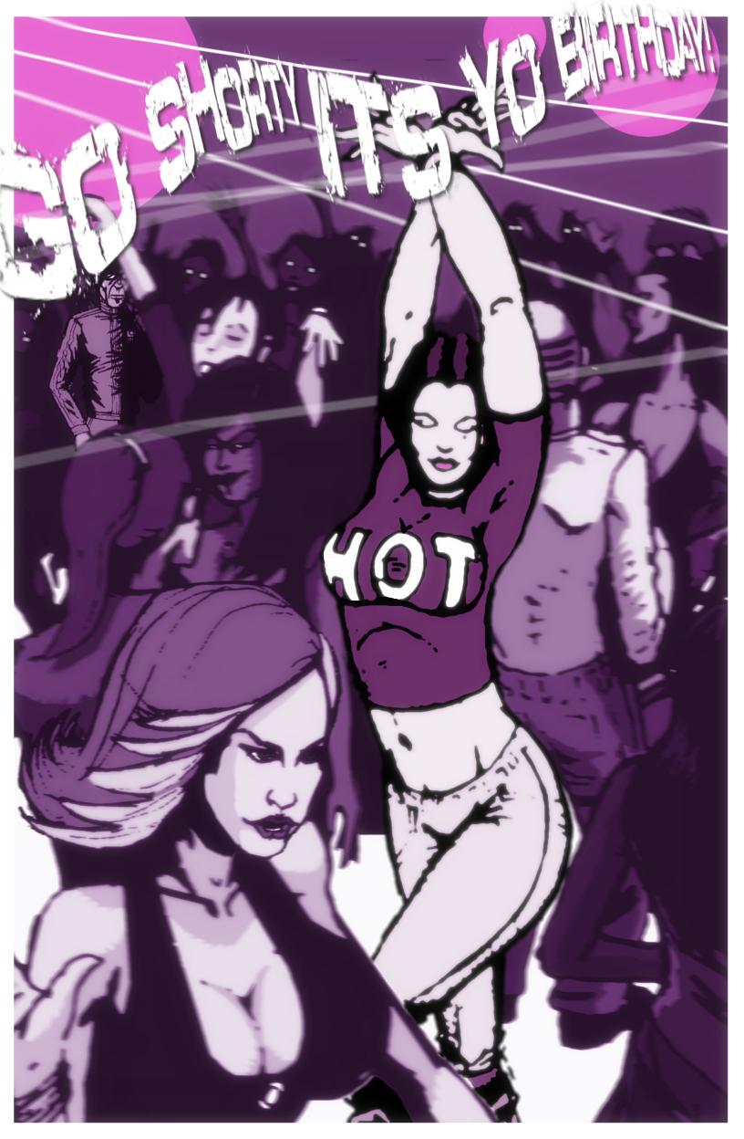
jgib99: Thank you! as I mentioned this image was much wider and had more peoples in the crowd but became too much! I'm glad you like how they came out.
Loud G: I love layers! and much of my ispiration for this comic comes from my over abundance of movies I have watched in my life. Thank you for mentioning because it means I'm got it!
Lemniskate: LOL! I can see what you mean! but its fitting because when I have been at a club many if all the drones I'm mean dancers seem to have the same appeal.
Jabali: Holla! That's was my desire and there's more of her too come.
Bocaj: Thanks, my friend. I really appreciate the thought you put into your comments. There not just onesided but rounded. I'm glad you feel I made the right decision. Because sometimes when working on a page I have moments of second guessing.
MrHades: Thank you I am glad it works.
Dragonizer: At my club, if I had a club, I'm sorry to say that would be what makes or brake someone getting in. ;) I'm kidding. What can I say? I'm a boob guy!
or maybe just a boob!
Fitz: When I quit last year and started to rework everything I wanted to start from scratch. That means tossing somethings which I used to do. I want it to have a different look and feel. I wouldn't give up on the use of negative space. It will be used but not as prominently as it was previously.
dgriff13: Ha! ditto Dragonizer's reply! Cleavage Club has a nice ring to it but actually the name of the club is “EXIT” that's why there is the exit sign on the first page. I know it's not clear but that's why its there.
Doctor Shadow: Many thanks especially with your prolific work with Wyrden.
Thanks guys for all the comment, critiques and support.
Please keep it coming and tell ya friends, family, co-workers, and strangers on the street who have internet access about this comic!
All your support is greatly appreciated!!!!


Crimsonskystudio at 1:49PM, June 26, 2009
Very Detailed
Abt_Nihil at 1:45AM, May 2, 2009
There's two ways to start a story: action or sexiness ;-) This looks like a set-up for both.
Scorpious at 3:30PM, April 8, 2009
oh men the wait was worth it ! this is magnificent !
Doctor Shadow at 4:12AM, April 3, 2009
Great setup dude!
dgriff13 at 9:39AM, April 1, 2009
wow, must be Cleavage Club. and it's BOUNCIN'! Love the purples.
Fitz at 10:41AM, March 31, 2009
Damn, this IS a completely different comic. The purple makes it really trippy - in a very different way than the devices you used in the original did. I WILL miss experiments with negative space etc. dearly but all the same I'm curious to see what you have in store for your readers.
Dragonizer at 1:47PM, March 30, 2009
This club must get all the busty chicks.
MrHades at 11:31AM, March 30, 2009
Nice depth of field effect :)
Bocaj at 11:15AM, March 30, 2009
I would have maybe blurred the guy in the background a [i]little[/i] bit, but I think that by doing it as little as you did, you get that cleaner feel, I remember you talking about a little while ago. Also, because he is so off center, some people may have missed him if you blurred him a little more. Very great, overall!
Jabali at 11:11AM, March 30, 2009
Boom shaka-laka! Sexy!
Lemniskate at 10:49AM, March 30, 2009
All the zombies dancing in the background...
Loud_G at 10:39AM, March 30, 2009
I like how you brought the shady figure to our attention via the lack of blur. An almost cinematic thriller effect
jgib99 at 9:27AM, March 30, 2009
Love how you made the crowd in the background. Great.
armandoB at 8:19AM, March 30, 2009
crowd scenes are always tough yet you nailed it
Orange at 7:23AM, March 30, 2009
MYSTERIOUS FIGURE IN BACKGROUND :O
harryq at 6:58AM, March 30, 2009
Awesome doin's here, and thank you so much for the heads up about the second page, you rascal! I'm going to have to quiz you about your technique, as I'm a Gimp boy too.
cs3ink at 6:37AM, March 30, 2009
GREAT start! It's awesome to have you back in the storytelling saddle!
dueeast at 6:07AM, March 30, 2009
Welcome back w/BH, Midge!