
The concepts:
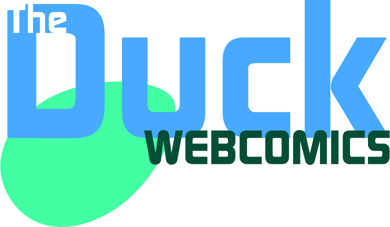
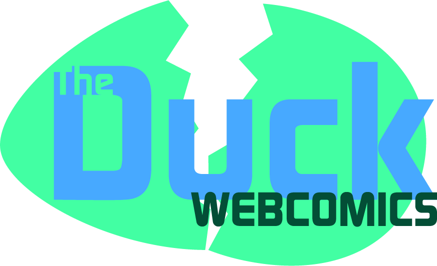
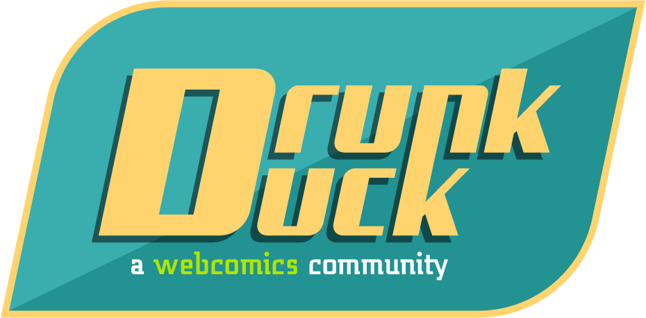
These were designed in Adobe Illustrator, the same medium I use for my comic.

ThrisbyDude wrote:
Ain’t looking bad at all! If my concepts don’t go through {the open-source SVG file stage or aren’t chosen}, I can definitely see one of the latter three be the official logo, though I might reconsider the first two if they have the same font{s} as the last three with a few changes.
It’s my opinion, but if I could some things about the last three I would…
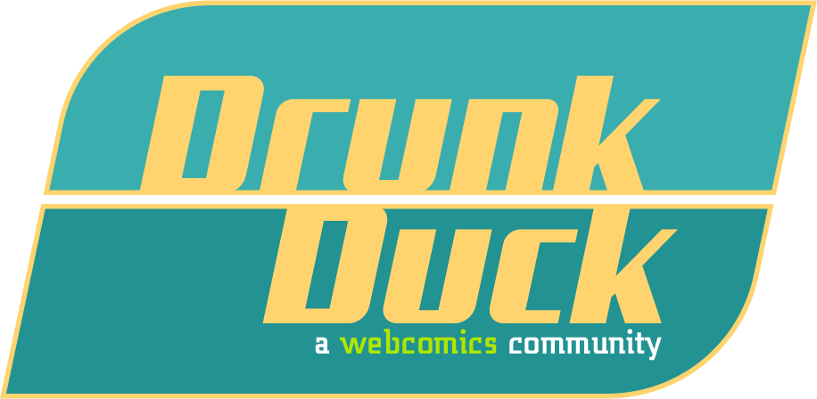
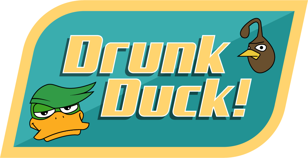
1. Have the “Drunk Duck” text stick out of the slick box backgrounds {a bit}, like the original DD Logo or my concepts.
2. Maybe add a unique outline to the letters themselves? The letters could pop out more.
3. Add an exclamation point! ((wink wink)) It would make the logo{s} far more familiar.
4. Make the line width of the slick box backgrounds bolder.
5. Place a symbol or representation of the Duck mascot somewhere. If you can’t do that, that’s fine - the logo{s} still look cool even without a symbol.
Other than that, your last three fit the site redesign quite well! I mean, one of yours has a drop shadow in it – mine doesn’t! The 5-color minimalist (in a good way) color design fits in with the turquoise and dandelion/tinted cream yellow sections of the site.
Keep up the good work!
kawaiidaigakusei wrote:
These are really cool and clean, DylanTale Comics!
I would like to add that the third logo design is the easiest to read because it has a faint line separating the words “Drunk” and “Duck”–the original site's name, assuming the Duck fell off the wagon. The title was changed to “The Duck” during the previous site design to create an inviting, all-ages community.
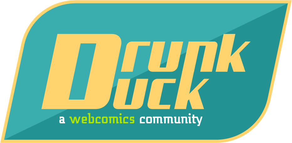
The last two logos might look confusing to someone unfamiliar with the site. It could be read as: “Drunk uck” or “D Runk uck”. From a distance, it reminded me of when I accidentally type-in the site's name and replace the “D” with an “F”.
The turquoise-dandelion yellow background of the site may be replaced by a different color scheme.
I have always been a fan of waterfowl mascots to give the site some flair.
Thank you for the time spent making all five of these logo designs!!

ThrisbyDude wrote:
↑ Looking good, DylanTale, my man! They all look good - nothing else from me to add.
kawaiidaigakusei wrote:
Wow, these logo evolutions are looking really stellar!
HawkandFloAdventures wrote:
I agree these logos are tight :D


