
This will be the main newspost about the update
DD will be getting a facelift! It's mainly an aesthetic change at the point, not for functionality improvements except for the organisation and display of data, like the Top Ten being split across genre lists and larger thumbnails on the front page.
Kawaii already posted about this on Monday, there are many useful comments here: https://www.theduckwebcomics.com/news/2022/jun/19/breaking-ground-on-the-promised-duck-webcomics-redesign-dd-awards-trophy-contest-closed-ballot-submissions-open/
We really super appreciate member comments and suggestions! Please don't go too far off topic with a wish-list of features at this point though, we're going with what we can afford and that's basically working with what we have but making it work better and LOOK better. The main thing is getting the site to be really usable and look good on smaller screens as well as big ones.
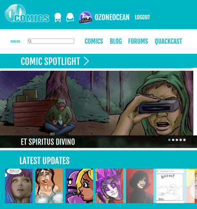
Here's a mock-up of a slight mod I did to the design
It's based on Emma's latest designs and just tweeked slightly for smaller screens: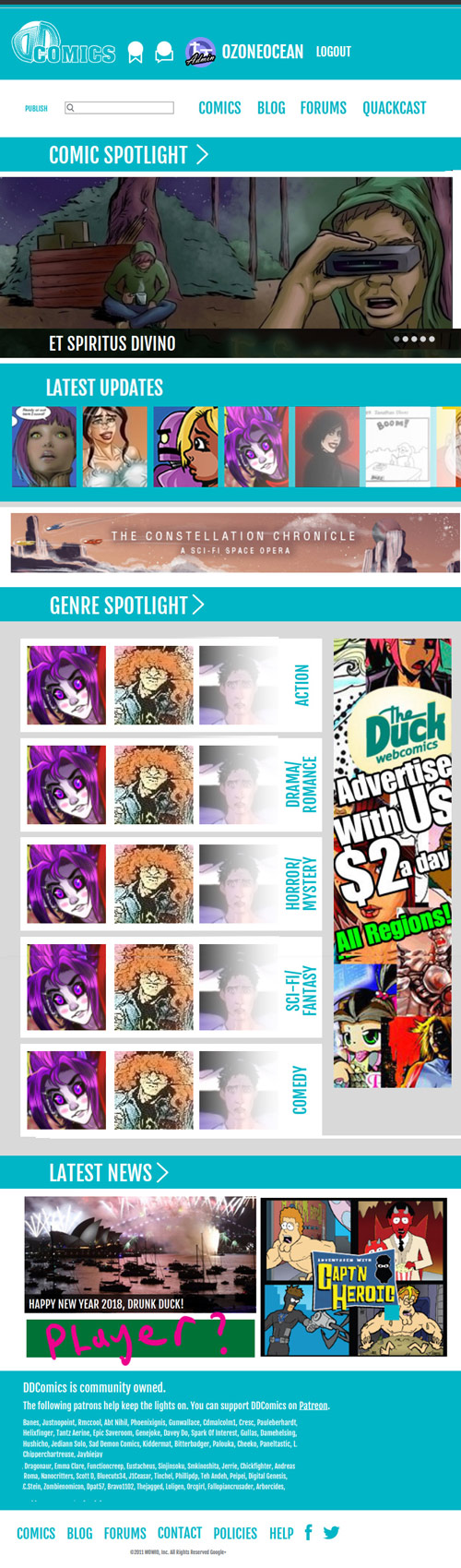
Therese are the layouts Alexey put together already based on Emm's old designs. Please disable your ad blocker so they display correctly.
Layout #1: Mobile
Mobile Layout (Preview Only): https://next.theduckwebcomics.com/index-mobile.html
Layout #2: Desktop
Desktop Layout (Preview Only): https://next.theduckwebcomics.com/index-grid-2.html
(No Patreon and supporter stuff in here se we keep focus. Banes posted it yesterday anyway :))
DD site update main post
Ozoneocean at 12:00AM, June 24, 2022
11 likes!


©2011 WOWIO, Inc. All Rights Reserved Mastodon
phinmagic at 10:00AM, July 26, 2022
Wowio ruined so much of my life back then. Destroyed DD, Tanked Wevolt, who I was signed with. Such a bad business. Gr.
Ozoneocean at 3:54AM, July 1, 2022
Good idea! Next Friday then :D
Amelius at 9:05AM, June 30, 2022
Hmm, yeah maybe might make another newspost since this one's gotta be hunted down now, to discuss the logo itself, I've really come around to the idea that just DD Comics is fine for the name. Though rotating banner does pique my interest I love that kinda thing!
Ozoneocean at 1:31AM, June 30, 2022
No worries :) The old logo could be good. Or we could even rotate that with newer logos to show the progression of the site?
Amelius at 1:29PM, June 29, 2022
Thanks for the clarification Oz, sorry that I was a little off base on some of that! That was just what I recalled from the forum discussion and that weird feedback site they funneled us toward to post feedback they could ignore. They'd really given off the impression HTML removal was more about our ad network and us making money off it, the "double dipping" comment was what made it sound that way. I do recall them saying it was a malware issue, but when we talked to the guys too it really came off as an excuse, especially since they broke the site so many times with theirs. If ya say it wasn't all BS, I believe ya. I don't actually dislike Emma's logo, I think it's way better than the egg. That's too bad about drunkduck url though, sounds like a hell of a lot of work for something most people aren't gonna notice. I was mostly referring to the logo in that regard if it's any consolation. :)
Ozoneocean at 4:14AM, June 29, 2022
"Theduckwebcomics.com" is too long and weird, but at least it's associated with us and recognisable, we also control the DNS stuff and pay the account. I personally own "DDwebcomics.com", which I thought is a better name, it's what many of us actually CALL the site and it's shorter and easier to say. Sure it can mean big boobs, or be short for something rude if you like but I don't care that it has a double or triple meaning, it just represents the site to me (Drunk Duck), so that's why Em did that as the logo. We can go bacm to the original logo if you really want. I think the egg is don't with though because it's too abstract.
Ozoneocean at 4:08AM, June 29, 2022
At this stage editable HTML is gone for good. The net just doesn't go that way now. The name: We can't have DrunkDuck anymore because we don't have full control of that URL. The amount of weedling I had to do just to have it as a proxy was too much. We have that much but we can not rely on stuff we don't have some control over.
Ozoneocean at 4:05AM, June 29, 2022
OK, the Drunk was definitely an advertising thing unfortunately. Skool and I both told them "The Duck" was stupid when they told us about the name but there was nothing we could do to change that. HTML going was not actually stripped out because of member ads, if that was a factor it was only tiny. The main reason was that the site had too be made streamlined with a unified look- Editable HTML could break that and it was also deemed an unacceptable security risk because it could be used to inject or host malicious stuff. I had MANY talks to the programmer and other people in change or stuff about that back in the day. IRONICALLY and HILARIOUSLY the FU**ING ads they put up were the source of ALL complaints about malicious scripts, porn, and spam, which persisted long after they were finished with all the design stuff. We were plagued with that for ages till we finally got rid of the shitty ad provider. Even Google ads were a source of bad stuff.
PaulEberhardt at 10:29AM, June 28, 2022
"Reformed duck who only ever drinks responsibly in moderate quantities and is definitely not going to drive afterwards" (RDWOEDRIMQAIDNGTDA) is too long anyway. :D And "Diverse Duck" (because you can't tell a cartoon character's sex) would be misleading - 1. instead of as being - of course! - supportive of diversity, it'd come across as if that were the single cause and focus of the site, and 2. with a Duck you CAN actually tell if he's male - the colourful plumage is a dead giveaway. ;)
PaulEberhardt at 10:26AM, June 28, 2022
Seconded! No reason to cling to Wowio's rules long after they've gone. Nobody was exactly overjoyed about these changes anyway, if memory serves. So let's buy old Duckie a beer. Showing a bit of old school edginess goes well together with a community-managed site that prides itself on being independent and thus different from the rest. (Also, I wouldn't mind an incentive to re-learn html, when it comes to functionality updates one day.)
Amelius at 11:56AM, June 26, 2022
Yup, let's not forget they also stripped us of the ability to use HTML because we were putting up our own ads next to theirs and they accused us of "double-dipping", (as in, they wanted ALL the money and we should be grateful they let us post here for free) so I have to be skeptical that the "drunk" in the name was that much of an issue. There's sites with way saucier words out there that manage to get advertisers. Wait, there's our name, DD, for Double-Dip, greedy creators making 50 cents off project wonderful ads while selfishly squatting on the free webhost!
Ironscarf at 4:40AM, June 26, 2022
That was Wowio's reasoning for losing the Drunk at the time, but since our only advertisers are comic creators I'm not sure it's really an issue now.
KAM at 2:11AM, June 26, 2022
I think Drunk had to be dropped because it was hard to get advertisers. Although there are other D-words, Dry Duck, Daring Duck, Dashing Duck, Drawing Duck...
plymayer at 11:32PM, June 25, 2022
Im with Amelius go back to Drunk Duck. :)
Amelius at 11:57AM, June 25, 2022
https://web.archive.org/web/20040708060418/http://www.drunkduck.com/ How about the classic logo with the color adjusted? I'm still on with insisting "The Duck" is a stupid name and Wowio did that, go back to Drunk Duck because we all call this DD, not TD.--- @kawaiidaigakusei: That ship's already sailed, the double d's and beyond are well represented on this site! XD
Ironscarf at 11:21AM, June 25, 2022
Enjoy! The logo must be one of the easiest things to change, but also one of the hardest for everyone to agree on. I definitely echo the sentiment that it needs more impact, whatever form that might take.
Ozoneocean at 9:12AM, June 25, 2022
The logo and colours can change, yes :) The reading list was forgotten! Good catch! There will be more things like that that are overlooked, it really helps if people pick up on that. I'm at a convention right now but when I get back I'll look into this!
kawaiidaigakusei at 1:38AM, June 25, 2022
Good point, @hushicho. We would get a whole different kind of audience if we were confused with "Double-D's Comics".
hushicho at 5:12PM, June 24, 2022
Change is often for the better, and I will say the new site design looks spectacular. I love how nice and sleek and very well-done the design is. I have said previously that I don't love the new logo though, and rebranding a third time even like this might not be the best idea, but in any case, I do like the simplification to "comics", though I would still suggest retaining "the Duck" because it's more distinctive and easier to remember than "DD", which also has an already-existing association with bra size. But that's just my two bits! I love the progress you've made, and it looks really beautiful to me.
plymayer at 4:43PM, June 24, 2022
Change can be good. Human nature has us hate it and be weary of it. We all get worried that we will loose something in change. Change can be good.
PaulEberhardt at 10:59AM, June 24, 2022
I thought the reading list was at the top - the left of the two symbols next to the user name? Now you made me nervous. I wonder what the layout would look like if instead of symbols with hover text there was just text. It may look clunky for all I know, but I'd really like to see a preview of that just so we can compare them.
Teh Andeh at 8:45AM, June 24, 2022
I agree with MOrgan. That logo looks quite messy. Took me a minute to realize it was two Ds.
Amelius at 8:43AM, June 24, 2022
Thanks for making a solo-post for this, it helps a lot-- all the other stuff on the last post pulled focus for the ADHD peeps (me) Thanks also for reminder to turn off the adblock, I already have it off for DD so I didn't think to disable for the preview! I'm gonna mull this over and come back with more thoughts, but I'm already liking this a bit better and the clarification on intentions is very appreciated. But yea ejb reminded me here a very important question I forgot to ask, where will our reading list be? :)
PaulEberhardt at 6:57AM, June 24, 2022
I still like this, especially with the mod. I had no trouble finding the sites' various functions/parts in the layout. The colour scheme looks stylish and I even think it looks better with the white than with a darker background colour. It's kind of inviting, really. Also, I still think the layout desperately needs a duck somewhere, if only because of "corporate identity" or whatever you call it. Otherwise the logo looks good to me.
ejb at 2:43AM, June 24, 2022
Maybe I'm missing it, but where would the list of a user's followed comics be? Is it the icon next to the comments at the very top? The redesign is looking great so far.