


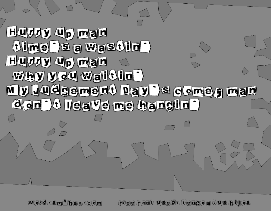
Hey Man
smbhax on Jan. 13, 2010
I adjusted the lowercase “c” in this; by default it has a gash through its left side and so looks just like two curves on top of each other.
The aliased jagged line effect is an artifact of an anti-aliased alpha edge on a Difference layer above another Difference layer. :o Kind of ugly but kind of neat at the same time, and somehow seemed appropriate for this little poem.

