


Chapter 1 cover
Scorpion451 on May 30, 2011
If this page seems a bit different from the usual style of the Greening Wars, its because I used my vector program to do a lot of this page. I normally only use it for lettering, but with all of the signs and such it lent itself rather well to doing this one. I have no plans to make it a regular thing, but it made for a fun experiment trying to capture the style of the Greening Wars in a different program.
By the way, I finally got the chance to post a new incentive on Top Web Comics, this ones a concept art that you won't want to miss, trust me.


Scorpion451 at 6:33AM, June 20, 2012
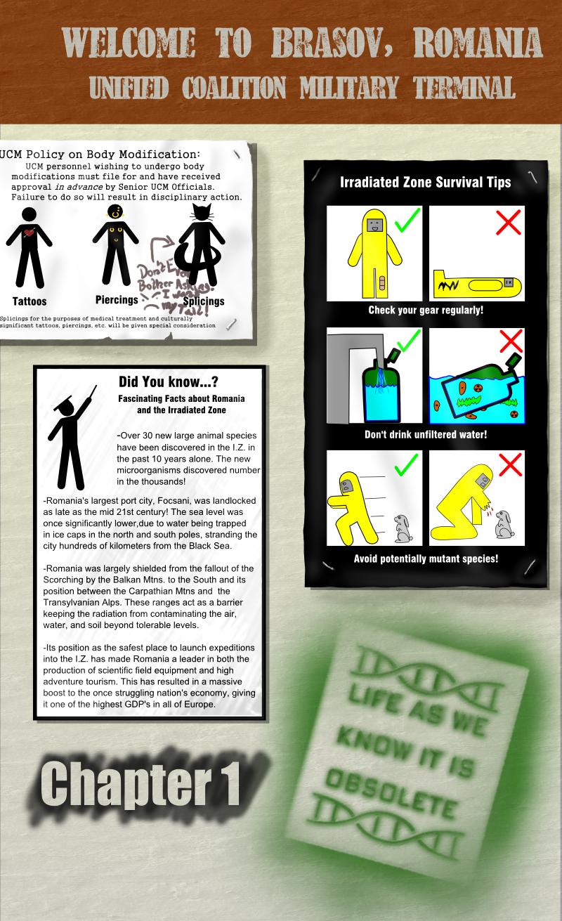
I need to go through my archives looking for comments more often... ^^; The graphitti reads "Don't even bother asking; I want my tail!"- the UCM does not approve many "elective splicings", for obvious reasons. XD
dalek955 at 3:32PM, March 23, 2012
Can't quite read the graffiti on the UCM Policy poster. What does it say? Also, the Survival Tips poster completely cracked me up. I literally laughed myself out of my chair.
Barn0wl at 4:06PM, June 6, 2011
LOL! I never got very far through Half-Life. It didn't like to run on the computer I had at the time. . But I'll take your word for it. :)
Scorpion451 at 3:43PM, June 3, 2011
Theres a reason they phrase it the way they do. ;D (Cue G-man from Half-Life: I trust it will all make sense to you in the course of.. [pauses and smiles] well, I'm really not at liberty to say.)
Barn0wl at 12:45PM, June 3, 2011
Ah ... yes, plaster on drywall works better. I hadn't really thought about how the stencil would've worked on a bulletin board. Just had a thought about that stencil ... if the Greening were putting them up as graffiti, with their targeted audience being un-modified humans, wouldn't "life as YOU know it is obsolete" be more to the point? Though really, "... as we know it ..." works just as good I think. Sometimes I just think too much I think. LOL
Scorpion451 at 8:26AM, June 2, 2011
There was an alternate second panel to that tip that would have probably gotten me sued for copyright infringement. ;D I originally had the page conceived as a corkboard, but then I wouldn't have been able to do The Greening's stencil on the lower right there. (Whatever greening member got through UCM security with spraypaint and a tail to put that there had bravado.) I decided that if the walls were plaster-finished drywall it would be a workable compromise, like the everyone stapled and spray painted stuff around the framed "fascinating facts", much to the dismay of the maintenance staff. XD I think this is one time that I would like to have had the ability to do a butterfly format page (double page spread), and spread things out more, and had the stencil off in the corner where it wasn't immediately obvious, and been able to fit the bulletin board in. Maybe for the print version.P: I like that concept a lot, helped cement the basic idea, and looks cool as a standalone piece, but it wasn't until that last little facet that it really felt right, to me makes the difference between "oh, crud..." and "OMG..." XD
Barn0wl at 4:55PM, June 1, 2011
Love this page! I LOL'd at the "Avoid Mutant Species" section of the poster on the right. Immediately made me think of the "Killer Rabbit of Caerbannog" (Run away!! Run away!!!!) Nice little detail of the staples on the corners of two of the posters. If you do something like this again, you might want to consider a slightly different background ... this almost looks like plaster and I was thinking a cork or burlap type background would be good if you could do it easily. Loved the concept art for ... well, YOU know! I'm glad you went the way you did on that particular character. The concept was EXTREMELY disturbing. The way you're doing that character now is much more elegant and, in some ways, more frightening, awe-inspiring, than the original (which is more grotesque than your final product, I think).