I think you have used the space more constructively in these panels. The space seems less vacuous. The composition is consistent on this page.
Once again, the art is much stronger than its earlier incarnation. You're thinking about camera positions. I love the way you have closed on Ed in panel 5. That's perfect.
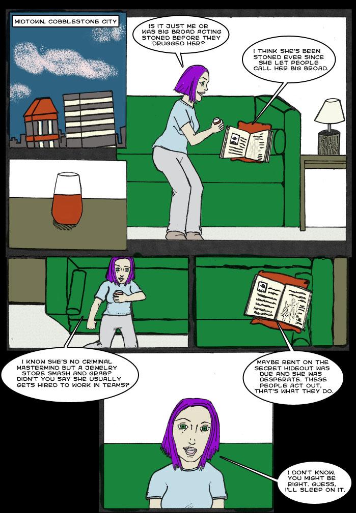
I wouldn't have used panel 2, as it doesn't feel necessary. Alternatively I would have included Gretchen's hand holding the glass, which ties into its relevance in the following panels more fluidly.
All in all, this is a very strong page.
One thing that would improve your coloring more is to get rid of the anti alias... the white around the black lines. It still looks good though and I hope you don't mind a bit of constructive criticism =)


fladam at 1:28PM, May 31, 2009
I think you have used the space more constructively in these panels. The space seems less vacuous. The composition is consistent on this page. Once again, the art is much stronger than its earlier incarnation. You're thinking about camera positions. I love the way you have closed on Ed in panel 5. That's perfect. I wouldn't have used panel 2, as it doesn't feel necessary. Alternatively I would have included Gretchen's hand holding the glass, which ties into its relevance in the following panels more fluidly. All in all, this is a very strong page.
parkbenchbook at 1:45PM, March 7, 2008
Thanks! I'll give it a try.
JustNoPoint at 12:56PM, March 7, 2008
One thing that would improve your coloring more is to get rid of the anti alias... the white around the black lines. It still looks good though and I hope you don't mind a bit of constructive criticism =)