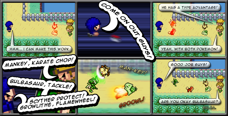
Panel 4 is very cluttered. Try to avoid having bubbles go over any of your characters. It makes the page look better.
It also makes it seem like you tried to fit too much into one page, making it feel a bit rushed.
Also, you need to zoom in and out more. The panels are too repetitive.
And finally, be careful with the pokemon text there. For instance, in the last panel, it's hard to notice Bublbasaur's text as it's green and it's going over grass. If you;'re in a similar situation with that agsin, just have the text over the path. :)
But you did a fine job with the emotions and effects, so keep that up.


coraz5000 at 1:59PM, Dec. 1, 2010
Flame wheel is epicness
slipknot6SIC6 at 1:45PM, Dec. 1, 2010
Well I agree with Arc completely. though you do seem to do awesome with emotions and effects. So keep it coming!
Arc at 7:14AM, Dec. 1, 2010
Panel 4 is very cluttered. Try to avoid having bubbles go over any of your characters. It makes the page look better. It also makes it seem like you tried to fit too much into one page, making it feel a bit rushed. Also, you need to zoom in and out more. The panels are too repetitive. And finally, be careful with the pokemon text there. For instance, in the last panel, it's hard to notice Bublbasaur's text as it's green and it's going over grass. If you;'re in a similar situation with that agsin, just have the text over the path. :) But you did a fine job with the emotions and effects, so keep that up.
drunken hippie at 2:30AM, Dec. 1, 2010
i liked it :) now all we need is a random pair of glasses for no specific reason... yeah... miami beach
charliemew2 at 10:11PM, Nov. 30, 2010
ah who cares. It's still badass