


Best Comic Layouts presented by Zac
Niccea on Sept. 22, 2014
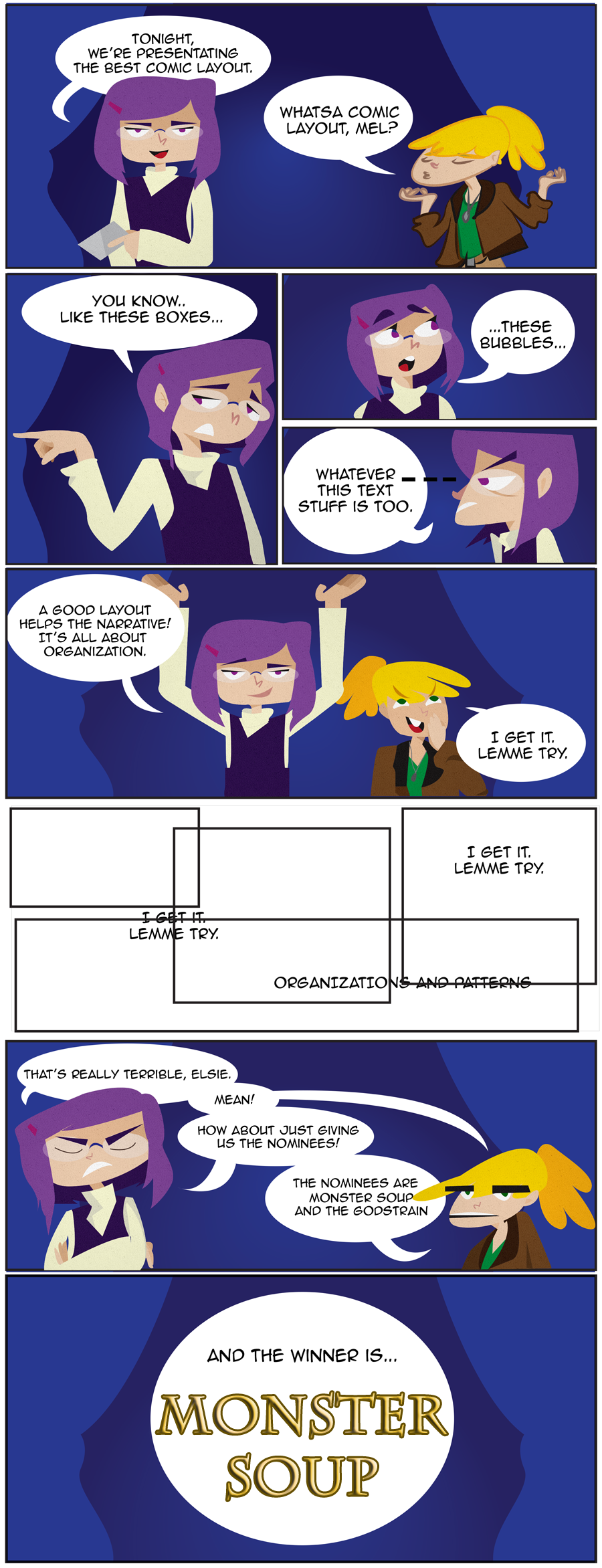
Congratulations to Monster Soup.
Your banner:
This presentation was made by Zac.
Critics Acclaim
Monster Soup seems to go a step above readability and even pacing/flow by matching the panel shape with the content for mood. Monster Soup uses expansive panels stretching past borders to “set scenes” or to show meaningful moments between characters.
'Monster Soup' is more conservative for the most part, and uses mostly traditional rectangular panels, only going for more elaborate designs when the page's sequence of events demands some special impact.
With Monster Soup, it feels like a great deal of thought went into matching the layout to the scenes, moods, and actions.
The layout never feels like it impedes you smoothly transitioning from panel to panel, and from a purely aesthetic standpoint, every page holds together as an elegant composition in and of itself. The dark page backgrounds feel appropriate for the subject matter, but occasionally for a lighter scene (like the ballroom), you get an ethereal glowing page backdrop that enhances your sense of place and, for a brief moment, chases the shadows away.


plymayer at 10:15PM, Sept. 23, 2014
Congratulations!
Ozoneocean at 12:26PM, Sept. 23, 2014
The art for this presentation is pretty high quality! There's a lot of high quality work in general with the awards work. Congrats to Monster Soup!
SnowTheHedgehog at 7:11AM, Sept. 23, 2014
Congrats, and saucy presentation right there.
Mr Kaos at 4:38AM, Sept. 23, 2014
fun presentation. xD congrates
El Cid at 4:03PM, Sept. 22, 2014
Soup-er presentation! Both comics use some really inventive layout concepts; worth checking out.
Banes at 8:16AM, Sept. 22, 2014
Well deserved win! Hahaha...keep tryin Elsie! You'll get it!
Genejoke at 5:07AM, Sept. 22, 2014
Hmmm, monster soup may be this years death p*RN...
usedbooks at 4:58AM, Sept. 22, 2014
Another well-deserved win for Monster Soup!
KimLuster at 4:18AM, Sept. 22, 2014
Yeah I can't really complain about losing to Monster Soup! haha Congratulations!
kawaiidaigakusei at 1:22AM, Sept. 22, 2014
Impressive. Zac's character design is world class for this presentation page. Great job, it looks incredibly cool. Congratulations, Monster Soup, on another victory!!