


Page 26
mlai on Sept. 11, 2007
Drawn by Mlai. Lettered by DigitalCAPS. Top page banner coloured by Whirlwynd. This ends chapter 3: Turn For The Worse.
Read the companion series FIGHT 1; each story follows a group of characters in the same world.
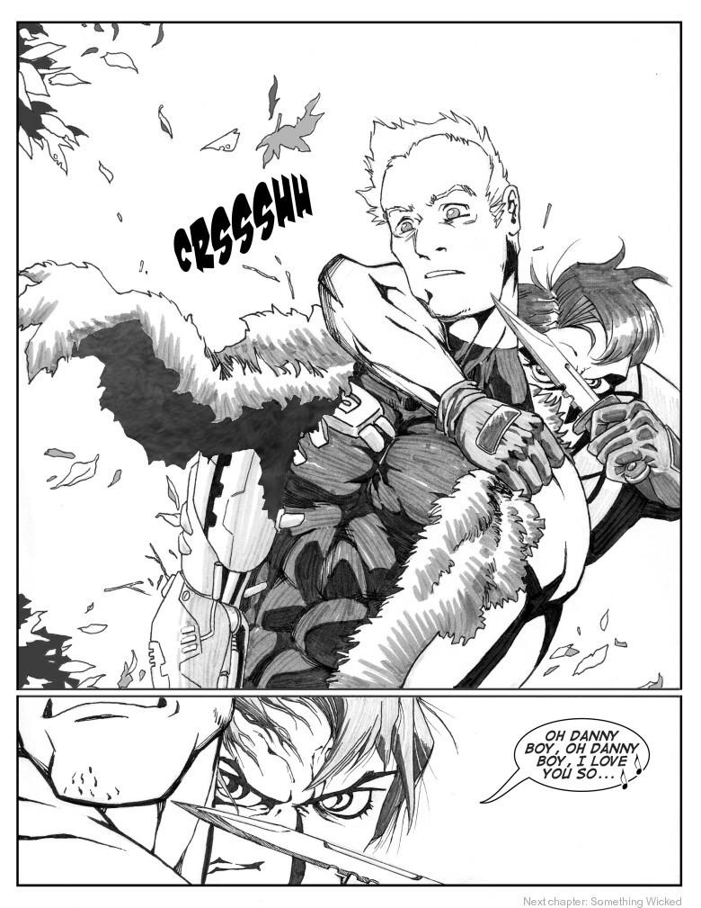
Now it's clear that the previous page's slow tempo was an intentional lead-up to this page. I employed the classic horror movie “stalked from behind” camera method for the last 3 panels of the previous page, but it was subtle enough that you probably don't notice.
The singing was deliberately used to pace the last 3 panels to hopefully achieve that stalking effect. The song itself isn't gratuitous. As in Fight 1, I chose the song to fit the story. Danny Boy also happens to be foreshadowing (don't worry, y'all will forget all about what I just said here by the time we get there).
The guy with the knife is Hanno, the normal dude in chapter 1 (in case you can't tell). When I do certain dramatic close-ups, like in Fight 1, I throw away anime conventions and call upon my American comics training. In this case, Clockwork Orange eyelashes yo~~


giovanni at 6:07PM, July 16, 2008
i just hope he don't mess himself up
Evil Emperor Nick at 2:26PM, Sept. 17, 2007
You know I should be making some sort of comment about the page but all I can think about that being surprised like that with an ultra powerful mechanical arm on your unmentionable could get messy. >.< Nice mood on this page again. Very nice indeed. I love this pacing.
mlai at 11:53AM, Sept. 13, 2007
Aha, I wish I had just markered the coat rather than filled it. Well, it's now touched up with a fur texture + gradient. That makes it slightly better. The leaves' white areas are small enough that they just look like light glints, so I'll leave those be.
Darth Mongoose at 9:28AM, Sept. 13, 2007
I like the layout, but I don't like that flat fill inside the waistcoat, it looks out of place, and like it's been done hastily, doesn't go right to the line in some places and obscures the line along the left edge. Adding some texture to a CG effect is usually a good idea when mixing cg and traditional, it makes it look less incongruous. It looks better on the leaves, but the tone doesn't go right to the edges on those either, you maybe need to up the 'tolerance' of the fill or selection tool, or touch-up with a brush to get those areas neater.
JustNoPoint at 6:01AM, Sept. 13, 2007
That's like the worst possible time to get ambushed!
ShinGen at 4:53AM, Sept. 13, 2007
This seriously caught me off guard. Now I'm so interested that I just have to go back and read it all. Insta-fave.