


Ch4 Pg15
Cheeko on Nov. 15, 2007
Hi, guys!
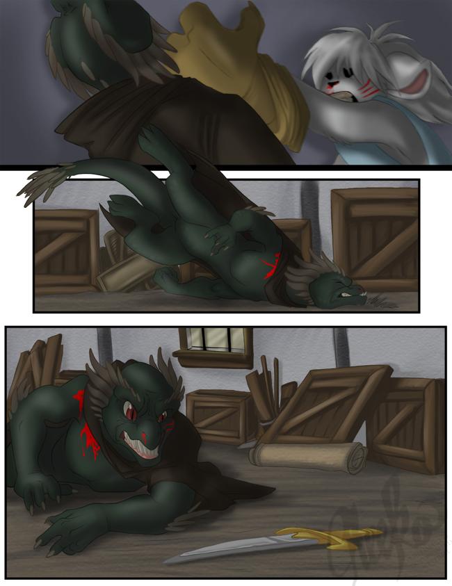
Here's another page for you. I hope you like it. How are my backgrounds? Okay? Not okay? I've told myself to really put a lot more effort and detail into my backgrounds so far. It's amazing what it did for the atmosphere on this page, it was very refreshing. I wasn't sure what items to put there, however, so I'm not entirely sure what everything is. Feel free to guess yourselves.
The thing that really bugs me about all my comic pages is the coloring. When I'm really proud of lineart, there's always the disheartening thought that I'm somehow going to screw it up while inking or coloring it. I am totally unsatisfied with my coloring skills, but part of the reason I started this comic was to explore new techniques and improve upon the ones I find. I'm trusting that, one day, I'll find a coloring method I really like, and then fine tune that method. Right now, though, I'm drifting from technique to technique, and when nothing works out the way I want it to it's very frustrating. But!! I shall prevail! D:
Hmmm, DD cut off the end of my post. But that's okay, all that was left was my classic sign out line.
Cheeko out.


nekodragon at 2:16PM, Nov. 29, 2008
cheater!
Poul at 11:21AM, Aug. 23, 2008
Go Dart GO!!!
polo at 12:28PM, Nov. 20, 2007
Nice coloring!
Unigirl at 11:20AM, Nov. 19, 2007
Bad lizard guy + sword = Trouble for Dart.
Potato U Princess at 7:31PM, Nov. 18, 2007
Anyway, Great use of Motion on this page. I can really get a feel for how intense their fight is getting to be. I do agree with what some of the others said though...maybe you should make the shadows look darker so it's more dramatic? I like your backgrounds on this page! Your shading is really good so far...my only question is what exactly happened to Dart's eyes on the first panel?? They seem to have become reddish black dots, which (as far as I know) would only happren if our friend, Mister Lizard decided to gore them out with those claws of his...Correct me if I'm wrong, but wouldn't they be a bit more bloody if he did? Heh, I dunno...It just confused me a bit, that's all... ^^; Keep it up! ~Potato U Princess!!~
lennan at 7:45PM, Nov. 17, 2007
I forgot to rate it...one day I'll get the hang of this place. XD
lennan at 7:43PM, Nov. 17, 2007
Good job on the backgrounds, so far. The only major comment I have to make on them is in the last panel particularly. There's something a little off on the perspective on the building, it looked like it's leaning towards the viewer and the character so that it may fall onto them. I think you also need to draw the vanishing point off to the left (I'm assuming this is an alley?) to make it consistent with the character. Another thing, I might ask, do you draw the backgrounds in the pencil stage or do you just paint them straight on? Because the wood support beams on the house in the last panel look crooked in that if you use the panel edge as a parallel, it doesn't look straight. A ruler may help this if you're actually drawing the backgrounds first, or maybe the line tool in PS? But I don't think I'm really all that equipped at making PS recommendations, since I'm quite the newbie. But I like the dynamics of the page. I can't really tell you whether the shadows are too bright or not, since I read that someone mentioned this, because I think it's an issue of different computers make different saturations, my work computer shows the scene as dark, but the same page on my computer here at home shows it as being a lot brighter. So, that just may be a case of a lose lose situation. I hope that helps, and are what you are looking for in critiques. Wow, I really said a lot. 0_o;;
Hawk at 9:39AM, Nov. 17, 2007
You're doing an excellent job with these action scenes, Cheeko.
emjee at 9:47PM, Nov. 16, 2007
The backgrounds are fine to me. They aren't too much, or too little. I mean, they don't take away from the story, or panels or anything, but they are noticable, which is good, I think that being able to see the enviroment around the characters is a major thing, and detail should be subtle, but noticable. Not entirly outright, unless thats the wanted effect. =D I would, however, darken up the shadows a bit as they get closer the that subject that casts it. Third panel is my favorite btw xD
Mykell at 9:34PM, Nov. 16, 2007
Your shading is absolutely amazing, just like your story thus far! But... something's not quite right with the blood, not sure what however... Perhaps it's like ninja3 said and is too bright. My suggestion is darkening it up a little, specially at the source of the wound, and making it look more... "liquidy," if that's even a word. Can't explain it right now, thanks to my allergy medications making me "zonked," haha. Just make it a shade or two darker and see how it turns out. Either way it's better than I would ever be able to do. Great job!
Knuckles at 4:05PM, Nov. 16, 2007
Can you do a step-by-step tutorial on how you color your next page? *is eager to learn* I think the coloring is awesome. And the backgrounds too. You do action scenes very well.
Rubygem at 3:20PM, Nov. 16, 2007
Your backrounds are great 10 times better than mine ^^'
littletrinks at 2:24PM, Nov. 16, 2007
uh oh, i see danger...
JillyFoo at 1:38PM, Nov. 16, 2007
Backgrounds are always good. There's even texture on the walls what a plus! Looks like lizardman can't fight just tooth and nail anymore.
BreathOfDreams at 1:09PM, Nov. 16, 2007
Knife? He's got a KNIFE? That's totally cheating! I hear ya, backgrounds are HARD. It took me two weeks, TWO!, to just ink in a background screen. Granted, a part of the issue is my painstaking slowness, but I now have three, er, 'furry' houses. And don't worry, I think the coloring looks great ^^
Argent_Nightmare at 12:30PM, Nov. 16, 2007
Those backgrounds are gorgeous... And, NOOOO! DART!
Chameleon at 12:14PM, Nov. 16, 2007
great page, I like backgrounds AND the colors ;)
Tabitha at 10:28AM, Nov. 16, 2007
lookout! him's gonna get a knife! Cheeko if you kill Dart off now i'm gonna have to hurt you... i wish i could use photoshop half as well as you... :(
Maverik at 9:53AM, Nov. 16, 2007
Nice composition for this page, and the background gives a nice sense of depth. When it comes to the characters, however, I personally prefer the harder shading of the past few pages, though the blurrier style does enhance the sense of motion... Aaaaand it just occurred to me that lizard-man has no pants. O_o -shiver- On that note, I love your art and your storytelling, and you should not be so hard on yourself.
ninja3 at 8:55AM, Nov. 16, 2007
not bad at all! the blood looks just a bit too bright though. however I do understand that it does take ages to do really realistic blood so bloody gore aside the page is great, can't wait to read the finale of this fight! ^___________^
RhianConway at 8:10AM, Nov. 16, 2007
O.O No killing Dart! I love him! He needs someone to reward him for beating up the reptile with a scratching of his ears or something! And I'm REALLY impressed with the pacing of this page! Really smooth, really fluid, it grabs you!
jiminycricketX at 6:38AM, Nov. 16, 2007
Those backgrounds are great, and they do indeed add a lot to the page. Keep it up.
Draco109 at 4:27AM, Nov. 16, 2007
oh so that's how it is? Fighting a kid and fighting DIRTY! C'mon Dart you can take em!
ShinGen at 12:38AM, Nov. 16, 2007
I personally think the coloring looks awesome. Another great page Cheeko! =^-^=
Soli at 10:37PM, Nov. 15, 2007
awuh oh! Dart's going to have his hands full. hmm... coloring looks nice.. (better than I can do anyway!) one thing I'm noting is that perhaps your shadows need to be more intense? This is set at night right? If you go outside when it's dark out, you'll see that shadows are very dark, very intense. At the moment the impression I get from this is that of an unusually well lit alley. good progression of the storyline though.