Part 7 page 4
Ozoneocean on Sept. 5, 2007
Page description:
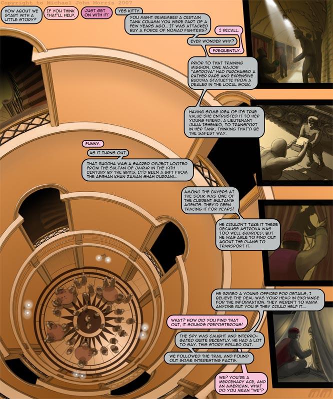
Ace tells Pinky a little story about the acquisition and provenance of the Buddha statue. It has quite a bearing on the previous chapter! It tells us more background behind what occurred.
Commentary:
Only a single day late THIS time! The main BG here was based on a photo of the inside of a hotel from a magazine. I can't remember what mag is was, something aspirational probably. I can't recall where it was taken either, probably a French hotel I think. Anyway, it was rather tricky to construct the pic, I messed up the perspective a bit, but it was such a magnificent angle and scene I just HAD to use it.
Vote
Using the BCX button to see the original version of the pic in the top right panel of The Morning after page- It's a sleeping Pinky's G-stringed bum, but not covered by sheets in the original!
And vote using the Top Web comics button to see the dull uncoloured linework of this page- the complicated concentric circle structure of the inner tower! Gawd that was a pain.
Feature
This week's feature is Life Like Weeds. A comical adventure by Mad Maz Mazzzoooooooooo! In the future the sea level has risen and there's no land left! But this isn't “Waterworld”. Life is sophisticated, futuristic and advanced. But even though people live in nice comfy floating bubble cities, they still want land.


Tantz_Aerine at 6:04AM, Sept. 6, 2007
This page ROCKS! That perspective there completely blew me over. I'm at awe at your perspective skills. And a very witty way to give us all this info without it cluttering the page. Very well done!!
spaz at 5:45AM, Sept. 6, 2007
Amazing angle for the first panel! Just simply great work all around.
Nepath at 5:35AM, Sept. 6, 2007
your artwork is outstanding
Darwin at 5:35AM, Sept. 6, 2007
Nice...and why Pinky's head? More and more intriguing!
Nick at 4:30AM, Sept. 6, 2007
That does not look like you at ALL messed up the angle. Well done dude!
kyupol at 4:27AM, Sept. 6, 2007
what tools did you use to get that perspective shot? It just looks too flawless. :P
polo at 3:58AM, Sept. 6, 2007
Awesome detail!
n_y_japlander at 2:20AM, Sept. 6, 2007
AWESOME!!!! Man... ACE gets some very imformative information! Love the column/tubular look ! Came out ultra spectacular!
Neilsama at 12:36AM, Sept. 6, 2007
Dude! My head would explode if I tried to draw that. I bow to your ability.
DAJB at 11:30PM, Sept. 5, 2007
Great page layout, OO.
simonitro at 11:13PM, Sept. 5, 2007
That picture of the depth of the hall is amazingly done! The way it's made looks fanatstic! While reading the texts and scrolling, it does give a nice feeling! That's a great page, Oz!
magicalmisfits at 10:44PM, Sept. 5, 2007
That picture has so much depth it almost moves Bravo!
jgib99 at 10:25PM, Sept. 5, 2007
Amazing work on the background.
NekkoXIII at 10:07PM, Sept. 5, 2007
now that's detail
bryan at 10:04PM, Sept. 5, 2007
*Urp*.... I think I'm getting vertigo... X.X