


07: Pharmatic
Hamorhage on March 18, 2006
Yo guys,
Back with an update…kind of a two sided sword. I like that I did the effort to create some backgrounds, on the other hand the first two panels seem kinda oversaturated…not to mention that I completely suck at drawing cars :)
Anyhow..here it is!
PS: If you wanna see some more crap by me, vot on buzz to see a new page :)


Ozoneocean at 4:40AM, March 27, 2006
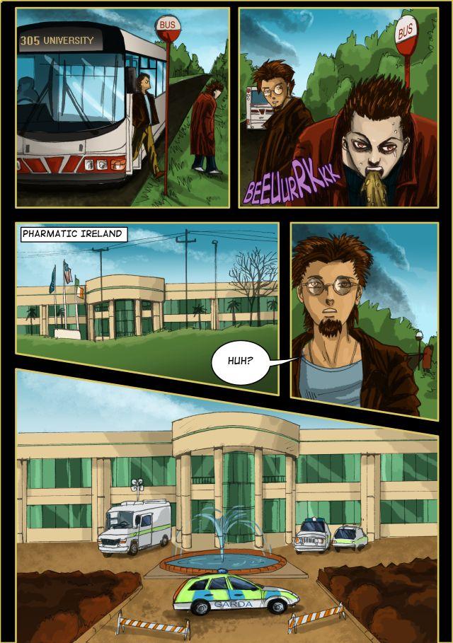
Mistake: You forgot the flags in the close-up of the bulding. The sick red yeyed man makes me suspicious.... Hmm bad doings at the pharma company! SO the police have their name writen in Gailic eh? Those nationalist irish people! Hahahaha! Good colour and good detail.
marine at 8:38AM, March 22, 2006
I like it.
bobo_81 at 12:31AM, March 22, 2006
If you're gonna spew....spew into this *unfolds paper cup*
iagojester at 10:04PM, March 21, 2006
Gross throwing up, yo! gross! ^_^ I sense foreshadowing. Hey- I like how everything looks normal from downhill, but once he crosses the threshold all the plants are brown and theres the garda... which I'm assuming is a security dude. That building is nutty- what made you draw curves in architecture? Do you have a death wish? I think so.
JuhFreak at 4:31PM, March 21, 2006
I wouldn't say the backgrounds are "oversaturated" at all--- and you're much better at cars than I am! :)
CORY at 3:59PM, March 21, 2006
It's a very good page. However, on the previous page it's kind of funny...you're art doesn't really reflect your text bubbles. I mean, the text is off-center, and rather plain. There's no emphasis on any of the words or different colors and whatnot. If you need any help I can lend a hand, or you can work it out on your own, but, as always, great art, terrific sky, too.
Bit Player at 2:58PM, March 21, 2006
woahly cow this looks stunning
Hamorhage at 10:00AM, March 21, 2006
I know what you mean sub. I mean I drew now 7 pages and what is the story? Nada. What do we know about Conor? nada....It's almost depressing, but then again we have to continue growing. One day we'll get there. And besides dud your art rocks :)
br4nzilla at 4:32PM, March 20, 2006
The first two panels look fiiiine. Not bad at all. Good job on the cars, too. They're the bane of many, but you got'em.
subcultured at 2:53PM, March 20, 2006
i especially hate working really hard on a page and there's really nothing repotely interesting on it. "hm...my character is drinking coffe..im gonna add reflection, smoke and realistism" but then my page doesn't really do anything for the comic as a whole. =P
Hamorhage at 10:17AM, March 20, 2006
Ye you got me there Sub...call it lazyness or a lack of interest or a combination of both. Anyway it took me less long to color then normal, and I wanted to get this page over with. :)
Hero at 10:10AM, March 20, 2006
Very nice. I like the whole building architecture and the sky. The whole emergency crew thing doesn't look like it's boding well.
Mika_yi at 6:18PM, March 19, 2006
oh your bg's are beautiful and wow that guy looks really sick. hey you drew the barf really well though.
subcultured at 5:36PM, March 19, 2006
i see this pages is not as detailed as the previous ones. I get tired of detailing everything too.. Over rendering my own scenes kinda taxes my artistic patience and gives me a headache. awesome buildings btw!
What A Life at 4:55PM, March 19, 2006
i love the building at the bus & the cars & eveything
coinilius at 4:54PM, March 19, 2006
Just what you want to see when getting off a bus :P I don't think the first two panels look overly saturated... and the effort put into the backgrounds really shows :)
WayneEnterprise at 3:24PM, March 19, 2006
*pale*
WayneEnterprise at 3:24PM, March 19, 2006
the channel van is looking good... That guy has to really see a Doctor, he's all pail and stuff
Coydog at 1:49PM, March 19, 2006
Nice... the cars don't look too bad.
magicalmisfits at 1:40PM, March 19, 2006
Looks good I'm trying to work on my backgrounds but not doing so well. Nice work.