


Page 12
Kristen Gudsnuk on April 10, 2009
Hey! sorry the font is small… it's still legible, I hope– I just needed to fit that in there. (Can't squeeze it into another box… life just doesn't work that way!
So, my little greedy dreams of fame and glory that I mentioned last time inspired me to finish this page really quickly. : ) and I'm okay with how it came out. I was wondering how to go about with the St. Kazimieras drawing, and I'm coo with how it looks.
okay, I'm gonna watch The Grudge now.. uh oh! ; )
oh ps: opinion question, do you think this comic is boring? does it need more razzmatazz? we just got through the introduction part. I just want to know if it has been painful.
OK! Thanks for your comments, it really means the world to me!!!!!
luv,
Kristen
PS: See the banner? Vote for me on TWC!!! PLZ!


Lilac at 4:03PM, Aug. 1, 2009
I don't think this comic is boring at all. I'm all hooked and stuff. :D It's sad when governments force people to have one belief. ): I hope their father will not try to kill them when he realizes that it is not a phase.
angry_black_guy at 4:53PM, April 17, 2009
I wish I knew how you get sharp colors. You should really look into making a font from your own lettering style. There are plenty of programs and even a website that will convert your writing into a font. Google is your friend. Also, little tip, dab a large round brush in water and make short, rapid pushing motions against the red you use for the cheeks. It'll blend the colors and make it look more natural.
patoborracho at 12:05PM, April 14, 2009
nice pictures!, this comic remind me the old tales I just to watched, you know, Alicia, Goldeylocks, etc
theorah at 6:23AM, April 14, 2009
boring? 0_0 If you find it interesting, then it will be interesting at least one kind of audience! anyway, I dont personally find it boring, its quite an emotional comic, and I feel attached to the characters, I think the narration and just their personalities do that for me. I am entertained by how they act towards each other, even if there isnt many events happening right now. Razzmatazz isnt always necessary!
Kristen Gudsnuk at 1:35AM, April 14, 2009
wow! bgoboing! you really outdid yourself.. :) thanks for this awesome comment. I haven't been using acrylics OR gouache to do highlights... & I don't have black watercolor; I make my darks with burnt umber & ultramarine when I want it to be more vibrant/darker, and burnt umber & cerulean when I want it to look a little duller. (for instance, top panel's sky was burnt umber and cerulean, with more cerulean to give it a sky-like feel... then I did a wash of cadmium yellow over the whole panel in a last-ditch effort to unify the color scheme. (I love talking art.) I see what you mean about the cheeks; I was thinking, "Kazimieras looks a little clownish..." when I finished. (but it's fun! little pink cheeks and little pink noses!) I was thinking "hey this could be my 'style'," but if it doesn't work visually, I'll have to rethink that idea. I actually put in some line work here already... just basically tracing around the important parts of the page. I use a pen I found on the ground one day ;) but I was thinking of investing in a nice art pen. if you don't wet the page enough, you really miss out on some cool effects, like washes and fun mix-ey colors...I use a watercolor block, by Aquarelle Arches... it was pretty expensive- like $15 for a 7x10 pad- but the pages are stuck to each other so the paper doesn't warp. That alone is worth the money, and it makes it easier to paint. thank you, thank you, for your comments. I'm wondering what page you're referring to specifically where excessive black flattens the piece... I should fix that wherever it is.
Bgoboing at 1:10AM, April 14, 2009
Ok, crit... From one fan of the medium to another: If you really need to highlight something with white, and can't leave it just the page color, use guash, not acrylic. guash is opaque, and the same texture as watercolors, so it will blend with the rest of the piece better. Also, instead of black, which flattens and kills any piece of any medium, try something like payne's grey, which is a very dark navy, looks almost black, and not nearly as harsh on a piece. You may be going a bit heavy handed on the red in the cheeks, though I like that you're not just leaving the faces a flat color. I can't wait to see what you do with the line work, whether it turns thin and delicate, whether you really push it to the limits, or if it disappears altogether and you depend on the watercolors to do your work. Have you tried adding lines in ink or watercolor before the piece goes into the computer? If you want to do that, I recommend spending money on good brushes, I love the Kolenski (sp?) series 7; so expensive, which blows, but totally worth it! I wish I was brave enough to work with the paper as wet as you do, it's a really nice effect. Good luck with the comic, I'll definitely be following it!
Lemniskate at 1:08AM, April 13, 2009
No razzmatazz, please.
Jonko at 8:19AM, April 12, 2009
That notebook drawing reminds me of the drawings you used to draw in class, lol! Are you watching the Japanese or American grudge? I love that movie coz I see so many grudge houses when I'm passing out fliers here.
Aghammer at 7:38PM, April 11, 2009
Interesting. And NOT boring... love the grudge, btw :D I dig the St K drawing... it really looks like a piece of paper overlaid on the paid... and you are always famous in my world :D
Twilight_of_the_gods at 3:02PM, April 11, 2009
no way, this comic isn't boring at all! ^.^
webcomics heh at 1:12PM, April 11, 2009
"Lithuania"... Heh.
Kristen Gudsnuk at 11:45AM, April 11, 2009
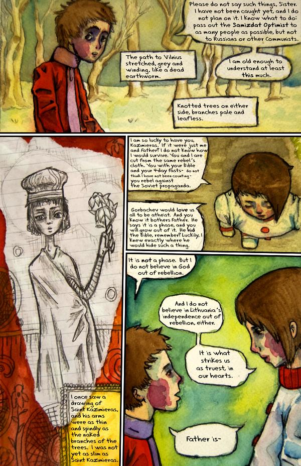
hm... well, I don't know if I would formally call him anorexic... although it is the kind of thing that tends to happen at that age. I probably should just leave it up to you readers to decide. But to me, it's more of a religious thing than it is a specific body issue thing. You know? He's young, and so the easiest way for him to be like his heroes (unconventional ones..) is to try to mimic them in all ways. This saint actually did die partially because he was so weakened from his ascetic lifestyle. It's kind of ironic that I wrote this; I'm a food-luvvin' atheist. My initial idea was to go into how religion could hurt someone (beyond the obvious route of the people in charge taking advantage of the people...) I'm not knocking religion-- well, maybe I am, but I'm not making this comic in a cautionary way, or in a snide way. (I'm just trying to understand thought processes that seem strange to me, like religious fervor and self-deprivation.) Actually, when I was researching this, I skulked around on some pro-ana websites for ideas and such; I got an okay idea amidst a lot of teenage whininess.
Emily Elizabeth at 4:18AM, April 11, 2009
This comic isn't boring at all, its one of the most interesting comics on here. Its really deep and clever! I love the political and historical aspect of it. I'm just worrying what cut him off just then. Also, the picture of Saint Kazimieras looks alot like Kazimieras himself!
Peipei at 3:50AM, April 11, 2009
Eeeek x.x So he's anorexic?
usedbooks at 10:07PM, April 10, 2009
Oh dear. He wants to be as thin as a drawing? Thank God Popeye isn't his idol. Lord knows what kinds of crazy things he'd be attempting to get into shape (poking his eyes out, trying to build enormous forearms...) It's neat how you incorporated the drawing, btw.