


Scene One p5
PeterAaronRose on March 20, 2007
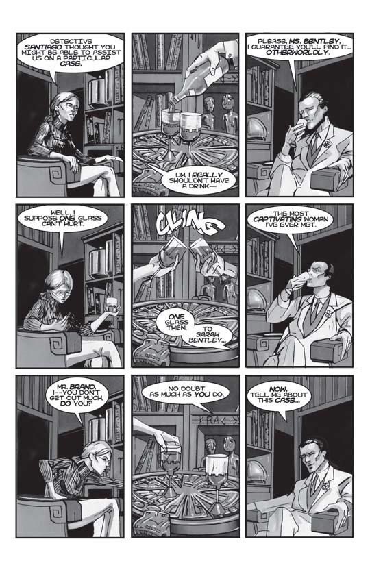
I find that the classic nine-panel grid works well in contemporary comics for conversational sequences. Warren Ellis does a particularly effective job of employing it in his excellent FELL series from Image Comics. Of course, Stan Lee used to squeeze entire issues worth of content into a single nine-panel grid back in the day, but decompression in comics is a topic for another day.
With this page in particular, I plotted it so that it could be read linearly from the upper left panel through the lower right panel, in addition to vertically across the three columns. So, if you visually look at any of the columns, you get a three-panel sequence that depicts an aspect of the conversation (Sarah's reaction, the toast between Sarah and Joshua, and Joshua's reaction). I felt this added a bit more movement to the page, and Brent captured it just as intended.
The script itself is purposely playful and is intended to portray one of Joshua's previously mentioned superficial facades. As the bond between Joshua and Sarah develops later in the story, the facade peals away and the dialogue becomes more genuine to reflect it.


Akuma the Spectre at 9:20PM, April 13, 2007
Ohhh he looks hot and he likes nerdy girls too. I like this guy even more!
alexhatzia at 11:58AM, March 28, 2007
whoops, meant to give you a 5
alexhatzia at 11:57AM, March 28, 2007
wow man, it's great to see some comics in here with some substance. i loved reading every part of this story. i'm gonna favorite this one! keep it up!
Firewitch at 5:39AM, March 27, 2007
i wish i could draw like that T_T
Roguehill at 5:20PM, March 25, 2007
Ahh...as a Black and White person myself, I've got to say that the artwork is stunning! It's definately become a favorite...and I'll be checking back regularly. Good show!
BrentElliottWhite at 2:29PM, March 25, 2007
And Mr. Brand can really put it back. That's a quirk I thought was cleverly written into this page. Also, I remember having to change the direction of the dialogue arrow on panel 8. It looked like the African sculpture piece in the background was being a little cynical.
KirkHodges at 12:58AM, March 25, 2007
I like how you had the glasses cling, little nice touches help.
I heart artists at 6:53PM, March 24, 2007
Whoa.
puck the duck at 2:54PM, March 24, 2007
not many pages im gladi could read them all and not be behind... amazing art. it really matces the story and stuff....yeah im not going to try and be all deep and stuff basically fav'd
boobies123 at 7:10PM, March 23, 2007
congrats on feature very cool comic :)
matteblack at 9:14PM, March 22, 2007
Great style, digging the premise. Nice work.
shany at 4:14PM, March 22, 2007
Well-detailed page!
Terroquita at 8:34AM, March 22, 2007
Interesting stuff.
Darwin at 8:01PM, March 21, 2007
I like how you did this page, and yes that linear action, 'tween, reaction is quite effective and visually pleasing! I was wondering about his "Devil may care" aura there...from what he was as a kid that seems a little too Cavelier.
jiminycricketX at 6:43PM, March 21, 2007
I like your style. Cool premise so far.
ccs1989 at 4:56PM, March 21, 2007
I like the layout here. 9 panel grids have always been good for getting a lot of info condensed and done quickly without being seemed rushed. I like the shadows. Reminds me a little bit of Frank Miller's stuff. That probably sounds cliche... Also the beginning pages in the house were a little bit difficult to figure out. The one with the wide establishing shot of the demons especially. A bit too much on the shadows. Still, I'm liking what I'm seeing now.
jaklaw at 4:37PM, March 21, 2007
:)
slimredninja at 4:16PM, March 21, 2007
really beautiful stuff
mrguy08 at 3:50PM, March 21, 2007
The dialogue is very well written.
eyesoftheblackk at 3:49PM, March 21, 2007
beautiful artwork