
When most people take a picture or draw a picture, the natural thing to do is to photograph or draw the subject in the center of the frame.
But one of the big tenets of visual composition is the RULE of THIRDS.
So pretty much, the frame is divided into…well, thirds. And the subject will sit in one side or the other.
This has the effect (so I've read) of pulling the viewer in to the image to take it in more fully, rather than having them just glance at the centrally-framed subject.
When a movie cuts between, say, two people having a conversation, the two will appear on opposite sides of the screen when the flick cuts to each one.
We see this effect in comics, too, with characters in conversation appearing on opposite sides of panels; if the comic “camera” was cutting between the characters but showing them on the same side of the panel, things would look awkward and confusing.
Stanley Kubrick's The Shining (and some of his other movies like A Clockwork Orange) are well known by people who are interested in such things, to break this rule and use a lot of centrally-framed images.
This has the effect, over a bit of time, of looking “wrong” to the viewer. This effect would be very bad if used unintentionally and out of context, in most standard films. But in these unsettling movies, used by a director with a mastery of visual language, the impact is powerful indeed!
A lot of us do this pretty naturally in comics; we generally have the character off to the side to make room for the text bubbles! But even when there is no dialogue balloon, or if it's a landscape or whatever, thinking of composition is a good idea. And the first rule is the Rule of Thirds!
A quick Google Image search will show the huge variety of images that have their focal points in the thirds. It's very instructive!
Have you seen this? Have you heard about this? Do you observe this “rule” in your comics? Do you observe the feeling of “wrongness” or discomfort when things are framed wrongly?
have a good one!
-Banes the Third

Rule of Thirds
Banes at 12:00AM, July 26, 2018
9 likes!


©2011 WOWIO, Inc. All Rights Reserved Mastodon
Ozoneocean at 9:09PM, July 26, 2018
Wes Anderson does a lot of centre framing... I think. It looks unusual but good when he does it. I often follow the Rule Of Thirds thing naturally because it's great for showing extra stuff in the panel. If you just stick your main subject in the middle it's harder to fit stuff in the rest of the space.
Albino Ginger at 5:02PM, July 26, 2018
The rule of thirds can make a crappy artist look like they know what they are doing. So I try to use it as much as I can.
Banes at 3:40PM, July 26, 2018
"Rule of Fourths, Luke!"
Gunwallace at 3:34PM, July 26, 2018
So will your next post be 'May the Fourths be with you'?
Banes at 3:04PM, July 26, 2018
@El Cid - Are you suggesting that I've improved upon the Rule of Thirds? Hooray! :D
El Cid at 1:24PM, July 26, 2018
I do this a lot in my comic but a lot of it is, like you said, to keep room for word bubbles. I never know what to do though when I have multiple subjects on a panel! Is there a rule of two thirds?
El Cid at 1:22PM, July 26, 2018
I think your picture's wrong; shouldn't they be along the dividing line rather than fully off to the side of it? It's the rule of fourths!
bravo1102 at 8:15AM, July 26, 2018
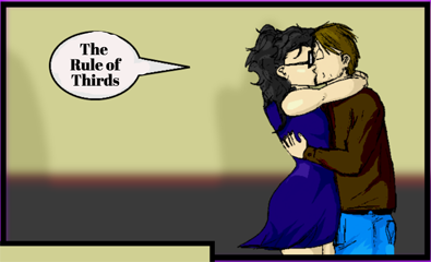
@Banes: in your panel you got it right. The balloon and the kissing couple's heads fit into the horizontal/vertical cross sections.
bravo1102 at 8:11AM, July 26, 2018
As a kid I did it instinctively in lo landscapes and kept getting asked why I put in so much sky.
Banes at 6:58AM, July 26, 2018
Hm - it's also about the focal points at the cross sections of the horizontal/vertical divisions. Hey! Maybe I can wring another newspost out of this!
Banes at 6:55AM, July 26, 2018
@bravo - that's true about the vertical division of thirds, yeah - with the horizon often in the bottom third, divided from the top two thirds. I'm not all that educated in this yet; I mostly use it horizontally (if I think about it at all; it often doesn't occur to me!)
KimLuster at 6:12AM, July 26, 2018
Ha, never heard of this but it makes sense... Sometimes I things like this sort of intuitively - let me go back and look! In any case, will be aware of it from this moment forward!! Yaaaayyy!
bravo1102 at 4:20AM, July 26, 2018
You realize it's Stanley Kubrick's birthday? Very appropriate.
bravo1102 at 2:46AM, July 26, 2018
This is also another one of those things based on stage layout for traditional plays. Right stage, center stage and left stage facing the audience and how to play to the full house. In film I've read it can also be interpreted vertically as well as horizontally for top, middle and bottom of a frame. There's even an interpretation of it for diagonal composition. And of course there's also screen ratio to consider. It works differently for widescreen as opposed to traditional screen ratio. More stuff to consider in the world of mise en scene.
Gunwallace at 2:26AM, July 26, 2018
Thanks for this. It's made me rethink some panels.
Genejoke at 1:08AM, July 26, 2018
I'm aware of it but rarely put much thought into it... maybe that's one of my short comings.