

Latest update news 22nd of July, 2022
-First up
Alexey has updated the prototype template again:
https://next.theduckwebcomics.com/
This time all the log in features, control panel, messages, likes, replies, comments, fave list etc will all be in a drop down to the right so that the top bar is not so busy. See examples bellow (the drop-down menu isn't fully populated right now):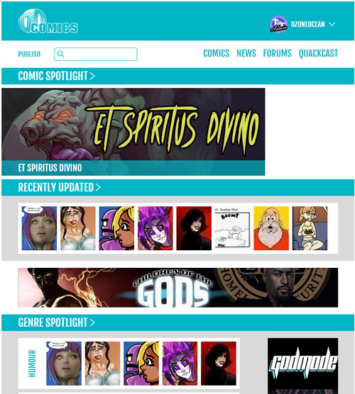
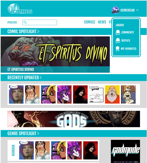
The faves list will expand to show about 15 of the latest updated faves and then you can click on a link and it will take you to a faves management page where you can see all the rest.
-Second up
Alexey has rearranged the positions of things as I suggested last time, but it's not obvious that these lists scroll horizontally in the mobile sized version so I've proposed we have triangle overlays to indicate that for the comic lists.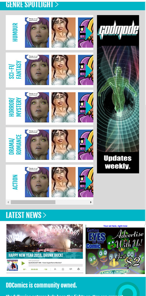
The news area may just shrink down so you see the whole of it plus the ad on the right and a player for the Quackcast under the news image.
(No Patreon and supporter stuff in here so we keep focus. Tantz will have it tomorrow)
We really super appreciate member comments and suggestions! Please don't go too far off topic with a wish-list of features at this point though, we're going with what we can afford and that's basically working with what we have but making it work better and LOOK better. The main thing is getting the site to be really usable and look good on smaller screens as well as big ones.
DD update post 22/JULY/2022
Ozoneocean at 12:00AM, July 22, 2022
9 likes!


©2011 WOWIO, Inc. All Rights Reserved Mastodon
Ozoneocean at 4:05AM, July 25, 2022
There are more functions in the dropdown now and there's a Quackcast widget on the front age.
Ozoneocean at 4:04AM, July 25, 2022
Alexey agrees with me that the bigger page layouts and larger thumbnails are good ideas. They'll both involve too much work to implement at this stage though. Alexey wants to get a fully working front page first and then we can try and go back and add bigger thumbnails and wider page layouts.
Amelius at 1:55PM, July 24, 2022
Hey as long as it's a consideration for the future, that is good news to me! Perfectly understandable about the Tetris considerations :P
Ozoneocean at 11:28AM, July 24, 2022
@Amelius- RE: increasing the size of the thumbnails- I love this idea but it means we have to change the layout of the design quite a lot to cope with that. AT the moment the designs are a complex game of Tetris to fit in all the elements. It also means we have to scale up the small images we have (making them blurry) or change the comic edit area to ask for larger thumbnails, so it could be just too complex to implement at this stage. But I do really love the idea so I'm going to talk to Alexey about it.
Ozoneocean at 11:24AM, July 24, 2022
@Hush- that's a small part of what we're working on and it's not set in stone. we can change the logo easily. :) It's mainly a placeholder
hushicho at 2:54PM, July 22, 2022
My only comment is that I still believe it's not a good idea to rebrand to DDComics and I do think that even a stylized logo evocative of a duck is much more engaging for most people and much less corporate soulless. It has no character, the closest thing you can say that's memorable about DD is that it's numerous people's favourite cup size, which I think may mislead people about what the purpose of the site overall is. The logo is super forgettable. The new layouts look good on my systems, but I don't work in super-huge ones. I like a lot of the things you've developed, and I hope my feedback isn't unwelcome. Thank you, certainly, for the hard work you've gone to.
Amelius at 1:06PM, July 22, 2022
I still think the thumbnails are too small. I'm not saying we need to go Hiveworks big, but seriously... comics are a visual medium and even if "file directory size" previews are better than what we had 18 years ago, 80x100 does a real disservice to a lot of the art on here. I've had to see some folk's comics featured to realize it's something I'd be interested in because the thumbs do little to entice attention at that small of size. We could have comic thumbs up to the size that we currently use for the Featured, and still have plenty room to spare on the redesign, since the Featured is now a long banner differentiated from updates. Still a modest size, but better. It'd be a nicer main page with less close-ups of faces, right now that's the only recourse we have.
Ozoneocean at 10:54AM, July 22, 2022
@jason- we don't know at this stage
Ozoneocean at 10:53AM, July 22, 2022
Interesting notes guys. Perhaps we will have to work on a design for large screen resolutions.
StariveArt at 10:40AM, July 22, 2022
This looks really clean! Great job
Andreas_Helixfinger at 9:55AM, July 22, 2022
I feel the same as PaulEberhardt looking at this! It looks totally fine on my cellphone screen. But on my laptop screen there is huge blank spaces on both sides that makes it look kind of off. The size of my laptop screen is 14:0.
Jason Moon at 7:54AM, July 22, 2022
Do you guys have a specific date in mind when you think you'll do the reboot of the site?
PaulEberhardt at 6:49AM, July 22, 2022
Ok, so I won't say it needs a duck, this time... ;) I generally like the neat look of the design, but at least on my 16:10 screen it leaves a lot of blank spaces that make it look kind of awkward. I don't know if this is just because of the number of examples in the test version, but in each category they take up about the left half (or perhaps three fifths) of the screen and leave the rest just white. I'm still not against a white background, mind, but this doesn't look good in any colour. I'd like to suggest centering everything, if that's possible, so the whole design stays flexible enough for all the different screen sizes, but the blanks on wider screens become less obvious.
cdmalcolm1 at 6:39AM, July 22, 2022
I for one cannot wait. Looks awesome.