


Ep. 1 Page 4
Abt_Nihil on Aug. 10, 2007
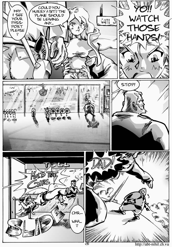
There are various things about this page which I like and which I don't like… I'm particularly happy I managed to make Naomi look like she's intended to look. Since I've been drawing her for more than six years now I have to make sure that even if I improve her design it should still be consistent. As for the parts I don't like… well, I guess I better not point them out ^^
Oh, and I even put an “Air Arcadia” logo on the plane in panel 3's background… just so you know :-)
EDIT: Thank you for your comments! DOm: Yup, very, very new. Still trying to figure out the controls and whatnot ^^


Fitz at 7:44AM, Aug. 12, 2007
Yeah I know exactly what you mean about consistent character design. I know I had problems settling on some sort of final design for my characters. In the planning phase, every time I drew the face, it'd look different than the previous version. But aaaanyway... The artwork's getting better and better - evem considering you're a pro to begin with. I love the calmness and the detail in panels 3 and 4. Panels 5 and 6 look very dynamic, you can almost see the image move, especially in the last one. Nice "camera work" in the last one, too.
TheMidge28 at 12:49PM, Aug. 11, 2007
really cool! I like the action in panel 5. dad's design really cool from what we see. getting interesting.
RapidoBlue at 11:00AM, Aug. 11, 2007
brilliant
D0m at 10:23AM, Aug. 11, 2007
This looks fantastic. You new here?
slimredninja at 9:45AM, Aug. 11, 2007
You got an awesome comic here!!!