I had to tend to a sick ferret this week (she's fine now though) so I didn't get to work on this right away. I was also out of town visiting my parents and picking up said ferret.
Apparently, someone thinks I make excuses so no one criticizes my crappy art. I guess my asking for crits and not ripping people's heads off when they point out mistakes is all a ruse!
NO. I do not make excuses to cover my failings in my art. I do like to let people know why it takes too long though. My hand hurting has nothing to do with why the art sucks at times! If I want to draw better I just IGNORE it.
Anyway, I'll say it again: well worded criticism is always welcome. Impotently leaving a 1 and making ridiculous assumptions about my character is completely immature and unwelcome. How am I supposed to respect your opinion if you're being an idiot about it? Then again, I don't think trolls are particularly concerned with the impression they give people anyway. Oh well.
Everyone else: if people are being snots, just ignore them. They hate that. Plus they think it's good fun to rile up people's readers, don't encourage/reward them by reacting to it. Thanks ^_^
Tabitha: I already did make a tutorial actually. you can find it [url=http://www.drunkduck.com/tutorials/view.php?id=90]here[/url].
Perhaps I'll even make another one.
Geez!! Finally finished reading thru all the older ones until present. Just wanted to say, good stuffs! You've improved a lot and it keeps getting better!
Ack! Another sleeper update! How does this keep happening?!
Oooooooooooooooh, that's gotta smart...
Who's been saying bad stuff about your comic? I'll murderlize 'em!
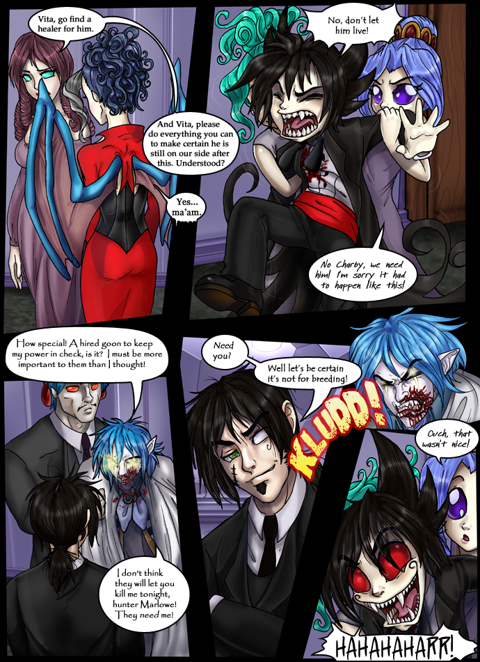
To Sakura: hehe, Vic didn't go "kludd". I don't want to be assumptive, but think about what Vic said, why Charby would be laughing so hard and mostly why "that wasn't nice".
As for the artwork, I don't see what you mean, Amelius. This is easily one of the best illustrated comics I've ever read. I'm not trying to be patronizing either. I know for certain that I can't draw stick figures decently, and there are those I've had experience with that I could say the same of. At least what can be perceived as rushed or particularly unrefined is usually in the less central details (if that makes any sense).
The art is as good as it always is with this comic. Something seems a little off with the last bit tho. I don't think it could have been done better for what your trying to show. As a personal point of view, I think having Vita's wing blocking the leader's face was a bit of a mistake. I hope my rather impotent attempt at con. crit. helped.
Aw no fair... Who went 'Kludd!' in the last panel. *lol* And if it was Vic, then how did what's his name manage to break free long enough to clobber him?
woopsie forgot one last thing.
Those who leave stupid comments are just annoying and should be ignored. besides, you get enough 5 votes that one or even five 1s wouldn't drop your average
The expressions and body motions have evolved greatly in just a few months. It's remarkable how they are both exagerated and realistic at the same time, especially Charby's face in the last panel. I'm impressed.
you know... you and EvilEmperorNick should make a tutorial or something... no... second thought. no one should know your tecnique... speaking of which...
Is it just me or has your shading tecnique simplified in the past several strips? don't get me wrong, It gets the point accross without you having to take a long time with it. I rather like it, I was just making an observation. Are you trying a new style or did it just happen like that? or am I totally off my rocker?
Dylanthdoodle: Egads! Don't worry, Momo isn't attacking you! It's over the person who I mentioned in my notes, who was saying I'm making excuses for "bad art". They mean the trollish critics, not the people who read and enjoy this comic and want to help make it better. I think Momo would have called you out by name if that was the intention of the post.
...and about the background, it's the ceiling behind Vick we're seeing. It's got one of those fancy-weird ceilings with shapes in the moulding. If his head wasn't in the way, you'd be able to see it better. ^_^
I love you: Thanks! I think that goes right over their heads when you tell them to do better though, they just go "why should I?" and continue to be jerks. Very sad.
Neila: Youse know, I was thinking the very same thing! I had a little difficulty deciding what the best placement for that was, I just wanted to be extra-sure that Q's bubble lead into Vick's. I may just scoot the bubble up above his head too, since the real important part is that it lead to the sound effect. Thanks for the advice!
"Momo", if you're attacking me, then you need to chill. I love this comic to death. It is my favorite as well. The artist herself asked us to be a bit critical, so that she would know where to improve, or specify for us. I mean no harm in my criticism, and I believe that it was fairly small, since it was about a single background. And NO, I can't do better. I can't even compare. But that doesn't mean that I can't have an opinion.
Although there are always improvements to make in anyone's art, I think that your style, and skill deserves a lot of praise. Your artwork is fricking amazing! I don't see what anyone's finding. And lets see one of your critics do better. They're just jealous, stupid trolls. Simple as that. Your comic is one of my faves of all time. Keep up the awesome work, and don't let idiots blowing off steam from their crappy lives get to you. ;D
Love,
Momo
Damn who knew that this comic would be so widely loved by the DD community. Great job on the art. If any one wishes to criticize the work of art lets see them do better. I highly doubt they can.
I really like this page, but the speech bubble placement in the last few panels confused me a bit, perhaps haveing "need you" above Vic and "Lets be certain..." lower after you see his expression might help the page flow a little better.
I can only guess as to where Vic hit Quix XD The expressions are fantastic as always. ^_^
I hope your ferret gets well soon! ^_^
I'm not sure that Quixoto is going to want to be on the elite's side after THAT! Haha.
The background on panel 4 is a little strange to me. Kinda like they're in a soccer ball or something. Now I'm a little confused by the layout of the room. Sorry if I'm over analyzing, but your backgrounds always stick out to me. Otherwise, it's a very good page.


Evil Emperor Nick at 1:42PM, June 3, 2008
Tabitha: I already did make a tutorial actually. you can find it [url=http://www.drunkduck.com/tutorials/view.php?id=90]here[/url]. Perhaps I'll even make another one.
Undefined at 1:07PM, June 3, 2008
Geez!! Finally finished reading thru all the older ones until present. Just wanted to say, good stuffs! You've improved a lot and it keeps getting better!
woodoo at 1:00PM, June 3, 2008
i love charbys face in the last panel, and vic's face in the seacond last panel is awsome to.
Luffy91 at 10:04AM, June 3, 2008
wow lotta comments anyway excellent work so far
dylanthenoodle at 7:42AM, June 3, 2008
Thank you for clearing that up, Ame. And sorry, Momo. I really thought you were calling me a troll!
Ogre fairy at 7:09AM, June 3, 2008
Ha. That was awesome. XP I absolutely love the art on this page. The details are beautiful.
ZeroVX at 4:38AM, June 3, 2008
Ack! Another sleeper update! How does this keep happening?! Oooooooooooooooh, that's gotta smart... Who's been saying bad stuff about your comic? I'll murderlize 'em!
Fenris at 3:41AM, June 3, 2008
Dont even know what to say...The last 2 panels are great :D
crimsonshaid619 at 3:38AM, June 3, 2008
To Sakura: hehe, Vic didn't go "kludd". I don't want to be assumptive, but think about what Vic said, why Charby would be laughing so hard and mostly why "that wasn't nice". As for the artwork, I don't see what you mean, Amelius. This is easily one of the best illustrated comics I've ever read. I'm not trying to be patronizing either. I know for certain that I can't draw stick figures decently, and there are those I've had experience with that I could say the same of. At least what can be perceived as rushed or particularly unrefined is usually in the less central details (if that makes any sense).
Lotus at 1:29AM, June 3, 2008
The art is as good as it always is with this comic. Something seems a little off with the last bit tho. I don't think it could have been done better for what your trying to show. As a personal point of view, I think having Vita's wing blocking the leader's face was a bit of a mistake. I hope my rather impotent attempt at con. crit. helped.
ScreamingPlauge at 12:02AM, June 3, 2008
ahhahahahaaaa love the manical laughter there ^^
Sakura_Lisel at 11:46PM, June 2, 2008
Aw no fair... Who went 'Kludd!' in the last panel. *lol* And if it was Vic, then how did what's his name manage to break free long enough to clobber him?
Tabitha at 8:29PM, June 2, 2008
woopsie forgot one last thing. Those who leave stupid comments are just annoying and should be ignored. besides, you get enough 5 votes that one or even five 1s wouldn't drop your average
Tabitha at 8:23PM, June 2, 2008
The expressions and body motions have evolved greatly in just a few months. It's remarkable how they are both exagerated and realistic at the same time, especially Charby's face in the last panel. I'm impressed. you know... you and EvilEmperorNick should make a tutorial or something... no... second thought. no one should know your tecnique... speaking of which... Is it just me or has your shading tecnique simplified in the past several strips? don't get me wrong, It gets the point accross without you having to take a long time with it. I rather like it, I was just making an observation. Are you trying a new style or did it just happen like that? or am I totally off my rocker?
Amelius at 8:22PM, June 2, 2008
Dylanthdoodle: Egads! Don't worry, Momo isn't attacking you! It's over the person who I mentioned in my notes, who was saying I'm making excuses for "bad art". They mean the trollish critics, not the people who read and enjoy this comic and want to help make it better. I think Momo would have called you out by name if that was the intention of the post. ...and about the background, it's the ceiling behind Vick we're seeing. It's got one of those fancy-weird ceilings with shapes in the moulding. If his head wasn't in the way, you'd be able to see it better. ^_^ I love you: Thanks! I think that goes right over their heads when you tell them to do better though, they just go "why should I?" and continue to be jerks. Very sad. Neila: Youse know, I was thinking the very same thing! I had a little difficulty deciding what the best placement for that was, I just wanted to be extra-sure that Q's bubble lead into Vick's. I may just scoot the bubble up above his head too, since the real important part is that it lead to the sound effect. Thanks for the advice!
dylanthenoodle at 8:04PM, June 2, 2008
"Momo", if you're attacking me, then you need to chill. I love this comic to death. It is my favorite as well. The artist herself asked us to be a bit critical, so that she would know where to improve, or specify for us. I mean no harm in my criticism, and I believe that it was fairly small, since it was about a single background. And NO, I can't do better. I can't even compare. But that doesn't mean that I can't have an opinion.
Scardy at 6:14PM, June 2, 2008
Awww! Vic cheered up Charby!
I love you at 6:11PM, June 2, 2008
Although there are always improvements to make in anyone's art, I think that your style, and skill deserves a lot of praise. Your artwork is fricking amazing! I don't see what anyone's finding. And lets see one of your critics do better. They're just jealous, stupid trolls. Simple as that. Your comic is one of my faves of all time. Keep up the awesome work, and don't let idiots blowing off steam from their crappy lives get to you. ;D Love, Momo
anonymous at 4:44PM, June 2, 2008
hey
Beraxillia at 3:55PM, June 2, 2008
ohhh... I felt that. and I dont bot balls
l3lack Heart at 1:48PM, June 2, 2008
Damn who knew that this comic would be so widely loved by the DD community. Great job on the art. If any one wishes to criticize the work of art lets see them do better. I highly doubt they can.
Kriss at 1:16PM, June 2, 2008
lol yay!
Neilak20 at 12:36PM, June 2, 2008
I really like this page, but the speech bubble placement in the last few panels confused me a bit, perhaps haveing "need you" above Vic and "Lets be certain..." lower after you see his expression might help the page flow a little better. I can only guess as to where Vic hit Quix XD The expressions are fantastic as always. ^_^ I hope your ferret gets well soon! ^_^
Ka_rin at 11:39AM, June 2, 2008
lol kludd.
dylanthenoodle at 10:41AM, June 2, 2008
I'm not sure that Quixoto is going to want to be on the elite's side after THAT! Haha. The background on panel 4 is a little strange to me. Kinda like they're in a soccer ball or something. Now I'm a little confused by the layout of the room. Sorry if I'm over analyzing, but your backgrounds always stick out to me. Otherwise, it's a very good page.