
The 31 May 2021 article related to “Color Theory as a Rewind Machine” mentioned how colors could be used intentionally as a way to transport the reader to different time periods. At the end, I posed the question whether anyone had ever used a specific decade’s color palette in their original comic work with a request to a link to a comic page that demonstrated how colors are used on comics here on The Duck.
Here are the responses:
USED BOOKS
“I'm currently setting an arc in the 70s. I'm very uncomfortable with the colors and styles. lol.”
-usedbooks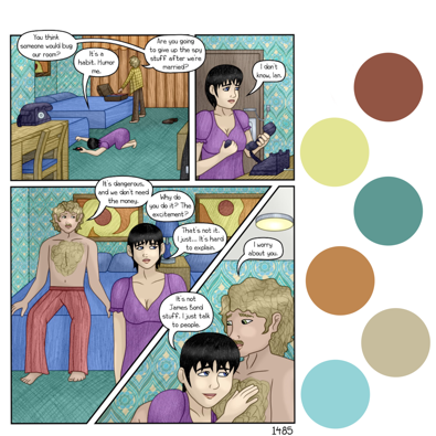
The use of muted, warm neutrals along with brick red, burnt ochre, gold, mint, and teals bring out the look and feel of the 1970s. The colors complement the style of curtains, art pieces, and fashion used in the comic.
—
GROWLUTION
“I use color themes all the time, I used jewel-bright colors for my underwater scenes. And now I am using natural colors in the land scenes. I know it's not from an era but color themes are very important to catch the eye. Ive seen this done well, and I've seen eyewatering terrible examples.”
-Xade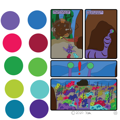
Growlution has a wide variety of jewel-tones used in the underwater scenes from emerald green, ruby, magenta, chartreuse, lapis lazuli, and amethyst. The land scenes in comic use a variety of earth-tones and warm neutrals including muddy brown, beige, and tan as a contrast.
—
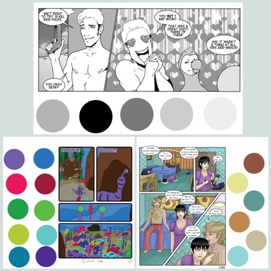
SPACE DADDY ADVENTURES
“This is such a good point! I also would like to point people who use color in their comics to color guides for the period, if available. Not only in decor and interior decorating, but also in comic books, most of the major publishers had color guides that you can use with a simple color eyedropper in most graphics suites. Even if they don't, you can likely find scans of comic pages, panels, and covers and accomplish the same thing. It's especially helpful in setting a certain aesthetic, and it can be so handy when that's strongly attached to a specific time!”
-hushicho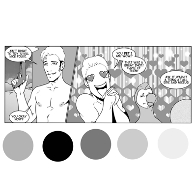
Monochromatic grayscale color schemes are a theme for several of Hushicho’s comics on The Duck. Black, charcoal, slate, heather gray, and white function together and can be used for more detailed shading. Hushicho’s grayscale palette is a example of a classic black and white theme in the absence of color.
Monochromatic color schemes can be used with any color family to add warm or cool effects.
—
Additionally, enthropy0013 suggested a very helpful comment for anyone interested in studying color theory more in depth.
“If you have a long standing college or university, in your local area, that teaches architecture, interior design, or historical site preservation. It can provide you with the color palettes and design accents of period in question. Better Home and Garden back issues can help as well since they marketed many home furnishings.”
-entropy0013
Thank you, usedbooks, Xade, hushicho, and entropy0013, for your comments/contributions!
.::.
What's Quacking?
Do you have any original art to contribute to our stock image database, announcements, community projects, ideas, news, or milestones to report? Please leave general comments below or send a PQ to kawaiidaigakusei. Email me at kawaiidaigakusei(at)gmail(dot)com.

Color Theory as a Rewind Machine (Revisited): Community Contributions
kawaiidaigakusei at 12:00AM, July 26, 2021
6 likes!


©2011 WOWIO, Inc. All Rights Reserved Mastodon
Xade at 11:51AM, June 15, 2023
huh, I totally forgot about this until I searched form my name in the newsbriefs. Nice.
cdmalcolm1 at 9:31PM, July 27, 2021
Interesting. I didn't use a time period for color in SolarCell's past. It never dawned on me to do so. The color aspect on my comic is bright and vivid. My other Comic that is in B/W is heavy with the Shadows and show like a high luster feel with the gray tones to help with highlights. If I decide to use tones of the passed or a dream like state, I would just choose one primary color then use analogous color scheme to create a rich, monochromatic look to match my comic aesthetic.
hushicho at 3:06PM, July 27, 2021
It was a really good article, and I recommend taking a look at it -- it was exciting to talk about the color references and using them to set a stage. And this is a really great look at how people practically use color or greyscale to give their comics distinctiveness and a cohesive flow. I'm also very flattered that you used one of my Space Daddy comics! Thank you so much for featuring me in this article. I'm always so excited to talk about levels, colors, and tones. They can add so much, and so simply.
Avart at 10:57AM, July 26, 2021
Excellent! I missed that article :( Thoug I've never tried to represent a specific time in my comic (which it's in B&W) I think that in an upcoming project it could be nice to give it a try.
Banes at 6:41AM, July 26, 2021
Very interesting! Color palettes are usually the kind of thing that I only notice subliminally, you could say, but does create a cohesiveness and authenticity.