


#004: The Lost Land Pt.2
Kendell on Oct. 29, 2008
Listen, I just want to go ahead and say this: PLEASE STOP BITCHING PEOPLE! I'm not going to point fingers, but come on people. Be mature about it. Don't flame me and stuff for no reason. For instance, don't give me a “one” just because there's a simple thing in my comic you don't like. You all have been warned. If you do so, I will not hesitate to report your comment. Just please. This kind of stuff does resort in bad publicity. One thing we can learn about this is tolerance. We have to learn to be able to adjust to things, and if we can't, just let it be. This… has been the message of the day. Have a good night. Drive safely. *Shot*


Kendell at 5:04PM, Oct. 30, 2008
Thank you for the head's up, and sorry, I read this post after posting the next page. Don't think I didn't pay you any mind. I really do respect your advice, and pointers.
soonmme at 4:36PM, Oct. 30, 2008
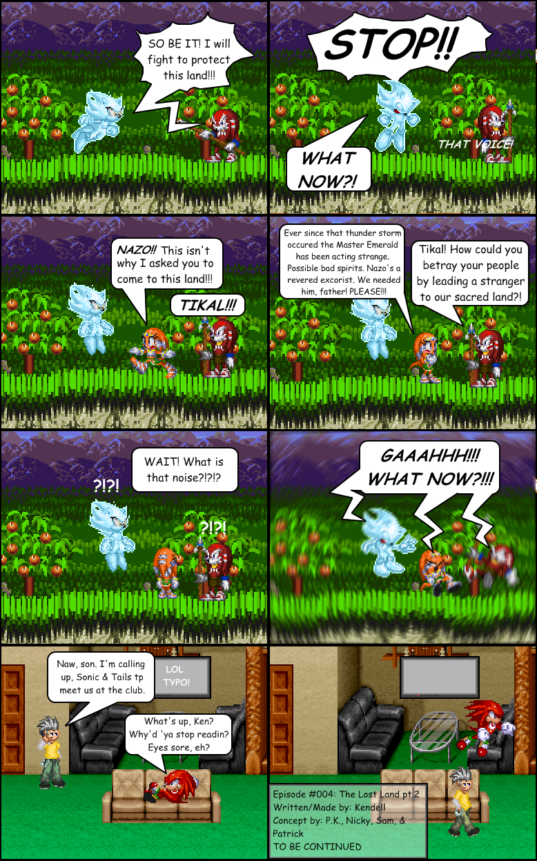
Really dude, no need to get your panties in a knot because someone has a negative opinion. The internet is fucking serious business. Now to get into an actual critique; Use emotions more(for the exception of Nazio in panel 2 and that gia in panel 7, you used none). Emotions look way better than giant floating "?!?!"s. When the characters move it's very static(might be partially caused by the sprites themselves), it almost seems like you're missing a panel or 2 in there, either make movements less drastic per panel(fan character guy from panel 7 to 8, for instance), or show some indication of movement(a blur from where Knux was in panel 7 to where he jumped to{?} in 8, for instance, you obviously have Photoshop, or at least some program capable of actually doing blurs, so use it.) You missed a large number of tails on your bubbles, maybe you should check over your comics to make sure you got them all(lolhypocracy). If you're lucky enough to NOTICE a typo you made, then FIX it, don't point it out. The random gia(that I assume is supposed to represent the author and therefore [i][b]is[/b][/i] god{which is extremely cliché}) has a horrid sprite that appears to style mix in itself. Speaking of which, style mixing is BAD. Mixing of CN style and regular Genesis is painful enough., but then mixed with whatever those echidnas are, whatever the fan guy is supposed to be, AND the BG in the last two panels is too much. Lastly, that little Episode title thing you do is very intrusive, either find a spot that doesn't get in the way of the comic itself, or drop it as a whole(since it is rather unnecessary). Overall you have a lot to improve. ;-;