——-
Because I'm so generous, I'm offering up two lambs to the slaughter:
(Note: this one was done by me and two of my friends, so it may technically be cheating)


FreegurtLeg joints and the position of one of the feet looks unnatural. Also, I believe the one arm is to point backwards, but it lacks the perspective for that. Other than that, the eyes are too high I think, and one hand has two thumbs I think, the pinky is attached as an opposable digit. Also, in one of the shoes a human foot couldn't fit.
Very nice! I don't know the movie, but I do like the lineart and the background a lot. It's simple, but you can still tell what it is. I also really like the colouring, especially on his skin.
~~~
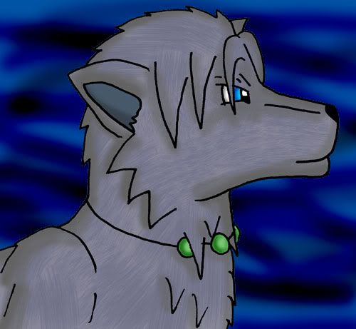
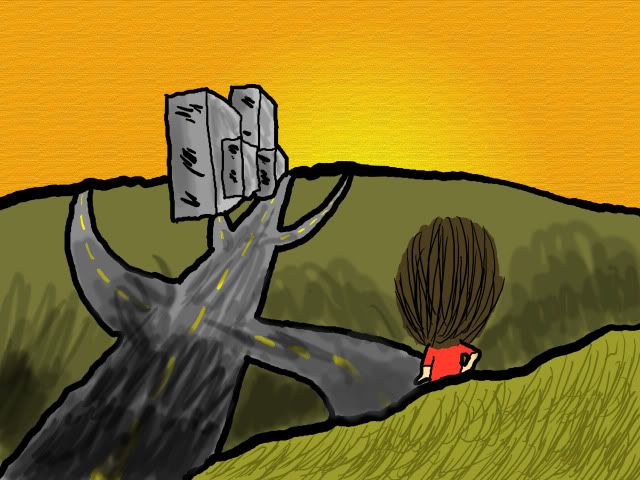
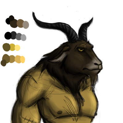
A brand spanking new character I made up about last week, I believe. I haven't quite figured out which colours I should use on him.
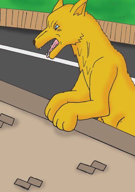
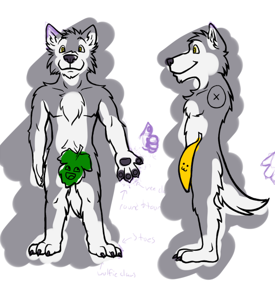
HunchdebunchVery good dog anatomy there. I'm not quite sure what she's leaning on but I guess that's not that relevant
Wow. That is really, really cool! I love the detail and the effects!
Here's a picture I just coloured. Also, I shaded it! I don't usually shade, but I'm probably going to start shading my comics, so I'm trying out different stuff, and at the moment I like this way best.


fernI can't say I do that much to be honest. I have an aversion for any drawing style that bends the noses to the left or the right even when the face is shown right up front. The way the mouth is drawn do makes up for it more than in most of it.
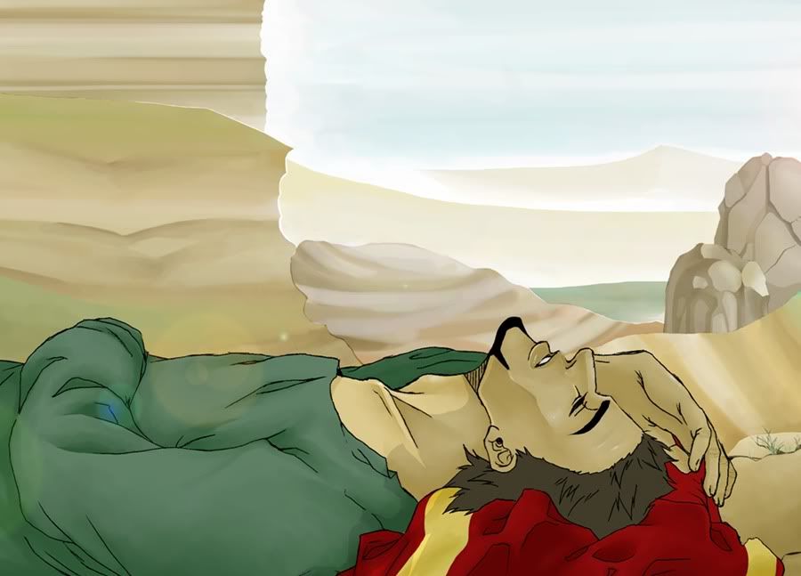
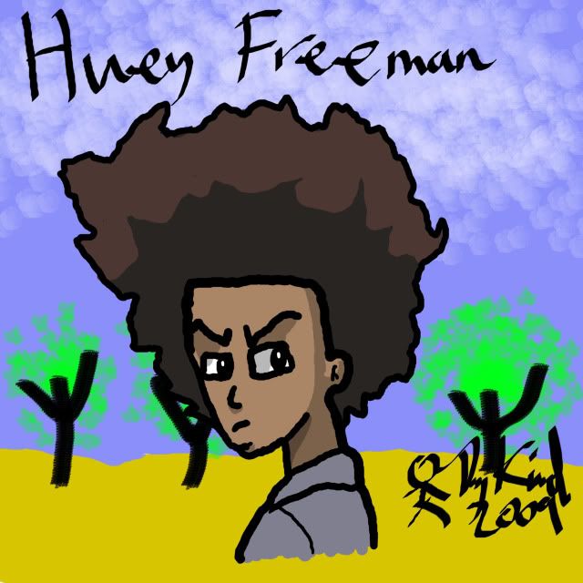
Huey Freeman in a desert is classic ‘cause that’s the look he'll give.
I'm thinking of starting a new comic with this lining/colouring style… I like it.


CrimsonskystudioThe wind's done very realistically which is a trouble for most people. I have only one item on this of discontent, but that's a rather large one and that's that their facial expressions don't match it at all, especailly the right one which looks as if she's pretty twisted and lost sanity.
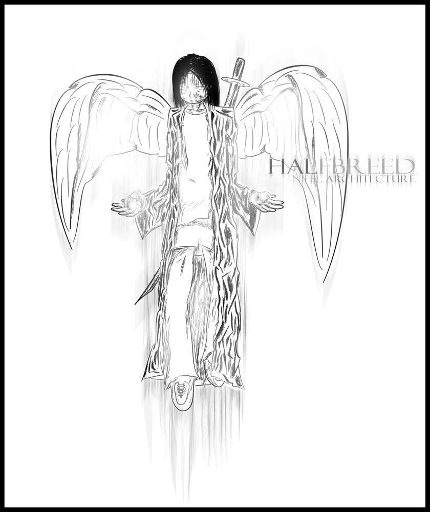
qqq, The angel design is very good, and the pose is subtle. It has a very
opposite look to the style with the bright white lighting
————————————
This is the full image for my comic title banner


qqq
Leg joints and the position of one of the feet looks unnatural. Also, I believe the one arm is to point backwards, but it lacks the perspective for that. Other than that, the eyes are too high I think, and one hand has two thumbs I think, the pinky is attached as an opposable digit. Also, in one of the shoes a human foot couldn't fit.
Folds of the clothing though are done excellent and really show the difference in texture between plastic / leather and jeans in how they fold. except that one knee perhaps. Facial expression hits it on every point.
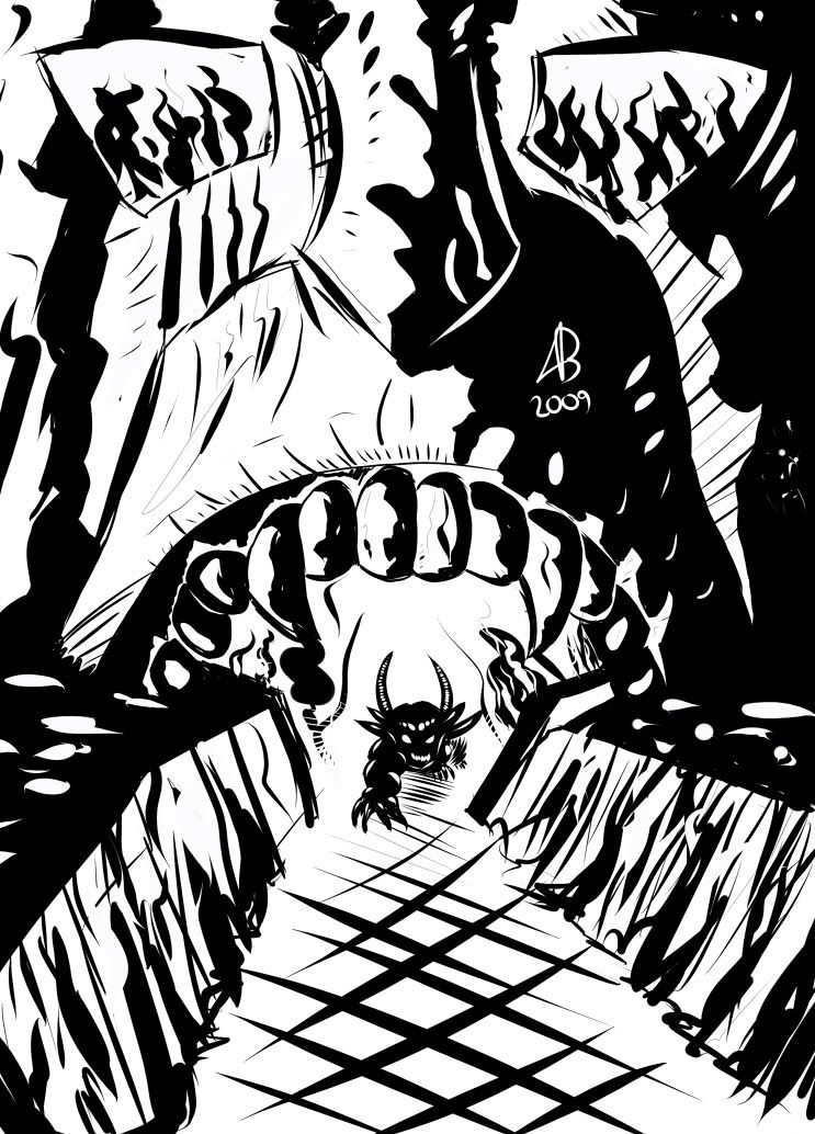
Since all you people are posting humans or at least antropomorph things, I'm going to be daring and original:
http://nihilarchitect.net/v7/sp:popup/image/the_reckoning
It's in a link because the image is too wide.


da_kashaThe link in the pic on top of you. it's bold: http://www.drunkduck.com/Out_There/gfx/girl%20retouch.jpg
Um, who's work am I supposed to comment on? 0.0
ParkerFarkerThey just made it like that by posting only drawings, besides, I don't see what bad it can do. Originality I'd hold as a good thing.
Although music is a form of art, I think this thread is just for drawings.
ParkerFarkerIt's to be under a part of a ‘chase’ scence if you get what I mean.
But It was a cool tune, I could only really see it as background music for a game or a TV show, and that's what you made it for. It was a cool tune, but what type of game you're making this for would help to know whether or not in fits.
ParkerFarker
This may be considered NSFW but it only shows her bum.
It is also one of my first times retouching an image (I made the shadow's darker)
http://www.drunkduck.com/Out_There/gfx/girl%20retouch.jpg
da_kasha
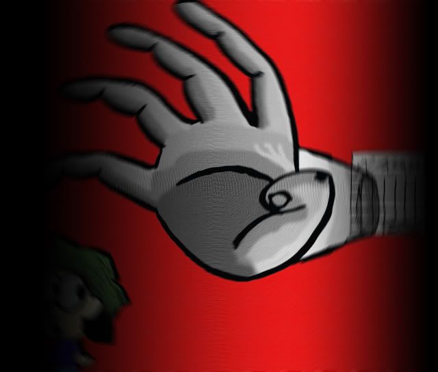
Well here's my pic: I just doodled it but I'm fairly happy with it. Apart from that hand.


elektro
Since you know there are some mistakes, I won't point them out. Although the big eyes look weird, somehow they fit.
——-
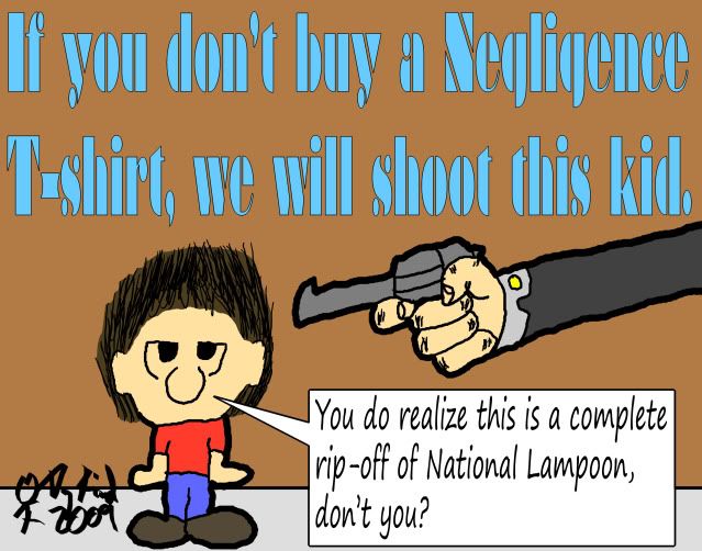
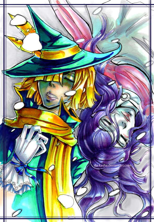
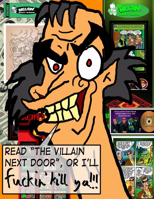
Roy Duncan of Villain Next Door recently made a pin-up for my Negligence comic. Since he was so nice to make that, I made something to promote his comic. Enjoy.


