
I drew it with my feet.


I Am The 1337 Master


FutonThat's hillarious!!! ^_^
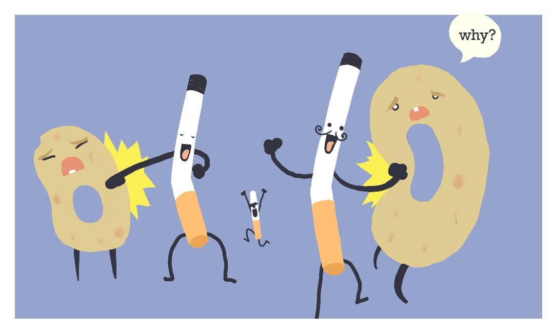
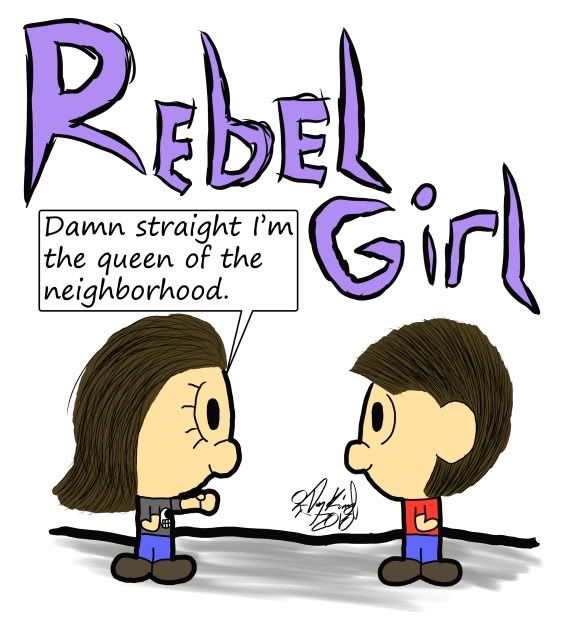
“Gay Donut-Punching Fags.”
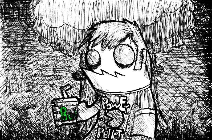
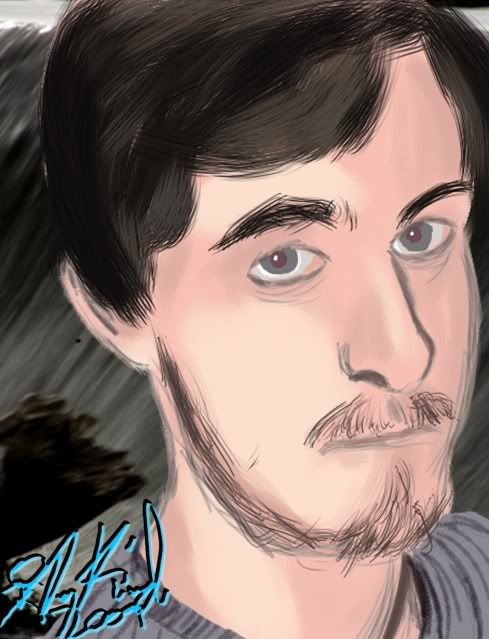
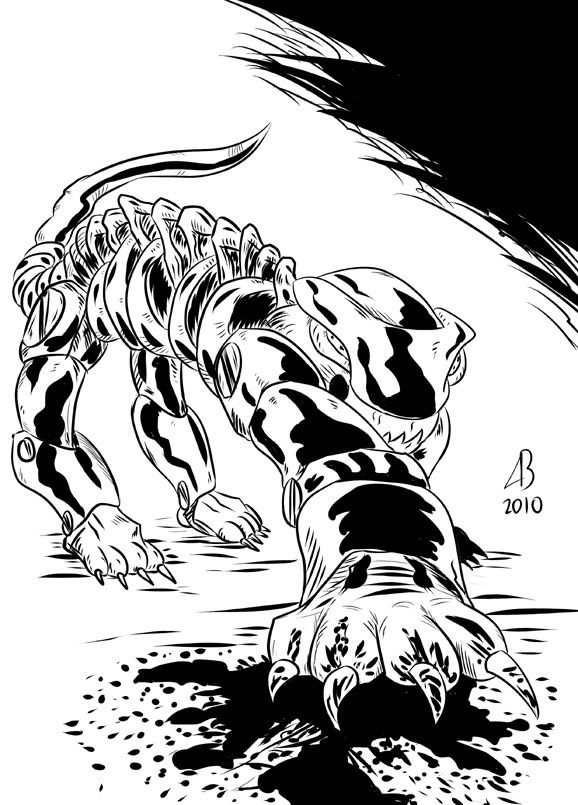
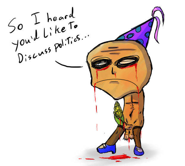
demontalesThat's a great sketch, nice sepia tone colouring!
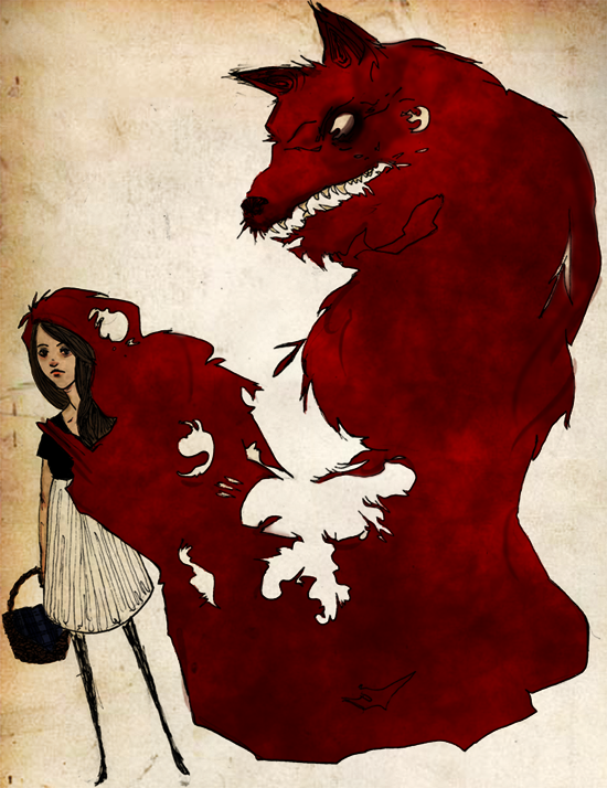
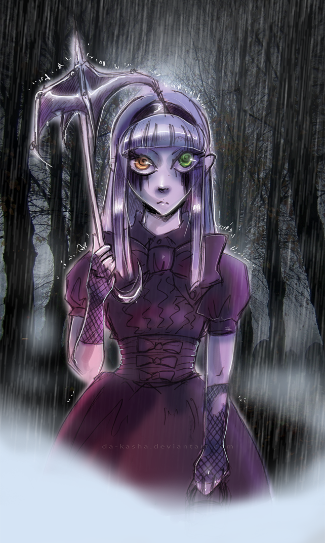
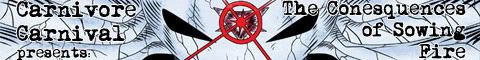
Sorry for the depressiveness of this image, it's one of the few image hosted that I didn't do fanart.


