
For me, this fascination started with David Feiss's work, specifically beginning with the second season of COW AND CHICKEN and onward, when his backgrounds suddenly took on this really interesting “marble” texture to them that I hadn't seen in cartoon backgrounds before.
The first season never had this marble texture, the colors were always just flat and simple; this to me marked an unexpected improvement in COW AND CHICKEN's art style that continued in not only ensuing seasons, but also in Feiss's other work, such as I AM WEASEL, and his LOST CAT pilot that was never picked up for series.
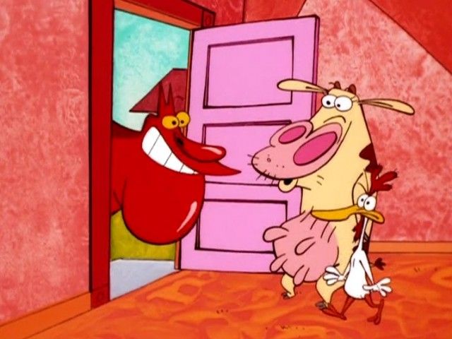
Then you have somebody like John R. Dilworth, who really took it up a notch by not only adding texture to the backgrounds in his work, but photorealistic textures at that, which you rarely saw in traditional 2D animation; he began experimenting with such in some of his early short films like THE DIRDY BIRDY, but he clearly had perfected it with COURAGE THE COWARDLY DOG.
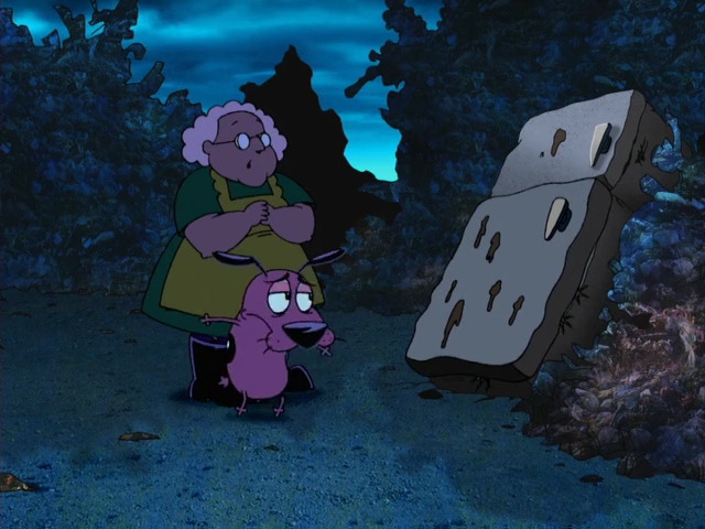
And it's not just the photorealistic textures of Dilworth's backgrounds that are amazing, but also the attention to color and lighting that not only make the backgrounds and overaall atmosphere of his work realistic, but believable as well. He has said that when it comes to his animated work, especially Courage, his approach has always been cinematic, and it definitely shows, as the blending of mixed media creates a world all its own that really set Courage and his other work apart. As some of you can probably tell, Dilworth in particular had a tremendously huge influence on my own art style, especially with VAMPIRE GIRL.
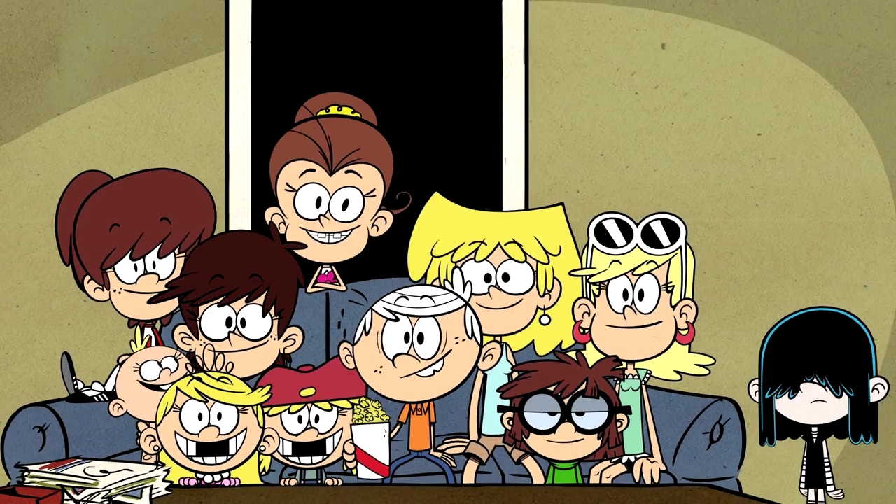
Then we have scenarios where cartoonists try to capture a certain look from another art medium and adapt it into the animation medium. Growing up, Chris Savino loved newspaper comic strips, and has often tried to emulate the look and feel of old funny papers in a lot of his work - the most notable of which is THE LOUD HOUSE, which really pays homage to the funny papers with not only character designs that you might find in the panels of such, but how the backgrounds have a very obvious newsprint texture to them.
I also heartell that Savino wanted to go a step further and have the entire show colored in halftone style to further emphasize the influence of printed newspaper comic strips (i.e. those tiny colored dots that create the illusion of particular shades), but was advised against it not looking particularly good on TV screens.
Then you have instances where popular storybooks are adapted into animated series, and try to capture the style of the source material's illustrations, which Cinar did paricularly well back in the day with such shows they adapted from books, like THE BUSY WORLD OF RICHARD SCARRY, and of course, ARTHUR.

ARTHUR's backgrounds were always painted with watercoloring effects, which definitely captures the look of Marc Brown's illustrations from the original books - it was particularly noticeable and effective in the earliest seasons that were still hand-drawn.
So yeah, like I say, for me, I just really appreciate when cartoonists and artists go that extra mile and add just an extra little bit of texture to their backgrounds; it's just so much more visually interesting and appealing to me and my personal taste than plain backgrounds are.