Comic Talk and General Discussion *

There's a NEW DrunkDuck on the way, with a bunch of improvements!
lefarce at 9:02PM, Feb. 12, 2011
(online)
posts: 5,452
joined: 2-9-2006
ozoneocean
I read him wrong- I thought he said he hated the crap out of it and the layout was bad as well.
-Just the sorts of things you naturally expect from Farce :)

Expect what, a completely reasonable evaluation of a template based on common web design practices? 'Cause heck yeah you can!

last edited on July 14, 2011 1:34PM
HippieVan at 9:16PM, Feb. 12, 2011
(online)
posts: 3,003
joined: 3-15-2008
ozoneocean
Hippie Van
before the green background was toned down the negative response was at least 4x more than the positive response(which was mostly "I like it even though it is a bit bright
This is an invention from what I can see, but people can look for themselves:
http://www.drunkduck.com/community/view_topic.php?cid=226&tid=54558&p=1

As far as I can see, and I could be wrong, most of the first responses were positive. The problem most people had was with the “liked” column on the front page.
When people were negative about the colour it was usually “I like it even though it is a bit bright”

No, I had nothing better to do so I literally went through the entire thing and counted the posts that were positive towards the colour(even mediocre ones) and the ones that were negative towards the colours.
But thanks.

But really, looking at that previous thread it's clear that there are enough concerns about the colour to justify at least something addressing their choices.

ozone
I read him wrong- I thought he said he hated the crap out of it and the layout was bad as well.
-Just the sorts of things you naturally expect from Farce

See, maybe stuff like that is why you're having trouble with seeing the overall negative comments. You've spent too much time on the forums and now you're just skimming and seeing what you expect to see.
Duchess of Friday Newsposts and the holy Top Ten
last edited on July 14, 2011 12:49PM
Dragonizer at 10:18PM, Feb. 12, 2011
(offline)
posts: 2,675
joined: 8-23-2007
Maybe it's just me, but I don't find obnoxiously loud colors to be very attractive and pleasing to look at. I know I don't browse the forums much anymore, but I do lurk through the hosted comics here a lot, still. I know I would hate it if a lime green and lime yellow background was to be implemented.

The layout itself is fine, I think. It's just the color scheme that's pretty… off-putting, I'd day. Now, I've got a suggestion that might help. I don't know shit about coding, but would it be possible to make several different skins (color themes, whatevs) for the site and allow users to change it? I've been a part of a few sites that let you set your layout or color scheme to whatever, so I know it's possible.

I just don't find the neon colors attractive. Actually, they kind of hurt my eyes to look at. I'm a fan of more muted colors myself. But I know others do like it, so I figured the color scheme options would be the way to go. I dunno, I hope you guys give it some thought.
K.A.L.A.-dan! Morality Pet >:3
The end of time will be the end of guilt.
last edited on July 14, 2011 12:16PM
shirkersama at 11:40PM, Feb. 12, 2011
(online)
posts: 481
joined: 12-4-2009
I'm with Hippie Van and company, I like everything but the colors. They hurt my eyes.
Meh
last edited on July 14, 2011 3:34PM
Ozoneocean at 11:54PM, Feb. 12, 2011
(online)
posts: 28,804
joined: 1-2-2004
Hippie Van
No, I had nothing better to do so I literally went through the entire thing and counted the posts that were positive towards the colour(even mediocre ones) and the ones that were negative towards the colours.
But thanks.
Stil seems like a construted view. I went through it as well and almost all the ones “negative” about the colour were because it was “too bright”, not much about the actual colour choice itself.
The only ones that were set against the colour to a sort of “no go” extent there were you, Lefarce and Ironscarf.

So the background colour was changed to greenyblue from the neon green that it was. Ironscarf liked that even less. I have to say that I personally preferred the other green to this blue, but I haven't really got a strong objection- overall I think it's a gigantic improvement on the current look which I hate with a passion.
-My personal preference would be to have it green again, bit less bright than it was originally.
Dragonizer
I've got a suggestion that might help. I don't know shit about coding, but would it be possible to make several different skins (color themes, whatevs) for the site and allow users to change
If you look in the original thread:
http://www.drunkduck.com/community/view_topic.php?cid=226&tid=54558&p=1

You'll see that Product Placement brought this up, and srhdt said they would definitely be introducing that feature in the future.
last edited on July 14, 2011 2:37PM
Skullbie at 12:11AM, Feb. 13, 2011
(online)
posts: 4,805
joined: 12-9-2007
I have a suggestion for the background colors, and it's to use the lighter yellow as the entire background or use that off-white coloring of ‘the webcomics community’.

Or heck drunduck getting new mascot colors could be cool too.
last edited on July 14, 2011 3:48PM
DAJB at 2:31AM, Feb. 13, 2011
(online)
posts: 1,462
joined: 2-23-2007
Wow - after all this time and one already failed attempt to introduce these changes, it seems the lessons of the past debates haven't been learned at all.

I'm sorry, guys, but you can stand on the balcony of the presidential palace and, like Hosni Mubarak, keep telling the massed crowds below over and over again that they're wrong, and that the majority of people really do like the proposed colour scheme, but you aren't going to convince anyone. For everyone protesting in the Tahrir Square-like area of the DD Forums below, they can see with their own eyes that this colour scheme is a vile mix of different shades of bile green. The admins can say it isn't true until they're blue (green?) in the face, but people are not stupid. They know what they like and what they don't.

Fortunately, if the powers that be are actually prepared to listen rather than resolved on stubbornly trying to persuade, the answer is fairly straightforward, and can be dealt with by answering one simple question:

Can the colour scheme be changed easily?

If it can, then mock up a few pages in PhotoShop and ask people which they prefer. One could use different shades of gold, another shades of blue, and one - of course - the current shades of green, etc etc. One could use DD's familiar greys and another could even use a simple B&W colour scheme that would tie in thematically with the design of Wowio's own site. See which one people really prefer.

Alternatively, if it can't be changed easily, then just be honest about the reasons for refusing to make a change. Don't tell people that a significant majority of other people actually like it, when that clearly isn't going to be believed. Tell them that, at this stage, it will be too costly or time consuming or difficult to change the colours. Those are reasons I think everyone will understand and sympathise with.
last edited on July 14, 2011 12:04PM
Ozoneocean at 3:00AM, Feb. 13, 2011
(online)
posts: 28,804
joined: 1-2-2004
DAJB
Reinterpretation of history to match with current events and the tone of this thread
Haha, yes, very entraining, but you can see from this thread that wasn't the case:

http://www.drunkduck.com/community/view_topic.php?cid=226&tid=54558&p=1

Read it. Most people LIKED the colour scheme, they just found the original green too hard on the eyes and that was changed.

I know the majority of people on the net like to group think, so I'm trying to counteract that trend here.
The original thread is right here for you to see:
http://www.drunkduck.com/community/view_topic.php?cid=226&tid=54558&p=1
last edited on July 14, 2011 2:37PM
DAJB at 3:06AM, Feb. 13, 2011
(online)
posts: 1,462
joined: 2-23-2007
If that's what you truly believe, Ozone, I shall defend to the death your right to think it (you know, metaphorically speaking!) But I honestly don't think you're convincing anyone. Sorry.
last edited on July 14, 2011 12:04PM
Ozoneocean at 4:36AM, Feb. 13, 2011
(online)
posts: 28,804
joined: 1-2-2004
DAJB
If that's what you truly believe, Ozone, I shall defend to the death your right to think it (you know, metaphorically speaking!) But I honestly don't think you're convincing anyone. Sorry.
There IS no convincing people who seem to have constructed their own reality. All I can do is point to the thread in question and hope others who're more interested in knowing the actual story will go and check it out :)

At the moment what we're getting from you guys in this thread is like the modern Neocon version of Reganisim where the story everyone now believes about that era is different to what things were like to those of us who can still remember.

Let's get a survey from that thread shall we:

Before the green was changed
alwinbot
Looks nice. I like how there's a like function. Though, it'll just be another top 10. e
Kroatz
I think it's amazing that there's some thought put into the design!
I think it will work very well, although the scrolling on the homepage may be a little bad for usability.
I think a next project, when it comes to the visual aspect of the site, should be a function for people to choose between different color themes. The green used now will be fun for a while, And it fits the general attitude of DD very well, but people that spend a lot of time on this website like me will be plagued with headaches within a couple of months.

Maybe a similar page as the template chooser for comics should be made available for the rest of the site too? It should be a matter of altering the images to have a different palette of colors and recreating the already existing page for templates.

But, my grumpyness aside, congratulatorium to the designer(s) I especially like the new logo's in the spotlight section and you've managed to keep the important parts intact!
I'm looking forward to the launch as well.
Red Slayer
Finally!
There's a full moon coming soon. It is a time for…changes.
Product Placement
(quoting Kroatz)
Very much agree with this statement. I'm kinda iffy about the green and would very much like to choose my own color.
same
Looks great.

I particularly like the email alerts on the user control panel.
usedbooks
It looks nice. Organized and functional.

(stuff about likes rating etc)
Macattack
Looks great! I'll miss actually seeing the duck and quail but can't wait to see the new site. It looks really user friendly
Ironscarf
It's almost there. A little more chartreuse…
Hippie Van
Glad to see you guys are making changes, here's hoping they go smoothly.

However, I have some complaints.
1. That green everywhere is way too bright. Ouch.
Edit: I should make it clear that the design other than that is quite fine, I just dislike how loud it is.
2. THERE IS NO DRUNK DUCK! :'(
3. The “Like” system instead of Quail's random seems like a really bad idea. Clearly it will just mirror the top ten comics.

Also, what will comic pages look like? Because a big lime green thing at the top of those pages wouldn't match with a lot of people's comics…
.
AQua_ng
It's not plastered with images of me. This…this displeases me.
elektro
Other than the really awful green color, the site design looks pretty cool, and far more modern looking than the current one.
Skullbie
I think the design is awesome and the ads look like they're a part of the site instead of vomited at you.

I'd like to see more of the blue in DDs logo i guess if i was gonna be all nitpicky.
DAJB
Looks okay. No doubt some people will love the new look and some people will hate it with a vengeance. Eventually we'll all get used to it, though!

(stuff about the like and top ten lists)
Genejoke
DAJB makes a good point about the random bit.
(referring to the top ten and like lists)
seventy2
Can i like this thread?
Terminal
Hopefully, this new redesign is alot easier on older computers.
PIT_FACE
hey, it seems like a step up, i really like it. it seems a bit more user friendly and the layout is nice! i just hope it can change over smoothly this time. the duck doesnt need any more big hic ups to tarnish its reputation.
skoolmunkee
Wow, the responses are for the most part pretty positive. :] I have to admit I was slightly worried. Oz and I got advance notice on this and the chance to raise issues and make suggestions, and we're more or less happy with the designs proposed, but you never know how the community will take a revamp. Keep posting your thoughts, input is good. :]
Byth1
cool.
Azerisii
Yes O¬O just… yes.

Ahhh I can't wait!
VegaX
It will be nice to get a new design at last. Looking forward to it.
..
((like list stuff)
Niccea
I'm joining the color band wagon and saying I'm not too fond of the neonish green (or whatever shade it is). It is a bit too bright. I personally think it would be ok if it were muted a little.
Lew
The snapshots look cool, but a lot of us have not recovered from the major site “upgrade” that Comicspace forced upon us. It was just… ugly. Please, please do adequate beta testing before you make the changes to get the bugs worked out in advance and try to remember that it takes some of us longer than others to become familiar with the interface. Please learn from Comicspace's bad example. Please. I've really been getting into the DD site lately and if the changes are too sweeping you'll reset me back to ground zero the way comicspace did.
I Am The 1337 Master
Cool. A new DD.
CZweig
(stuff about the random collumn etc.)

Other than that, I'm actually really stoked for it! The design looks great; I actually don't mind the green colour. I can see how it might be discerning, though, but it's bright, catchy, it looks fun, just what you'd want from a site that hosts webcomics.
Chernobog
(Quoting DAJB's post on the likes thread/top 10)
This is exactly what I thought when I saw this. I like everything else, but the current proposition strikes me as redundant bad idea. I recommend revamping it entirely or just keep the random spot.
PaulEberhartd
(lots of stuff about the lists)

Oh, and the site would certainly loose a lot of its charm without the Duck and the Quail, so I hope you'll still include them in the final version of the new design. They'd also make this horrible shade of green more bearable (while I admit that it's already an improvement over the current gruesome grayish blue).

Sounds like I'm only complaining, but I'm actually happy to see that someone cares for this site and puts some effort into upgrading it. Thank you very much.
lucky7s76
Damn, Christmas comes earlier every year, I swear!

(asks for a new feature)
Blue_and_Aze
Blue: oh wow!! great design choices! i love the new look and feel… that lime green might get annoying after a while (just in contrast to the usual white and grey colour scheme) i think adding an option to change the over all colour would be cool… just cuz the whole lime and my retinas not getting along :P
amanda
Nice! I'm really happy to see people putting the love and thought into the Duck that it deserves BEHIND the scenes ^.^ Kudos to you. Looking forward to the redesign!
Nicotine
The design looks smooth to me; not much to add besides what's been said. But I'm going to have to repeat some of the sentiments about the color. Green is fine to me, but that is really, really bright o_o
Dave7
I think it looks great- especially putting the news back on the front page, although I'm going to parrot what a lot of people have already said in that I think we should keep some form of the Quail's Random system.

(stuff about the front page lists)
YuiPweeLi
Overall I'm really excited for the redesign, I think the site will be a lot more usable and flow better, but I do have a few questions and concerns.

Many people have already stated this but, the colors are too bright to look at after a while, and the ‘Most liked’ more than likely will reflect the ‘Top Ten.’
demontales
I was kinda scared when I saw in the news a redesign was coming, not that Drunkduck doesn't need one, but that redesigns often makes thing more complicated. I actually like most of the new changes. I like the green, although it might be tiresome after a while. Most of the new options seem to be pretty good updates.
BlkKnight
While the design it seems good, I do not like that retina-burning lime green at all. There really has to be a better color.
lefarce
The coloration is absolutely terrible, almost in an offensive way. Cooler colors will be less stressful on the eye and keep a reader on your landing page much longer (cha-ching). But the layout itself is good. Its a lot better than the disorganized crap we have going on now.
JustNoPoint
(stuff about list organisation)

I'm really liking the redesign! I am so glad DD is getting positive attention and cannot stress how much I hope you stay on top and follow up with fixing bugs! The last “redesign” was one of the worst things that ever hit DD in recent years XD
Anubis
I like the new look a lot, except for the colour, it is a bit bright. Some sites I have seen have the ability to change the colour pallet when your logged in. Perhaps that may be an idea?
Bocaj
I would also like to reinforce that it is a good idea to be able to customize site's color. I'm worried that the top liked will just be the top ten. Maybe if it was the likes over just 1 day, to mix it up more? I don't know. A lot of cool stuff here, though!
Rain27
Does it have to be bright green? Could you possibly have the option to change the colors?
harkovast
I have to agree with people voicing concern over the “like” system.
I cant see how it wont just replicate the top ten.

(more complaints on the top ten)
smbhax
The color's a little bright, but otherwise this looks a lot less horrible than I feared it would. Just don't break current functionality and we might all get through this okay.
ghostrunner
personally i'd like to see the trophy system revamped. maybe a few more added. i tend to read a comic and leave a blank five or a blank message as more of a support than anything.

(stuff about leaving 5s)
Ironscarf
I notice you haven't addressed any concerns about the colour srhdt and there appear to be several. Should we take this to mean that aspect of the design is not up for negotiation? I don't know if it's the colour that's causing offence so much as the intensity: it's so intense it's almost impossible to focus on any other aspect.

Bearing in mind that we're already staring into a light source when we view this, wouldn't it be possible to just back off the saturation a bit for the sake of all our retinas?
MrHades
I've already posted this elsewhere in the forum, but…

(asking for comment replies)
rmccool
on liking
(stuff about likes)
SpANG
I like it for the most part. I always hated the current one, especially the width. I can't stand horizontal scrolling. :/

(stuff about top lists)
ayesinback
When do you expect to be able to give a preview of the forum functionality?
Orin J Master
bloody hell that's a generic appearance.

(Stuff about lists)
nigbun
(stuff about comment replies)

As for the rest of it, plenty has already been said - although none of it really bothers me, as I remain a hermit in my own space, and acid green is one of my favourite colours :P
CoyoteLongshot
I'm actually a pretty big fan of the redesign myself. I remember being really disappointed when the news section was moved off to the side years ago… Good to see it back in the center. The layout as a whole seems a lot more effective. Glad you're getting rid of the loud green color, I think it might look nice with an understated blue.

(stuff about the liked lists)
last edited on July 14, 2011 2:37PM
Ozoneocean at 4:36AM, Feb. 13, 2011
(online)
posts: 28,804
joined: 1-2-2004
Loud_G
Alright. First off, you guys are doing a bang-up job with the new redesign thing.
I like the arrangement, organization and such. The color while certainly fun, hopefully won't be on the individual comic pages…(I can't tell you how terribly that would clash with my personal layout) :D

(Misc suggestions on other aspects)
El Cid
(STuff about the lists)

Aside from that, I like the look. The green doesn't bother me. Much.
JazylH
That looks so Neat! I can't wait for this new layout to take effect! :D
ksteak
*Sees the news post on the right*
ABOUT FUCKING TIME.
*Clicks the forum link*

(nonsense about ads)
crocty
Looks okay. I can't really say much, it just looks like you're improving what we currently have. But I guess when we get it we'll know absolutely all the differences.

(musing on the general issues with site redesigns
Randal
I'm not sure I like the green so much, but then I've been around since the early days of Howard Johnson syled blue and orange. It's your site to do with what you want, and all the stuff looks snazzy and sleek, but it won't feel like Drunk Duck to me unless it's blue and orange.

Think of It like Coke. They're always messing with the look to make things fresh, but it's always red and white.
darrell
I'm late to the party but I'm really happy to see that you're making an effort to improve DrunkDuck so thank you for that. Overall I think I like the design though the colours do seem a little too bright.

(stuff about the main page links)
ayesinback
Just to clarify, I like green, but this rendition practically pulsates. The intensity/brightness of the color competes with the content for attention, instead of enhancing the content. I find myself wanting to move away from the page more quickly rather than lingering to see what the page offers.

(layout stuff)
darth_paul
I like the green, green is my favorite color, even pulsating lime green! LOL! But, perhaps blending the darker green at the top into a brown or blue would instead of the lime at the bottom would work better. The green does make sense though since the Duck is green. I just suggest the green to brown or green to blue since the Quail is brown and blue is the color of the logo font.

(stuff about likes etc)
Terzle
But, I do like the general look of the new design, although like many I found it very bright. I am relieved the duck will stay in some way and see that you are keeping the yellow and blue of the logo. Also, I especially like the idea that I would not keep needing to click my favourites to see them - it means I am more likely to visit regularly

(stuff about likes)

Now I shall sit back and wait to see what appears and hope my eyesight holds out if it remains bright lime green :)
Aelwyn
I love that you guys are working on improving Drunk Duck!

But I must say, the bright colours are too much; not only to look at while browsing the site, but I think the new banner might clash with a lot of the css floating out there on webcomic pages - unless we are allowed to select the header tone on our own comic pages, then it wouldn't be so bad.

For myself, however, I am very sensitive to migraines; and such bright colours would likely drive me away from the main page rather quickly. Otherwise, the design is great.
ghostrunner
some kind of gradient effect for the color green would help.
AzuJOD
OK, at first I was I was going to agree with everyone else and say the colours are too bright, but now that I look at it again they're not as bad as I thought they were.

(comic ads)
Walrus
The colors are ugly. From what I've seen, it looks awful. But why the need to change it? If anything, please change the color scheme. I don't want a lime-green Drunk Duck. I hate how you can now choose a “Like” button. There's not even a dislike button. Just a like? We all know the Top Ten comics will also be the same under “Most Liked” bar, so really, what's the difference? I hope to god that users can still comment on comic pages.
Fitz
(Stuff about lists)

As for the color theme… The first time I saw it, I loved it. I look at it now - on a rainy, gray day - and it makes my eyes bleed. I guess you can get used to anything - but an alternative would be nice.
Salsa
-1- That bright green hurts. I really hope that the new scheme has a darker, cooler green. It'd look better in my opinion.


(Stuff about lists)


After colour change


Eviltwinpixie
I had some trepidation when I came into this thread, but I'm excited now! I think I picked a good time to throw myself back into the community.

I'm thrilled by how responsive the people in charge are to the questions and suggestions of the people here. Usually, in my experience, designers just throw something out with a “like it or go home” kind of attitude– taking the time to respond to concerns and take ideas on board is a wonderful sign. I basically have three comments beyond this:

(stuff about lists etc.)
ayesinback
This color revision entirely satisfies my problem with brightness/intensity. I can't speak for the others (obviously) but Thank you so much!

(about ads
Salsa
Much Better on the color.

(stuff about ads etc)
Niccea
Thank you very much for taking what we said about colors and Quail's random into account. I'm really happy that you listen to user feedback and don't go blazing on ahead. Means a lot to us.
JustNoPoint
(stuff about lists)

Thank you thank you for really listening! And testing! I look forward to seeing the new and improved DD you guys are creating!
Ironscarf
Yes, you've certainly impressed by the way you've addressed everyone's concerns here, not just paid lip service to them. We're not used to this kind of treatment. Actually, we're not used to any kind of treatment!

Furthermore I'm going to be a gigantic arse (that's English for ass) by saying the colour is now too dark and too blue!
lefarce
The reason major sites like Youtube, Facebook, and Myspace user cooler colors (specifically lots of whites, greys, and blues) is because they'll keep a user on their landing page longer. Vivid colors tend to hurt the eye, or make a user want to close the window out sooner than something that is less of a visual strain. The layout, even in its newest form, is too busy with colors. In fact that bright green should probably get removed in general, it doesn't mesh well at all.

However, its nice that you guys are actually responding to the concerns over the template, instead of springing a new design on everyone and saying “deal with it, suckers!” I want to feel your warm embrace Wowio. We just got out of an abusive relationship with Platinum, but I can still feel its icey hands.
Whirlwynd
I really like the new look =) It's a shock seeing so much green after mostly gray all this time!
Blue_and_Aze
Blue: Looks great! I'm glad to see the lime green got toned down with something a little less… invasive on the eyes.
harkovast
Its got me and kev on! It must be good!
Perhaps we should be a permanent part of the front page?

(stuff about the top ten)
Skullbie
I like the new beta site design but the colors scare me away from using it…everything is so garish when you actually browse the page. Maybe a dark grey would be better, same tone as the blue but it wont have the same clash on my eyes when i scroll the page.
Evil_Hare
OH BOY OH BOY OH BOY OH BOY OH BOY OH BOY OH BOY OH BOY OH BOY OH BOY!

I want in! (I can't resist new and shiny stuff ).
Randal
The latest color scheme isn't bad, but being a purist, I'd still like to see the neon green changed to some form of orange to make it feel more like DD.
ZeroGee
I'm a little late commenting here. :D You know, bells and whistles are nice and all that but the only thing I care about is being able to upload new pages.

(rambles)
PyThomas
While I'm eager for this new website layout to manifest itself, I hope this is the last server or site upgrade for a long while. There's just been way too many of these lately, and it's run off a lot of good comics and creators.

The New version/ beta is implemented and starts working funny.


michael roche
The new design is nice, but maybe I'm just old. I really appreciate the ease of the old design. It was simple, fun and easy on the eyes.

(mainly stuff about lists)

The new design is withdrawn due to the server issues.

Ettie
Also, I think the template looks nice,

(stuff about functionality issues with the failed implementation)
AshenSkye
I missed the whole launch fail. But I'm droppin' by to wish you luck on the second attempt. (I've found that giving a full heads up on a site change makes adjusting to the new look a heck of a lot easier. So here's an overdue thanks for the heads up.)


There' that's a pretty FULL version of the real history and not some wierd groupthink version that's going on now.

I tried to cut out the unrelated stuff (giving a summery) and second and third posts by the same users when they were mainly repeating the same things- IE Hippie and Lefarce always said similar things about the colour issues.

The issue that people had with the colour was limited to the bright green background. This was changed due to what people were saying.

Only Lefarce, Hippie, Skulbie, and Ironscarf really struck me of having more colour issues after the change, but I'm sure there are a couple more in the text I quoted up there.

Now, this was a shitload of work, so please no more groupthink and reinterpreted history based on personal biases.
-Ie. NOT everyone were in the same camp as Hippie and Lefarce, please stop the pretence that they were. The main issue with the colour was the bright green NOT the colour scheme as a whole, after that was changed MOST people's concerns were addressed.
last edited on July 14, 2011 2:37PM
Genejoke at 5:20AM, Feb. 13, 2011
(online)
posts: 4,207
joined: 4-9-2010
as long as the change doesn't ripple the site i don't really care.
last edited on July 14, 2011 12:34PM
DAJB at 5:44AM, Feb. 13, 2011
(online)
posts: 1,462
joined: 2-23-2007
OzoneOcean
There IS no convincing people who seem to have constructed their own reality.
It's not a question of “constructing a reality”. It's a question of people telling you what they think now, and either being listened to, or not. Quite clearly you don't seem to think it's necessary to do so.

That's cool. I have no axe to grind either way. Personally, I think it's a mistake to ignore the feedback you're getting but, frankly, I'm sure the colour scheme is the least of anyone's concerns. As long as the site runs smoothly, everything else is secondary.
last edited on July 14, 2011 12:04PM
BffSatan at 6:02AM, Feb. 13, 2011
(online)
posts: 1,478
joined: 3-2-2008
I really don't think the colours are bad at all.
last edited on July 14, 2011 11:21AM
Ozoneocean at 6:09AM, Feb. 13, 2011
(online)
posts: 28,804
joined: 1-2-2004
DAJB
It's not a question of “constructing a reality”. It's a question of people telling you what they think now, and either being listened to, or not. Quite clearly you don't seem to think it's necessary to do so.
Ok DAJB, trying and sell it another way when the first one doesn't work?

What you're saying would make sense if the people of that view in the first thread weren't the same ones who're posting in this thread. All that tells me is that they haven't changed their minds.

Most of the people, BffSatan here included, did not share those same concerns.
BUT, as stated previously, srhdt posted in the original thread that they would allow users to have alternative colour schemes- that would be a future modification.
last edited on July 14, 2011 2:37PM
DAJB at 6:29AM, Feb. 13, 2011
(online)
posts: 1,462
joined: 2-23-2007
ozoneocean
DAJB
It's not a question of “constructing a reality”. It's a question of people telling you what they think now, and either being listened to, or not. Quite clearly you don't seem to think it's necessary to do so.
Ok DAJB, trying and sell it another way when the first one doesn't work?
Nope. Same argument.

I'll be honest, I don't like green very much. But that's neither here nor there. I visit lots of websites with colour schemes I don't like, and so I had no intention of contributing to this particular discussion when it first started.

On reading through the posts made by others, however, it was apparent that other people were complaining about the colour scheme and their views weren't being heeded. If you read my very first post, you'll see that was exactly the point it was making, and that's the only interest I have in this topic at all. No change of position whatsoever.

Anyway, I think we've now reached the point where the discussion is in danger of becoming overheated (as so many internet debates do!), so I'll bow out now. Good luck, whatever you decide to do.
last edited on July 14, 2011 12:04PM
HippieVan at 6:44AM, Feb. 13, 2011
(online)
posts: 3,003
joined: 3-15-2008
DAJB: I think your idea of a few different choices for us to look at is a great one.
Srdht, is there any way that could happen?

Ozone: Evidently I still disagree with you and I could spend all day arguing with you about what constitutes a positive or negative comment and what all those people were really addressing. However - not to be mean, but quite honestly I couldn't care less what your viewpoint is right now, as that is only frustrating me and certainly not getting me any closer to what I want. I'd like to hear something from srdht or someone else involved in the redesign.
Duchess of Friday Newsposts and the holy Top Ten
last edited on July 14, 2011 12:49PM
Product Placement at 6:52AM, Feb. 13, 2011
(online)
posts: 7,078
joined: 10-18-2007
I'm still in the “Pick your own color scheme” bandwagon. It's going to be impossible to please everyone, since some will like loud colors, while others would prefer darker ones. Also, bright text on dark background is supposed to be better for dyslexic people, so having the option of picking a colorscheme like that, would be nice for them. Also, a setting that allows you to enlarge/shrink the letters in the forum would be nice (for similar reasons as stated above).
Those were my two cents.
If you have any other questions, please deposit a quarter.
This space for rent.
last edited on July 14, 2011 2:53PM
Ozoneocean at 7:05AM, Feb. 13, 2011
(online)
posts: 28,804
joined: 1-2-2004
Hippie Van
but quite honestly I couldn't care less what your viewpoint is right now
My viewpoint is that I don't want to this whole thing to be stalled just because a few people have an aesthetic objection.
srdht, Skoolmunkee, myself and others are all involved in this process and we're all well aware that holding it up to change thigs like this for a few people will mean multiple delays and no guarantee that there won't be another group who're not satisfied with the next change.

DAJB
On reading through the posts made by others, however, it was apparent that other people were complaining about the colour scheme and their views weren't being heeded.
No, the main problem was the bright green. You can count them VS the ones of Hippie, Lefarce, Skulbie, Ironscarf etc and see what ratio you come up with.
You do keep changing your position…
Product Placement
I'm still in the “Pick your own color scheme” bandwagon. It's going to be impossible to please everyone, since some will like loud colors, while others would prefer darker ones
Yes! YOU came up with this idea in the first thread, that was YOUR baby and you deserve full credit for it.

If you read through the original thread srdht himself promised that would “definitely” be a feature that would be added to the new redesign.
You have the promise. Make them stick to it. :)

————————————-
–Edit–

It was actually Rain27 that came up with the suggestion but here is the promise in question:

srhdt
Product Placement
I still support the idea of including a feature where readers are allowed to choose their own color scheme.

I've seen sites do that before and it's nice feeling to be able to personalize it a bit. It doesn't even have to be that many choices, maybe the original color scheme, this one and few others. It aught to silence all nitpicking about the current/future color, since people will feel appreciated to be able to pick the scheme they hate the least :Þ

I can say that this is definitely a feature we are planning to implement into DD. This will happen eventually. Probably as part of the next feature roll-out after this one coming up.

Now I will bow out for the night.
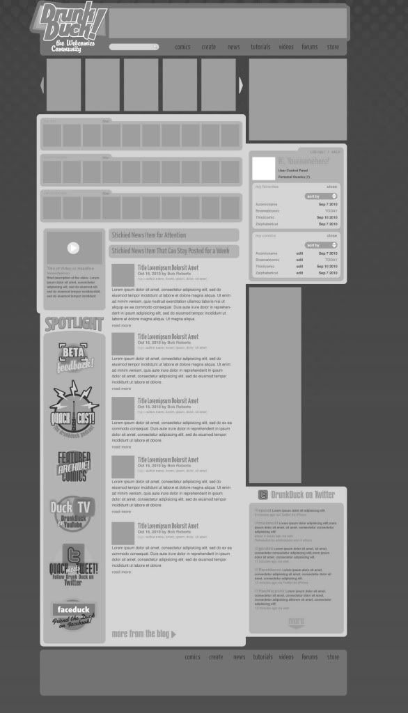
All I want is to make sure this change actually happens. The best way to do that would be to try and pick up on issues with the format of the actual designs as proposed, not focussing on personal issues with superficialities. Things like a “create” link being forefront on every page. How many times in a users history with the site will they actually click that to create a new comic? maybe 5, 10 tops? is tat really the best use of link space then?
-That sort of thing.
last edited on July 14, 2011 2:37PM
Product Placement at 7:23AM, Feb. 13, 2011
(online)
posts: 7,078
joined: 10-18-2007
ozoneocean
Yes! YOU came up with this idea in the first thread, that was YOUR baby and you deserve full credit for it.
What was that for? I wasn't demanding recognition for the idea. In fact, the first comment of mine (which you quoted in your big grand list of quotes) has me saying that I'm agreeing with Kroatz, who suggested the same thing. I was also well aware of srdht responded favorably to that suggestion.

If you're looking to give me credit for something then I did point out that I wanted to be able to scroll through a bigger list of PQ's instead of the initial 10 PQ's per page format that was first proposed. I'm happy to see that fixed, in the new setup.

I also pointed this out as a possible future improvement to the site.
Those were my two cents.
If you have any other questions, please deposit a quarter.
This space for rent.
last edited on July 14, 2011 2:53PM
Ironscarf at 9:04AM, Feb. 13, 2011
(offline)
posts: 1,911
joined: 9-9-2008
ozoneocean
I don't want to this whole thing to be stalled just because a few people have an aesthetic objection.

Crikey, how did a few comments about colour turn into an insurrection?! Now I've been tagged as a chromatic protestor, I feel obliged to camp out here in the DD square until our demands are met.

Edit: what were our demands again?

last edited on July 14, 2011 1:02PM
El Cid at 10:03AM, Feb. 13, 2011
(online)
posts: 1,273
joined: 5-4-2009
I sorta like the new color scheme, but I want to protest anyway. Seems to be what all the cool kids are doing these days.
last edited on July 14, 2011 12:20PM
HippieVan at 10:16AM, Feb. 13, 2011
(online)
posts: 3,003
joined: 3-15-2008
Ironscarf
ozoneocean
I don't want to this whole thing to be stalled just because a few people have an aesthetic objection.

Crikey, how did a few comments about colour turn into an insurrection?! Now I've been tagged as a chromatic protestor, I feel obliged to camp out here in the DD square until our demands are met.

Edit: what were our demands again?

I feel like our demands involved cookies. Well, now they do.
Solidarity!


I expect srhdt(sorry if I keep spelling your name wrong) will post on Monday about the colour stuff so we should probably go back to any other issues/suggestions for the redesign I suppose.
Duchess of Friday Newsposts and the holy Top Ten
last edited on July 14, 2011 12:49PM
skoolmunkee at 10:41AM, Feb. 13, 2011
(offline)
posts: 7,057
joined: 1-2-2006
Okay, so I think this thread has gotten a little bit out of hand. The color hijack was useful in that it shows us basically that whatever color design DD goes with, an ability for users to change the colors is a must. I do think that Ozone is right in that in the old thread, most of the color complaints came before the change to the background color and after that there were fewer people dissatisfied with it.

I don't think the point about the colors should be ignored (or any other points brought up), but the designers do need to consider:

1. How representative it is of the majority of users
2. Whether changing it will hold up production even longer

1 is relatively simple, 4 or 5 people in one thread who feel strongly is something which should't be ignored, but we don't have a true idea of the majority of people's feelings. Statistically, people who disagree are more likely to say something than those who agree, and people who have no problem with it don't really have any incentive to say anything about it at any stage as they don't care whether it stays or goes. It's a bit dangerous to go making big changes based on statements from what may be a relatively small number of people, in the absence of any ability to determine more accurate numbers.

2. It's very likely that ANY colour scheme is going to make the same amount of people equally unhappy (and in fact some people are very unhappy about the current color scheme with grey and blue), so any time spent on changing it (vs. time that could be spent on developing the changability feature) might be wasted. Meanwhile the discussion gets hung up on one specific issue rather than on looking at other things which could benefit from feedback, like the “create” link thing that Oz mentioned. If the site gets implemented with a “create” button that a lot of people think is useless but didn't say anything about because they were too busy talking about the color, that hasn't helped anyone.


I think what Wowio has done is sensible- they already modified the background green based on previous input and they're aware some people don't like the color scheme for various reasons. They've promised the ability to change the colors in some way, which is the ONLY thing they could do which would make EVERYONE happy. However in the interest of getting a functional site up and running, which they've been wanting to do since October's failed server move and which is needed more and more as time goes on, they need to have some kind of starting color scheme. They could get stuck in an endless cycle of proposing designs and getting feedback, meanwhile the site isn't actually getting developed. I'd rather have the site being worked on.


Anyway, I think we get that the color is something people would like to see Kinh address somehow, but it's likely to be another 24 hours at least before we'll hear back from Wowio about anything. Can people have a look at some other things which appear on the designs and not spend so much time on the color?
IT'S OLD BATMAN
last edited on July 14, 2011 3:44PM
lefarce at 12:05PM, Feb. 13, 2011
(online)
posts: 5,452
joined: 2-9-2006
ozoneocean
At the moment what we're getting from you guys in this thread is like the modern Neocon version of Reganisim where the story everyone now believes about that era is different to what things were like to those of us who can still remember.

I still believe what I believed before. Granted I'm glad they changed that terrible background, my issue was always with the bright greens, which included the top and bottom tables.

Hey so I got this crazy idea in my head. I decided to lift a that light green from the Facebook banner, and substitute the current color of the top table with it to create a more unified design, which would also add to its pastel feel by removing an obstructive bright color.


edit: oops I forgot the forum resizes things. Here's a link to the full image http://i52.tinypic.com/29bd3mf.jpg and yes I know the font for “forums” “tutorial” and the others is wrong and off center but oh well

last edited on July 14, 2011 1:34PM
A Reaver at 1:17PM, Feb. 13, 2011
(online)
posts: 196
joined: 1-10-2011
I am fine with these colours.
Because I'm colourblind.

Although a sent box will be a huge improvement.

Shiny new comic.
last edited on July 14, 2011 10:44AM
Salsa at 3:11PM, Feb. 13, 2011
(offline)
posts: 2,384
joined: 7-10-2008
skoolmunkee
1. How representative it is of the majority of users
2. Whether changing it will hold up production even longer


NOTE: I did read what you wrote, I just cut it out because there's no need in having twice as much text as necessary.

Okay, I'm just going to address the second point first. Unless the color is coded right then and there (which if you are trying to be standards compliant you won't), it literally takes about 15 seconds to change the color of the text, or anything on the page. It shouldn't take that much time, and unless they have to have any changes approved, they should be able to change it, load it up into a web-browser and take a snap shot of it, just to show the community. I'll give that actually coming up with a good color scheme would take awhile, but this is changing one color in the current scheme.

As for the first point, yes some people like loud colors, some people like highly saturated complementary colors right up against each other. Most people don't. I understand that the yellow and the blue probably come for the logo, but the logo doesn't hurt people's eyes because the the two are not up against each other. In this layout they are, and that's a problem. The front page is going to be what a lot of people see, and it needs to be able to keep readers. As for the whole argument about me and three or four other people being in the minority, I'm looking at this from a good design stand point. Good design means that everything has to be easy to read. Pale blue on pale yellow a) doesn't look that good, b) the contrast is too low, especially for the smaller text sizes.

Edit: I just realized I'm an Idiot and should have desaturated the colors. Oops, sorry.
RAGE!
last edited on July 14, 2011 3:19PM
Ironscarf at 3:17PM, Feb. 13, 2011
(offline)
posts: 1,911
joined: 9-9-2008
lefarce
Hey so I got this crazy idea in my head. I decided to lift a that light green from the Facebook banner, and substitute the current color of the top table with it to create a more unified design, which would also add to its pastel feel by removing an obstructive bright color.

That's a seriously great idea, which is why I already mentioned it. Great minds think alike, fools seldom differ, but either way, it looks really well balanced and apologies for not mentioning other, non colour related issues.
last edited on July 14, 2011 1:02PM
A Reaver at 3:21PM, Feb. 13, 2011
(online)
posts: 196
joined: 1-10-2011
Salsa
Image

I don't see the difference.

Shiny new comic.
last edited on July 14, 2011 10:44AM
Salsa at 4:54PM, Feb. 13, 2011
(offline)
posts: 2,384
joined: 7-10-2008
A Reaver
Salsa
Image

I don't see the difference.


Hehe, sorry about that, I just realized that I should have desaturated the image, not set the color-mode to grayscale, oops.^^;
RAGE!
last edited on July 14, 2011 3:19PM

Forgot Password
©2011 WOWIO, Inc. All Rights Reserved Mastodon