
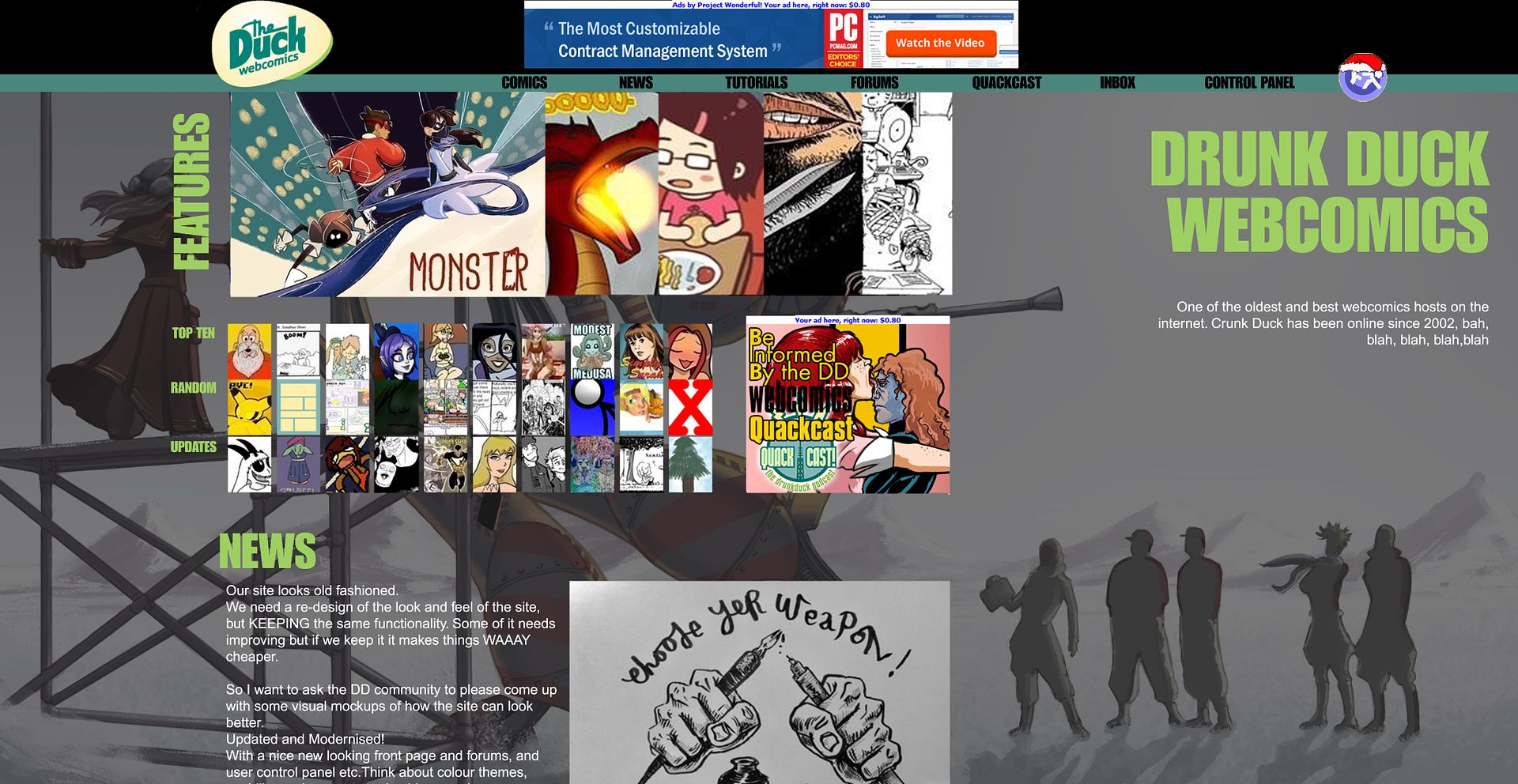
Our site looks old fashioned.
We need a re-design of the look and feel of the site, but KEEPING the same functionality. Some of it needs improving but if we keep it it makes things WAAAY cheaper.
So I want to ask the DD community to please come up with some visual mockups of how the site can look better.
Updated and Modernised!
With a nice new looking front page and forums, and user control panel etc.
Think about colour themes, usability, and try not to make things too busy.
also think about making it a modular design that can work well on different sized screens (mobile, huge TV, tablet).
Do not TELL me about what you WANT to see, You need to SHOW me! ^_^

Comic Talk and General Discussion *
DRUNK DUCK graphical redesign????
Ozoneocean
at 8:09AM, May 24, 2017
(online)
posts: 29,169
joined: 1-2-2004
No takers or interest at all?
That's quite disappointing.
That's quite disappointing.


KimLuster
at 9:21AM, May 24, 2017
(online)
posts: 795
joined: 5-15-2012
I, for one, tend to like the way DD is laid out. It seems easier to navigate that other comic sites I've visited. Other than (maybe) a fresh coat of paint (changing colors and images maybe…), what needs changing?!!
But then, I'm old fashioned myself! ;)
But then, I'm old fashioned myself! ;)


bravo1102
at 4:48PM, May 24, 2017
(offline)
posts: 6,374
joined: 1-21-2008
I'm not into fixing what isn't broken. This is actually a refreshing alternative to other sites which are often so in your face and difficult to navigate for anyone but a millennial.


Ironscarf
at 4:29AM, May 25, 2017
(offline)
posts: 1,958
joined: 9-9-2008
I would say this is in your face and difficult to navigate for anyone who isn't used to it. I regularly discover things myself that should have been obvious. Webtoon and Tapastic look more modern to me. They look a lot like other social media platforms, but how that would translate to our functionality I don't know. Ideally I would try to retain our quirkiness and adapt it to something more like that. Sorry, I'm telling not showing.
El Cid
at 8:23AM, May 25, 2017
(online)
posts: 1,273
joined: 5-4-2009
I was sort of thinking about giving it a try, but that's not something I could do in a week or two. You have to first see what these other sites are doing and figure them out, then find a way to adapt it to what we're doing here. Honestly, when I click on Webtoon I don't even know what's going on at first, and Taptastick looks to be a clone of the same layout, more or less. I think they're designed to viewed more on a phone than on a computer. If that's what we're going for – a Duck Mobile site – then I wouldn't even know where to start. I think I'll leave this to someone younger and hipper.
I'm usually in the ‘Don’t Fix What Ain't Broke' camp, but if there's a way to make the site more mobile device friendly without screwing it up for computer users, then I'm all for it. But other than cloning Webtoon and Taptastic, I don't know what that would look like.
I'm usually in the ‘Don’t Fix What Ain't Broke' camp, but if there's a way to make the site more mobile device friendly without screwing it up for computer users, then I'm all for it. But other than cloning Webtoon and Taptastic, I don't know what that would look like.
Amelius
at 11:12AM, May 25, 2017
(offline)
posts: 411
joined: 1-6-2004
I've got a mock-up somewhere, but it needs more work before I'd feel anywhere near confident sharing it… plus I'm way behind on 3 of my 4 comics so I gotta get some work out of the way before I get back to that! But I'll make an attempt.
I'm all for a redesign adapting the current functionality… but guys this “adhering to the status quo” attitude that ALWAYS comes up whenever a VISUAL UPGRADE is mentioned is a huge problem for this site! Stagnating like this is hurting DD. This is a FACT. This site is an effing Cul-de-Sac and I think you ALL know it. Familiar neighbors but nobody new comes through and when they do, it's just to turn around and go elsewhere.
Oz has taken on a lot with this site and I'm sure he wants to see it not just survive but THRIVE. DD is not thriving right now! We are being overlooked, ignored, and even disrespected.
The way comics are presented here leaves a lot to be desired in terms of window dressing on the main page. This isn't a place where authors want to host, let alone make it their webcomic's HOME. We're at best a dumping ground for mirrors that aren't being updated after the first batch of archive and a link gets dropped off. Why should they care? They baked a fancy cake and this site made people look at it through a pinhole. Maybe it'll churn into Quail's Random with other dead bloated corpses of comics and 1 person will see it and come to their actual website.
Of course we can't just make it look like Tapas or Hiveworks, but HELL guys, Smackjeeves just went through 2 design overhauls. The current one doesn't look as good as the previous change but the admin is trying their darndest, the user base is motivated and sharing feedback instead of digging in their heels at the mere suggestion of any change. WE ARE BEING LEFT BEHIND.
Our site looks more like a blog than a webcomic host right now. This stupid little track the content is squashed onto and all the dead space to the sides is just ridiculous, there's so much we could be doing with that space! It is not too much to ask that we at least put all this space to better use!
The tiny, tiny thumbnails were an improvement over the title text with no image in2006 but that should have been a stepping stone. We've had the thumbnails since what, 2007? It's been 10 years. That's AGES for something on the internet.
We can and should do BETTER.
I mean, gods… I think you guys are too entrenched in your comfort zones to realize that it's not just the content authoring experience that matters here– it's the READER EXPERIENCE. Most readers don't even bother making an account if there's at least RSS feeds. We aren't attracting new readers across the site because the site's main page presentation isn't set up to APPEAL to readers. It looks and feels like the comics are an afterthought.
It looks like a blog with a few thumbnails crammed at the top.
I'm getting the feeling that anyone who is opposed to the change hasn't actually been on another website besides DD for a while? ‘cuz just look at this.(And no disrespect intended to the comics I’m covering with thumbnails)

That's the entirety of the space dedicated to the comics– the reason this site exists– fitted into a SINGLE banner on the top of Tapas.
And Webtoon, up and coming competitor–

If you walked into a comic store and everything was bagged and boarded with the board over the cover– not the ads on the back— and a little postage stamp in the corner with a cropped picture from the comic therein– would you want to buy that comic? Would you give that comic shop your patronage? Would you even come back?
I don't want to slam on the news/blog but we dedicate WAY more space to it than the actual comics. Comparison to Webtoon's main page:

This is first and foremost a webcomic site. I appreciate what the blog brings to the site, it's unique among the other hosts out there and I enjoy the articles but this is practically the main focus when you consider the vertical dimensions… I think there could be a better balance here.
Heck, I feel even that putting all the comics in that little space even discourages people from scrolling down and reading the blog posts!
If we had more things along the sides where that wasted space is maybe? Place more things below the blog, like maybe a feed of our favorites… y'know, useful comic related stuff? But that's getting into functionality changes over aesthetic changes perhaps. I'm not asking for clutter, just USING the space we have to its fullest.
Now something positive… I love that we have comic descriptions and ratings. That's something we should definitely keep when considering the redesign. And from what I've read around, DD is a lot more stable than some of these other sites.
We just need to make the place presentable, make it look more like we're about comics. We've been left behind and we need to catch up to the rest of the webcomics hosts out there. Change is never comfortable, but it is absolutely necessary.
I'm all for a redesign adapting the current functionality… but guys this “adhering to the status quo” attitude that ALWAYS comes up whenever a VISUAL UPGRADE is mentioned is a huge problem for this site! Stagnating like this is hurting DD. This is a FACT. This site is an effing Cul-de-Sac and I think you ALL know it. Familiar neighbors but nobody new comes through and when they do, it's just to turn around and go elsewhere.
Oz has taken on a lot with this site and I'm sure he wants to see it not just survive but THRIVE. DD is not thriving right now! We are being overlooked, ignored, and even disrespected.
The way comics are presented here leaves a lot to be desired in terms of window dressing on the main page. This isn't a place where authors want to host, let alone make it their webcomic's HOME. We're at best a dumping ground for mirrors that aren't being updated after the first batch of archive and a link gets dropped off. Why should they care? They baked a fancy cake and this site made people look at it through a pinhole. Maybe it'll churn into Quail's Random with other dead bloated corpses of comics and 1 person will see it and come to their actual website.
Of course we can't just make it look like Tapas or Hiveworks, but HELL guys, Smackjeeves just went through 2 design overhauls. The current one doesn't look as good as the previous change but the admin is trying their darndest, the user base is motivated and sharing feedback instead of digging in their heels at the mere suggestion of any change. WE ARE BEING LEFT BEHIND.
Our site looks more like a blog than a webcomic host right now. This stupid little track the content is squashed onto and all the dead space to the sides is just ridiculous, there's so much we could be doing with that space! It is not too much to ask that we at least put all this space to better use!
The tiny, tiny thumbnails were an improvement over the title text with no image in2006 but that should have been a stepping stone. We've had the thumbnails since what, 2007? It's been 10 years. That's AGES for something on the internet.
We can and should do BETTER.
I mean, gods… I think you guys are too entrenched in your comfort zones to realize that it's not just the content authoring experience that matters here– it's the READER EXPERIENCE. Most readers don't even bother making an account if there's at least RSS feeds. We aren't attracting new readers across the site because the site's main page presentation isn't set up to APPEAL to readers. It looks and feels like the comics are an afterthought.
It looks like a blog with a few thumbnails crammed at the top.
I'm getting the feeling that anyone who is opposed to the change hasn't actually been on another website besides DD for a while? ‘cuz just look at this.(And no disrespect intended to the comics I’m covering with thumbnails)
That's the entirety of the space dedicated to the comics– the reason this site exists– fitted into a SINGLE banner on the top of Tapas.
And Webtoon, up and coming competitor–
If you walked into a comic store and everything was bagged and boarded with the board over the cover– not the ads on the back— and a little postage stamp in the corner with a cropped picture from the comic therein– would you want to buy that comic? Would you give that comic shop your patronage? Would you even come back?
I don't want to slam on the news/blog but we dedicate WAY more space to it than the actual comics. Comparison to Webtoon's main page:
This is first and foremost a webcomic site. I appreciate what the blog brings to the site, it's unique among the other hosts out there and I enjoy the articles but this is practically the main focus when you consider the vertical dimensions… I think there could be a better balance here.
Heck, I feel even that putting all the comics in that little space even discourages people from scrolling down and reading the blog posts!
If we had more things along the sides where that wasted space is maybe? Place more things below the blog, like maybe a feed of our favorites… y'know, useful comic related stuff? But that's getting into functionality changes over aesthetic changes perhaps. I'm not asking for clutter, just USING the space we have to its fullest.
Now something positive… I love that we have comic descriptions and ratings. That's something we should definitely keep when considering the redesign. And from what I've read around, DD is a lot more stable than some of these other sites.
We just need to make the place presentable, make it look more like we're about comics. We've been left behind and we need to catch up to the rest of the webcomics hosts out there. Change is never comfortable, but it is absolutely necessary.
KimLuster
at 12:33PM, May 25, 2017
(online)
posts: 795
joined: 5-15-2012
I wasn't being lazy ;) I preferred Windows XP and 7 (concise menus, tree views of files and directories), over Windows 8 or Apple (with those panels and icons just floating all over the place…) Most of the other comics sites I've been to have that free-floating look that makes me feel lost… It feels like I'm toiling just to sift through comics…
Maybe I'm just showing my age. I much prefer music from the 70s and 80s over anything modern (esp. modern pop)
But, if it means a more vibrant community here I certainly will accept any change (I can learn new stuff…). That said, I'm no graphic artist, and crafting something that ‘looks modern’ would be like thinking in Cantonese for me…
stinger9
at 1:28PM, May 25, 2017
(offline)
posts: 55
joined: 10-1-2007
Okay, time to make a mockery of the word mock-up!
Going along with the idea of comics taking up too little space, assuming the side parts serve a purpose (I know some sites don't use them, but I've seen others with decent layouts have them too, so, I don't know), and keeping the general feel and theme intact, I very hastily threw something together just for ideas sake (Image may be big, not sure if they scale or not):

Okay, like I said, very rough, and looking now I forgot to move the user/feature part over to the right a little. Obviously, not saying it should be offset that way! But, removing that one ad that only ever advertises the Quackcast (Seems a little unnecessary, and I'd assume doesn't really do much) Possibly more ads could be placed in the space alongside the blog if need be, or shift everything down and put and extra banner ad in, not sure.)
Removing the spotlight section (Too big, could probably be put in smaller buttons somewhere, somewhere alongside the blog) The comic thumbnails are bigger, possibly making higher resolutions available, user box shifted up to the left side alongside the features to save some space, as well as removing a lot of empty space on it to reduce it's foot print. Same goes all over, there's a lot of unneeded space between things which could be better used. I cut some space out between the three thumbnail sections, It's a little more cluttered, but doesn't seem like it would be too cluttered, if that makes sense. One change I didn't make was the Quail's Random section. I do think that isn't entirely needed, so many dead comics. Maybe even doubling up the latest updates would be worth thinking of, that way twice as many updating comics can get representation. At a push, the thumbnails could possibly be a little smaller to allow for even more to be visible.
Basic functionality is still there, and the visual changes are basic, some revamped graphics wouldn't hurt, I'm sure there's something that could be done there, but that's not really what I'm looking at.
And again, this is really just some vague ideas, that's not flat-out what I'm suggesting!
Going along with the idea of comics taking up too little space, assuming the side parts serve a purpose (I know some sites don't use them, but I've seen others with decent layouts have them too, so, I don't know), and keeping the general feel and theme intact, I very hastily threw something together just for ideas sake (Image may be big, not sure if they scale or not):
Okay, like I said, very rough, and looking now I forgot to move the user/feature part over to the right a little. Obviously, not saying it should be offset that way! But, removing that one ad that only ever advertises the Quackcast (Seems a little unnecessary, and I'd assume doesn't really do much) Possibly more ads could be placed in the space alongside the blog if need be, or shift everything down and put and extra banner ad in, not sure.)
Removing the spotlight section (Too big, could probably be put in smaller buttons somewhere, somewhere alongside the blog) The comic thumbnails are bigger, possibly making higher resolutions available, user box shifted up to the left side alongside the features to save some space, as well as removing a lot of empty space on it to reduce it's foot print. Same goes all over, there's a lot of unneeded space between things which could be better used. I cut some space out between the three thumbnail sections, It's a little more cluttered, but doesn't seem like it would be too cluttered, if that makes sense. One change I didn't make was the Quail's Random section. I do think that isn't entirely needed, so many dead comics. Maybe even doubling up the latest updates would be worth thinking of, that way twice as many updating comics can get representation. At a push, the thumbnails could possibly be a little smaller to allow for even more to be visible.
Basic functionality is still there, and the visual changes are basic, some revamped graphics wouldn't hurt, I'm sure there's something that could be done there, but that's not really what I'm looking at.
And again, this is really just some vague ideas, that's not flat-out what I'm suggesting!
last edited on May 25, 2017 1:29PM
bravo1102
at 5:01PM, May 25, 2017
(offline)
posts: 6,374
joined: 1-21-2008
“If it ain't broke, don't fix it” applies to things that aren't broken. Amelius just proved (magnificently, I might add) that it's broken.
I never notice the dead space because I zoom in to read. I shouldn't have to do that. It should all be function, hover and choose, not moving a mouse that does not exist for most readers these days.
I never notice the dead space because I zoom in to read. I shouldn't have to do that. It should all be function, hover and choose, not moving a mouse that does not exist for most readers these days.
Ozoneocean
at 12:57AM, May 26, 2017
(online)
posts: 29,169
joined: 1-2-2004
Amelius and Stinger, that's some really interesting stuff.
Actually, Amelius, your two images that show how much space our thumbnails use would be pretty good layouts in their own right: thumbnails floating on top of a bigger background image.
That would be very easy to resize for mobile screens. Items can be modular and more around to fit.
(I personally hate mobile only sites and personally prefer sites that are resizeable)
We have a lot to think about…
- We need ads (BTW- The Quackcast ad comes up in no one has paid for an ad in your region, there may be ads there, but they're only shown in Europe, Asia etc)
- We need a log-in info somewhere (can be in the top bar)
- We need some way to show the comics IN the site. (i.e. thumbnails)
- We need News to be somewhere prominent (but we don't need the whole archive on show.)
- Need to decide on the maximum and minimum screen res…
THAT is probably the most important figure to start with because we need to design around it.
Both my main screens are 1600 wide. And those aren't super high res in today's world.
DD is set at 1000 pixels wide. That's not much. The res on my phone is 2,560 x 1440 pixels, but that doesn't matter because DD is automatically zoomed up on it… I think for phones we have to consider that the site will be at its most compact regardless of resolution.
WHAT are people's screen resolutions?
Ironscarf
at 4:01AM, May 26, 2017
(offline)
posts: 1,958
joined: 9-9-2008
My main screen in 1920.
I have some suggestions based on the work I do, which involves trawling through endless websites. After a couple of hours of this my tired eyeballs cry out for breathing space, especially white or off-white space. I'll try to put some roughs together later, just to throw my hat into the ring.
When it comes to ads, they have to be integrated in such a way as not to conflict with the content. Our top banner for instance, is currently telling me that The Duck Webcomics specialises in customizable contract management systems. Far better to display the ad and then the content, like this.
last edited on May 26, 2017 4:13AM
Ozoneocean
at 11:12AM, May 26, 2017
(online)
posts: 29,169
joined: 1-2-2004
Haha, those ads are earning us some decent money… The square one isn't up to much though. :(
stinger9
at 5:30PM, May 26, 2017
(offline)
posts: 55
joined: 10-1-2007
Hah, I actually don't think I'd ever seen a real ad in the square box until just after posting that! Now I seem to be seeing them half the time! Whelp, my mistake! Guess advertisers are just less likely to go for the EU traffic, really.
Although, that does kind of complicate things a little there must be something that can be done to keep all of them, but use space better, but honestly, I'm blanking on it!
1080p on PC, around the same on tablet, and occasionally I check on a phone with a 320x240 screen… okay, last one is kind of an outlier, and guessing I figured out what the side borders do. Some things still use 4:3, and sites need to support vertical displays.
Guess this isn't much help though, I'm just tossing out ideas at this point, I'm slowly remembering why I never got into web-design!
bravo1102
at 1:35AM, May 27, 2017
(offline)
posts: 6,374
joined: 1-21-2008
A couple of years ago that box ad was used to increase participation in the Drunk Duck awards. Cost someone a pretty penny.
In the US, where the majority of click through traffic comes from, that box ad is almost always rented. It's often the first thing I see when I open the page. If you want to see something there, bid on it on Project Wonderful and you'll see how much it costs. ;)
In the US, where the majority of click through traffic comes from, that box ad is almost always rented. It's often the first thing I see when I open the page. If you want to see something there, bid on it on Project Wonderful and you'll see how much it costs. ;)
last edited on May 27, 2017 1:38AM
Ozoneocean
at 5:52AM, May 27, 2017
(online)
posts: 29,169
joined: 1-2-2004
I've just done a newspost on it where I include everyone's designs (thanks Stinger and Amelius!).
It's really helpful to know people's screen res too. :)
1080p usually means 1920 wide, right? That's a good size.
Here's my own mockup of the front page (click to see it a bit bigger):
Taking into consideration what people have said so far and the designs of Stinger and Amelius, I came up with that…
Design considerations:
1. All the thumbnails and the feature images are far larger than they are now.
All links, including user login are in the top bar. (There may need to be more, like the search function I forgot to add)
3. When you mouse over a thumbnail it will show twice its size, along with the comic description.
4. The same thing happens with the features. The current feature is largest.
5. The titles of the top ten, features etc are links that take you to listings of those things: random comics, the top list of all comics, all features, all updates.
6. the News section is bellow the comics stuff, There are 5 articles like now in a scroll, and there will be a skyscraper ad on the side.
7. Neutral background image, no side bars, no icon links done the left.
8. Some text about DD on the right.
9. The site is aligned a bit to the left. But it's modular and things can move around to work better in a smaller window size i.e. the news images will go above the news etc.)
last edited on May 27, 2017 5:53AM
Ironscarf
at 6:21AM, May 27, 2017
(offline)
posts: 1,958
joined: 9-9-2008
Question: are we able to call ourselves Drunk Duck again now?
This is already a vast improvement. I would still make the thumbnails bigger, maybe by putting 10 in a single block where you can select recent updates, top comics, random comics and even a genre dropdown on a top bar in the same shade of verdigree. That may be changing the functionality - I'm not tech savvy enough to know. I'll try to do a visual of it.
Could you post a link for just the background image?
last edited on May 27, 2017 6:25AM
Ozoneocean
at 6:52AM, May 27, 2017
(online)
posts: 29,169
joined: 1-2-2004
Ironscarf wrote:
Question: are we able to call ourselves Drunk Duck again now?
This is already a vast improvement. I would still make the thumbnails bigger, maybe by putting 10 in a single block where you can select recent updates, top comics, random comics and even a genre dropdown on a top bar in the same shade of verdigree. That may be changing the functionality - I'm not tech savvy enough to know. I'll try to do a visual of it.
Could you post a link for just the background image?
Here's the BG image:
http://s3.amazonaws.com/media.drunkduck.com/users/ozoneocean/assets/BGr-small-JUST-BACKGROUND.jpg
Any background image is good as long as it's muted enough.
I have an idea that we'd have about 5 different ones that the site would rotate throughout depending on the reload.
I'm not sure what you mean with the rest… I sort of do…
OK, maybe instead of hiding the other rows we could overlap them a bit in a vertical stack. Mousing over a row would bring it to the top.
That wouldn't be a functionality thing, just more CSS layout stuff.
Jason Moon
at 2:20PM, May 27, 2017
(offline)
posts: 33
joined: 5-15-2017
I like the look of the new layout. Im excited you guys are deciding to update. Another thing is friends who have logged into the site have told me they have a hard time spotting the smaller captions so maybe new brighter color schemes are a good idea as Ive seen others suggest.
thunderdavid
at 3:11PM, May 27, 2017
(online)
posts: 32
joined: 1-26-2016
I would like to suggest a couple things for the site.
For the Feature Comics, I would like to see a ‘slide show’ effect. The icon/ comics scrolling across.
Enlarge other comic icons. Fill the page up with them. There is too much dead space or margin.
And for those icon with NO picture… they gotta go. Advise the User they need some icon for their book. I under stand Adult comics will display “A”. but for the other books they need a image.
Wells, that's all I can think of.
bravo1102
at 10:29PM, May 27, 2017
(offline)
posts: 6,374
joined: 1-21-2008
To build on thunderdavid's post. Adult would keep the red A. Those comics without icons could have an explicit “no image” icon. So like the adult comics It's blatantly obvious what you have.
A creator who can't be bothered to upload an image icon, obviously the comic isn't worth looking at. Hit them over the head with that. ;)
A creator who can't be bothered to upload an image icon, obviously the comic isn't worth looking at. Hit them over the head with that. ;)
jerrie
at 12:22AM, May 28, 2017
(offline)
posts: 31
joined: 7-14-2007
I like the site the way it is. its easy to use and upload pages
I agree with folks that say ‘'Dont fix what isnt broken.
maybe its because I’m old, too, I like things simple.
KimLuster had said this, and I laughed when I read it, because I felt the same way…I liked windows xp and windows seven. when they upgraded to windows ten I went friggin crazy, and had windows seven re-installed.
if the site is working fine….why change it?
stinger9
at 2:06AM, May 28, 2017
(offline)
posts: 55
joined: 10-1-2007
The phrase “If it's not broken, don't fix it” doesn't really make much sense here. Things can be improved, therefore, it's “broken”. It may not be literally broken, but if there's a chance that changing things can improve the site overall, there is reason to try and fix it.
If the site was working fine, we'd be back to how things were, when DD was one of the biggest and best. Failing to keep up with things, to actually draw in users, has the potential to be the death of things. It's not like it's a case of changing the site in such a way to make it a shadow of its former self, it's a fresh lick of paint.
The current site layout may not have been the main reason people left, but it's a contributing factor to why we don't draw in as many as we could.
Ozoneocean
at 3:29AM, May 28, 2017
(online)
posts: 29,169
joined: 1-2-2004
All of this:
That's too expensive :D
Just updating the look a bit. So that when people come here it doesn't feel spammy, mouldy and old.
We need new people to stay healthy ad we're losing out to all the other webcomic hosts because we're not seen as equal- even if we actually have a more solid and reliable site than most others (maybe all of them). We look so much older that no one realises that.
stinger9 wrote:Like Stinger says; We're not changing functionality.
It's not like it's a case of changing the site in such a way to make it a shadow of its former self, it's a fresh lick of paint.
The current site layout may not have been the main reason people left, but it's a contributing factor to why we don't draw in as many as we could.
That's too expensive :D
Just updating the look a bit. So that when people come here it doesn't feel spammy, mouldy and old.
We need new people to stay healthy ad we're losing out to all the other webcomic hosts because we're not seen as equal- even if we actually have a more solid and reliable site than most others (maybe all of them). We look so much older that no one realises that.
Ironscarf
at 6:29AM, May 28, 2017
(offline)
posts: 1,958
joined: 9-9-2008
It's all true. The only reference to this site I ever see is “The Duck is dead” and that's coming from sites that can't even manage a newspost, let alone all the great content we have.
People like to stick with what they know. They come here and see the same old thing and go away safe in the knowledge that The Duck is dead, without having to actually look. Give them a reason to look, and give ourselves a look that makes them want to stick around.
That egg up there is kind of symbolic of our current state.
El Cid
at 6:25PM, May 28, 2017
(online)
posts: 1,273
joined: 5-4-2009
Hmm, maybe just to make it more “in your face” that this is a newer and improveder version of the site, you could change the logo to say “The NEW Duck Webcomics?”
Or would that be too cheesy?
Or would that be too cheesy?
Luccia
at 7:53PM, May 28, 2017
(offline)
posts: 125
joined: 3-24-2010
Ironscarf wrote:
It's all true. The only reference to this site I ever see is “The Duck is dead” and that's coming from sites that can't even manage a newspost, let alone all the great content we have.
People like to stick with what they know. They come here and see the same old thing and go away safe in the knowledge that The Duck is dead, without having to actually look. Give them a reason to look, and give ourselves a look that makes them want to stick around.
That egg up there is kind of symbolic of our current state.
Hatch the egg!!
Ironscarf
at 3:33PM, May 29, 2017
(offline)
posts: 1,958
joined: 9-9-2008
This is Ozone's design with a few additions: Wider top bar, loads more prominence for updating comics with other categories underneath and a mention of the new and improved status. Oh, and no egg! Click image for larger version.

last edited on May 29, 2017 3:41PM
Ozoneocean
at 7:27PM, May 29, 2017
(online)
posts: 29,169
joined: 1-2-2004
Nice and bold!
Well done. I like your variation.
Well done. I like your variation.
plymayer
at 10:31PM, May 29, 2017
(online)
posts: 262
joined: 11-5-2008


©2011 WOWIO, Inc. All Rights Reserved Mastodon