
Hello everyone, and welcome to Panel by Panel, a periodic exploration of comic panels around The Duck. This week as I weigh possible panel challenges for later updates, I wanted to return to our more usual analysis of panels. This week we're turning to the comic Heaven Hunters by TedGreavesArt to check out how they split the focus of the reader between two concurrent moments.
This is from the most recent update, issue 9, page 24. Specifically, we are looking at the last panel on the page.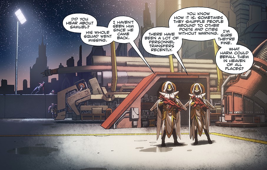
This large panel with plenty of detail plays with foreground and background elements to split the reader's attention between two simultaneous instances. It is also extremely well handled. We have a foreground conversation with brightly lit foreground figures taking up the space of roughly half of the large panel.
But we also have several characters in the background on the left-hand side of the panel, filling in about a quarter of the space of the panel. We are being asked to focus on two things, but they maintain their unique sense of time and movement and make for a cohesive whole.
But how is this working?
Well, I think specifically, we are looking at three things at play here: size, brightness, and scanning.
Size is obvious; the most attention we pay toward the panel is initially the two armed guards conversing. The figures take up about half of the panel, while their conversation sprawls over three-quarters of the panel. They take up a lot of focus, especially compared to the silent team in the rear. We also should consider the panel's size; This is more real estate on this panel compared to other panels on the same page. The extra room allows for a more natural environment to play with a sense of depth. Even the smaller size of the figures in the back provides an advantage, though we may not read them initially until we consider the brightness.
With brightness, the heavy spotlight over the conversing figures draws the eye to the foreground. However, there is a less intense but still noticeable spotlight on the background figures. These two intensities naturally draw our eyes; we're likely to focus on the brightest light on the page, which happens to be on the conversing figures we're meant to notice. However, our eyes also pick up on gradual variations in lighting, and as we scan the panel, we're likely to pick up the less intense but still noticeable background spotlight on our mystery team.
When it comes to scanning, the human eye can make many different scans of an image or an environment very quickly and over multiple points of interest. Not going to dive too deeply into the mechanics of vision, but pattern recognition is key. We're wired to recognize patterns at a subconscious level and, more importantly, follow them. If you notice the position of these two groups of characters in the context of the panel's “shot” and detail, you may notice a diagonal flow from the mid left to the bottom right. 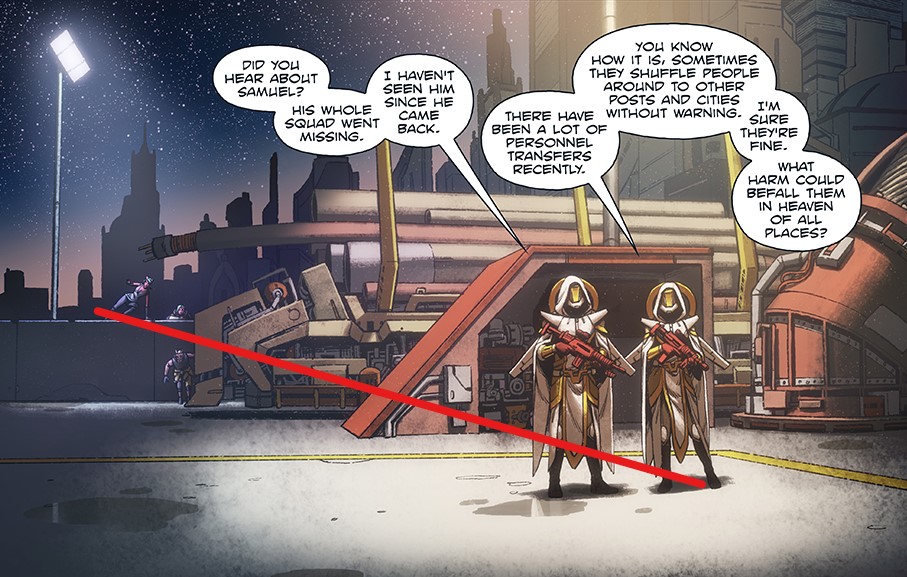
You could draw a line from one point to another with a ruler. Likely as anyone scans the page, they may recognize the diagonal nature of the arrangement but are initially drawn to the bright spot… however your eyes still detect the pattern, and you are likely to scan that diagonal direction anyway, probably in reverse.
So yeah, based on what I can tell, these three elements at play make this panel work so well and spit the reader's focus in a fun way.
____________
Don’t forget you can now advertise on DrunkDuck for just $2 in whichever ad spot you like! The money goes straight into running the site. Want to know more? Click this link here! Or, if you want to help us keep the lights on you can sponsor us on Patreon. Every bit helps us!
Special thanks to our patrons!!


Justnopoint - Banes - RMccool - Abt_Nihil - Gunwallace - PaulEberhardt - Emma_Clare - FunctionCreep - SinJinsoku - Smkinoshita - jerrie - Chickfighter - Andreas_Helixfinger - Tantz_Aerine - Genejoke - Davey Do - Gullas - Roma - NanoCritters - Teh Andeh - Peipei - Digital_Genesis - Hushicho - Palouka - cheeko - Paneltastic - L.C.Stein - dpat57 - Bravo1102 - The Jagged - LoliGen - OrcGirl - Miss Judged - Fallopiancrusader - arborcides - ChipperChartreuse - Mogtrost - InkyMoondrop - Jgib99 - Hirokari - Orgivemedeath Ind - Mks Monsters - GregJ

Panel By Panel: 'Heaven Hunters' and Splitting the Focus
hpkomic at 3:40PM, March 10, 2023
9 likes!


©2011 WOWIO, Inc. All Rights Reserved Mastodon
skyangel at 11:24AM, March 12, 2023
That's a really impressive panel and it shows great mastery of the art of making comics. There's a rule of composition that says the subject should always be off centre, preferably a third in from either side and it works perfectly here for both centres of action. I also love how the perspective of the buildings leads the eye to the same spot where the action is happening. The use of the lighting is the cream on the cake!
PaulEberhardt at 8:14AM, March 12, 2023
That's another excellent panel that's really been thought through. I've always been a sucker for background action as a cool way to add liveliness to a scene.
Jason Moon at 12:34PM, March 11, 2023
I LOVE this comic! Ted is an amazing artist! It surprised me when he told me that he was color blind because his colors are beyond anything I've ever seen. His work is cleaner than paid Marvel artists.