
Hello everyone, and welcome to Panel by Panel, a periodic exploration of comic panels around The Duck.
This week I want to explore one element of art I have been thinking about lately as I color comics for some other creators. Before that, however, I needed to find a comic. This week, we'll be looking at one of the many one-panel comics of Mister V's Them There Hills. You can find several of Mister V's other comics under his user profile, where he goes by arborcides.
This time, we're looking at comic 293 in the Them There Hills archive.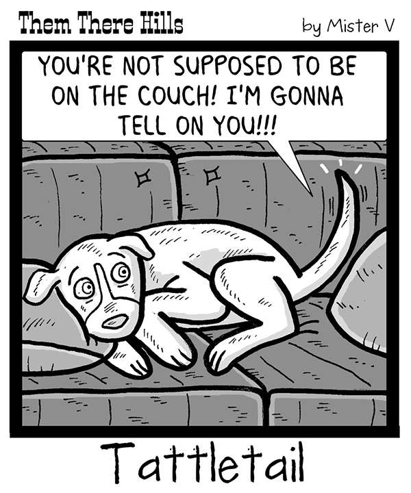
Them There Hills is a fun comic that reminds me a great deal of Gary Larson's The Far Side. The comics are usually one-panel strips that drop a joke in juxtaposing the image and the caption below. But that is not why I brought up the comic this week.
I want to talk about contrast. Specifically, I want to talk about value contrast which is fairly important to how readable a black and white comic can be. Allow me to quote the site I just linked regarding value contrast: "Value Contrast: Refers to the contrast between light and dark colors. Every color has an underlying level of lightness. A saturated yellow is lighter than a saturated blue. So when you place a yellow next to blue, there is a contrast in hue and value."
For comics that use black and white or shades of grey, this contrast becomes very important because, without the interplay of various values, those images can lack depth, and the focus can be lost. Another way to think about it is that lighter colors feel closer visually than darker ones. Essentially an object can pop out or fade backward based on its value and the associated values surrounding it.
Now, as a whole, I think strip #296 of Them There Hills does an excellent job with the value contrast present in the strip. Beyond stark black and white, there are three major values for objects in the comic, with some mid-values used for shading. This allows the objects to remain separate and not blend into an amorphous blob when it comes to greys. Particularly, the color for the dog, the focus of the comic, pops quite well from a background with distinct objects but is also not as important as the dog. It is pretty tough to make shades of grey look appealing, but the usage of value contrast makes it possible. I think the values between the couch and the cushion can be a bit muddy here, but then again, the couch and cushions are also sorts of a single object to the dog and his tail here. I'd of probably lightened the cushions just a little more.
Value contrast is part of why black and white movies, while lacking hue, often look so damn good; value contrast is something the cinematographer shoots for to emphasize characters or places in the frame where the eye is drawn.
Take two examples here from classic films Casablanca and Dracula. Look at how value contrast lets us know where our eyes should focus and what is important in the frame.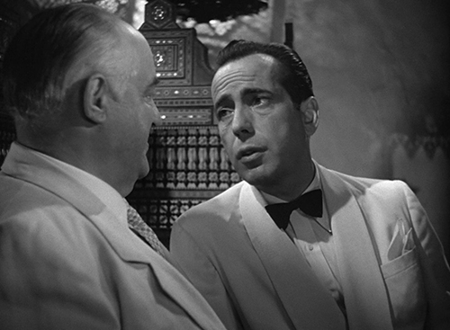
Notice how the lighting on Humphrey Bogart's face creates a lighter value than the surrounding scene and even lights him up differently than the other gentleman. I wonder who is the focus of the framing here?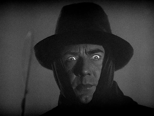
Good ol' Bela Lugosi's eyes are the focus here; the high contrast of the whites gives him a supernatural appearance. The rest of him is still distinctive from the background, but the eyes are definitely the focus.
This week, I don't want to dwell on this topic for too long. I think I want to revisit it in the next post, however, in the context of color comics. Before we go, let me ask you this: if you have a comic that is in full color, have you ever seen how it looks in black and white? If not, try it. That's part of the topic next time.
Anyway, that's it for me this week. Why not take some time to check out Mister V's Them There Hills and drop him a like and some comments?
____________
Don’t forget you can now advertise on DrunkDuck for just $2 in whichever ad spot you like! The money goes straight into running the site. Want to know more? Click this link here! Or, if you want to help us keep the lights on you can sponsor us on Patreon. Every bit helps us!
Special thanks to our patrons!!


Justnopoint - Banes - RMccool - Abt_Nihil - PhoenixIgnis - Gunwallace - Cdmalcolm1 - PaulEberhardt - dragonaur - Emma_Clare - FunctionCreep - Eustacheus - SinJinsoku - Smkinoshita - jerrie - Chickfighter - Andreas_Helixfinger - Tantz_Aerine - Epic Saveroom - Genejoke - Davey Do - Spark of Interest - Gullas - Damehelsing - Roma - NanoCritters - Scott D - Bluecuts34 - j1ceasar - Tinchel - PhillipDP - Teh Andeh - Peipei - Digital_Genesis - Hushicho - Sad Demon Comics - JediAnn Solo - Kiddermat - BitterBadger - Palouka - cheeko - Paneltastic - L.C.Stein - Zombienomicon - dpat57 - Bravo1102 - The Jagged - LoliGen - OrcGirl - Miss Judged - Fallopiancrusader - arborcides - ChipperChartreuse - Jaybiejay - Chris_tar

Panel By Panel: Them There Hills and Value Contrast
hpkomic at 8:43AM, Sept. 23, 2022
6 likes!


©2011 WOWIO, Inc. All Rights Reserved Mastodon
Ironscarf at 9:42AM, Sept. 24, 2022
To answer your last question, I have and the results don't look good! I'm trying to work mainly with colour contrast and harmony more than tonal contrast. You can do both, but then colour takes less of a starring role I'd say.
Ironscarf at 9:27AM, Sept. 24, 2022
Nice Post and an great topic to focus on.
Ozoneocean at 6:43AM, Sept. 24, 2022
Interesting perspective! Working with limited tones is very difficult to do.