Hello, everyone, and welcome to Panel by Panel, a periodic exploration of comic panels around The Duck. As we established last time, this week we'll be going over the community feedback on a webcomic page provided by a volunteer. I'll also share my thoughts as well.
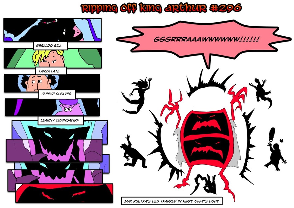
As for our next workshop focus, I have pulled the next user up from the initial post. For next time, I want everyone to look over this page, volunteered by arspitzer, titled “#296a Just Put It Out of Its Misery Part Twenty-Five”. This is from their comic, Ripping Off King Arthur.
I'll post the page here for reference as well as their comment: “Sadly, my most interesting and confusing layout is NSFW. But here's one where I break that whole never make your last panel a long vertical one.”
Our first feedback example this week comes from HawkAndFloAdventures, who writes: “The more I look at Ripping off King Arthur the more I actually like it. At first I wasn't sure what was going on with the page It took me a 2nd look to realise the characters surrounding the GRAWWWW! Were silhouettes. The poses are fairly well executed, my only real issue with this page is i'm not entirely sure which order I'm supposed to be reading. Do I look at the Big Grawww first? or do I look at the panels on the left ^^? After a few tries I get the sense I read the stuff on the left first then see the GRAWWW, even though my attention is first and foremost on the Grawww.”
HawnAndFlowAdventures is right on the money, emphasizing the “Graww” creature, as it catches the eye. The panel itself is striking as it relies on a limited color palette and largely silhouetted figures, which can be quite stylish. In contrast, I do not necessarily struggle with panel flow here, as we're going with a typical Western comic style. The page's action, subtle that it is, does provide a logical sequence as the creature transforms in the vertical column.
I think it does a pretty good job of leading the eye from panel to panel until it opens up into the larger image. The quality of the image is fine given the visual style of the comic. The part that is most interesting is the silhouette panel, but it contrasts well with the stack of relatively more detailed panels that grow increasingly condensed. There is almost a spring-like motion to it all, with compression to expansion.
Regarding the submission comment made by arspitser, about the “rule” of never making your last panel a long vertical one, I can't say I've really ever heard that rule. Given the orientation of the page, it doesn't matter much anyway as the page really only works because the final panel is so large compared to the preceding panels.
The real problem is context: I really have no idea what is going on and the page order on the Duck site does not logically make sense, making this comic a bit tough to read. I found myself getting a little confused by the names of pages in the dropdown and some errors in the website navigation. For example, clicking on the previous button to get some context on the page brought me to what is basically an advertisement for a remastered series of strips. I am not sure what the issue is, and it falls outside the panel discussion, but I felt I should mention it. I was able to piece things together, but if the plan is to announce something as an update, it may be best saved at a natural division point between stories and chapters.
But that is what we have for this week. Thank you. Next time we're switching to a different sort of post, then we'll get back to running down the workshop list.
If you want to find earlier editions of Panel By Panel, click here.
____________
Don’t forget you can now advertise on DrunkDuck for just $2 in whichever ad spot you like! The money goes straight into running the site. Want to know more? Click this link here! Or, if you want to help us keep the lights on you can sponsor us on Patreon. Every bit helps us!
Special thanks to our patrons!!


Justnopoint - Banes - RMccool - Abt_Nihil - Gunwallace - PaulEberhardt - Emma_Clare - FunctionCreep - SinJinsoku - Smkinoshita - jerrie - Chickfighter - Andreas_Helixfinger - Tantz_Aerine - Genejoke - Davey Do - Gullas - Roma - NanoCritters - Teh Andeh - Peipei - Digital_Genesis - Hushicho - Palouka - cheeko - Paneltastic - L.C.Stein - dpat57 - Bravo1102 - The Jagged - LoliGen - OrcGirl - Miss Judged - Fallopiancrusader - arborcides - ChipperChartreuse - Mogtrost - InkyMoondrop - Jgib99 - Hirokari - Orgivemedeath Ind - Mks Monsters - GregJ - Soushiyo - JohnCelestri - TottyComics - Casscade - Salexander - Willed

Panel By Panel: Workshop Week - 'Ripping Off King Arthur'
hpkomic at 9:18AM, June 7, 2024
6 likes!


©2011 WOWIO, Inc. All Rights Reserved Mastodon


arspitzer at 10:25AM, June 8, 2024
Oh and here's how to read Ripping Off King Arthur on The Duck: #1-213 all are here: https://www.theduckwebcomics.com/Ripping_Off_King_Arthur_Redone_Art_Edition/ #214-#239 is The Suicide in Destiny City Story (which is self-contained and you don't need to read any of the previous strips to understand it) is here: https://www.theduckwebcomics.com/A_Suicide_in_Destiny_City/ And #241-To the Present Day strips should be here: https://www.theduckwebcomics.com/Ripping_Off_King_Arthur/ (There might be some Phnne ot im Frdayy that aren't on The Duck -- but no real loss there)
arspitzer at 10:25AM, June 8, 2024
Thanks for the comments and suggestions about that panel. And, yeah, all the ROKA stuff on The Duck is a bit of a mess. Although everything from #248 to the present should be in the right order (despite occasionally having nonsense like ads for redone strips interspersed in them -- the price of free stuff on the web). My own ROKA website is a bit more orderly.
marcorossi at 12:42AM, June 8, 2024
As plymayer says, the eye is attracted first to the big right panel and only later to the left small ones, so to me the effect is that of contemporaneity: some action is happening (big panel) and we also look at the onlookers (small panel) at the same time.
plymayer at 7:03PM, June 7, 2024
The only issue I see with the large last panel is that it immediately grabs the reader's attention stealing it away from the other panels. Not necessarily a bad thing but there it can be.