
Hello, everyone, and welcome to Panel by Panel, a periodic exploration of comic panels around The Duck. As we established last time, this week we'll be going over the community feedback on a webcomic page provided by a volunteer. I'll also share my thoughts as well.
Our first volunteer was KAM, who provided us with a page of their comic, The KAMics. This page is called “Where the Bottle Takes You 5” and I will also provide the page here for reference.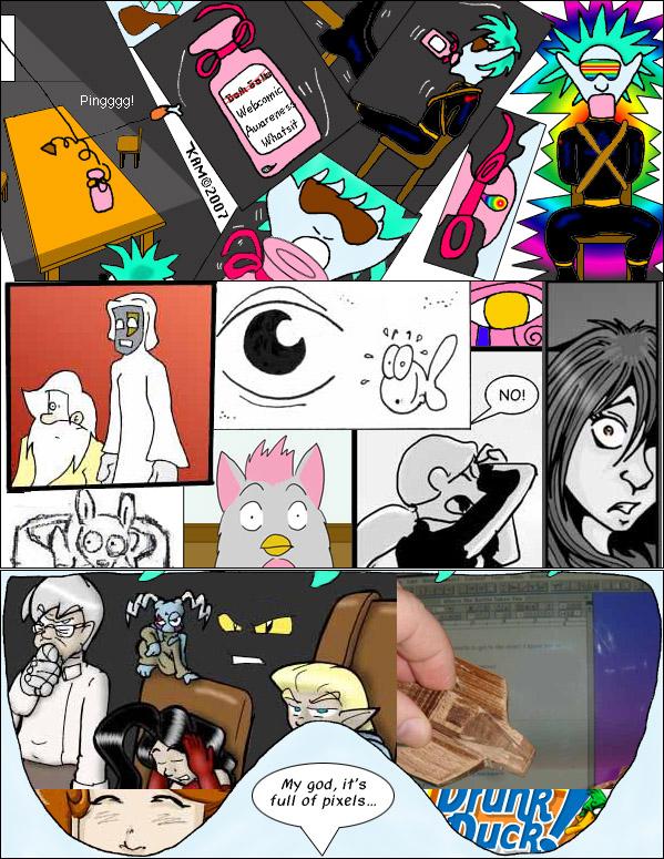
So, what did the community have to say about the page?
Our first example comes from HawkandFloAdventures, who writes:
it's quite the sensory overload. The Furby looking creature I like the look of. The page as a whole looks like a sort of wild trip of sorts. Reminds me a bit of Beavis and Butthead do America when they're in the desert and Rob Zombie starts playing ^^
Next, we have InkyMoondrop, who adds:
I don't find the experimental or pages being readable in more than one ways a mistake, instead of looking for a “correct way” to read, I try to approach these with an open mind. To look for context is generally a good advice in these cases. The shape of the goggles or glasses/headset down there is a good one.
arspitzer writes:
The panels that look like shades are interesting. I would've done a more minimalistic color palette for that so maybe it would look you're looking through some tinted shades so they pop out a bit more.
Finally, we have plymayer with some feedback:
The many panels are symbolic of a rush of thoughts and emotions pulling the character to a realization and sudden abrupt awaking. And of course the line at the end (from the classic Kubrick film) assists the reader understand this. It is a bit of an overload but it works here in that context. As the images are random and quick thought it really doesn't matter what order they are in. The narrative story still reads left to right top to bottom, but doesn't have to.
Overall, great job, everyone. Lots of interesting thoughts and many of you brought up things that I noticed as well.
So, two things need to be acknowledged right away: first, this is a gimmick page, and second, it is a collage. With that in mind, how could we go about making the overall effect of the page stronger? Regarding the gimmick, this is a crossover cameo page comprised of clipped images from comics involved in the crossover, so a lack of uniformity is going to be something that comes with it. Second, because of the nature of it being a collage of different styles, it locks KAM into being able to do so much with the design.
There is a third thing to mention as well, as this page dates all the way back to 2007, so any advice given is made way, way after the fact.
So, given the restrictions of the format as it stands, I think what is here works, but it is still a little too chaotic. The usage of the goggles as a panel shape for elements of the page is a nice touch, but I also think it could have been leaned into more. Especially given that the majority of the clipped images are just presented in a row of often overlapping images. For example, it could have easily been two sets of goggles as panels, maybe even angled to provide a little variety. The one batch of flashbacks being stuck in a rectangle doesn't feel as nice when compared to the others in the goggle shape.
The other thing about the collage that could be tweaked, in my opinion, is a color overlay to make them uniform. There is a variety of styles that create interest on the page, but the color variation feels all over the place. A unified color scheme overlay on the collage, based on the goggle color, could keep the variety but give them a more united feel.
To cut down on the overlapping feel of the clipped images, I'd also suggest a form of blending between them so it feels like they are blurring into one another, as though the boundaries between the individual images are fuzzy. That might also necessitate a layout change and some decisions as to what source clips are used, but it would help to sell the trippy effect.
Lastly, the chaos of the panels seen on the page can be a bit much for me. The first third of the page has a rather chaotic sequence of panels at angles. The middle third of the page features a horizontal strip of overlapping images. The final third features the unique goggle shape. My suggestion for this page would have been to illustrate the first third as a more traditional three-panel sequence. Then the middle row would be a wide panel with the goggles in closeup, with some of the cameos included. Finally, the last third would be the goggle shape blown up with the bulk of the cameos. This would create a deliberate pace as well, and make that final panel all the more trippy, as we see it is no longer constrained by the panel rules before it.
Of course, this is also a page from 2007. What feedback we can apply to it now is probably best used to rethink the comics we draw today. With this in mind, I'd be curious to know what KAM might do if tasked with drawing this page today. Please let us know in the comments!
As for our next workshop focus, I have pulled the next user up from the initial post. For next time, I want everyone to look over this page, volunteered by arspitzer, titled “#296a Just Put It Out of Its Misery Part Twenty-Five”.
I'll post the page here for reference as well as their comment: “Sadly, my most interesting and confusing layout is NSFW. But here's one where I break that whole never make your last panel a long vertical one.”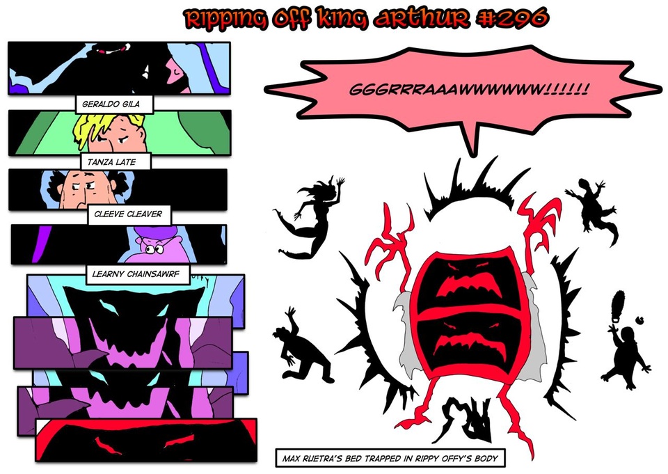
Gather your thoughts on the comic and post them here, and I'll include them in the next workshop post.
If you want to find earlier editions of Panel By Panel, click here.
____________
Don’t forget you can now advertise on DrunkDuck for just $2 in whichever ad spot you like! The money goes straight into running the site. Want to know more? Click this link here! Or, if you want to help us keep the lights on you can sponsor us on Patreon. Every bit helps us!
Special thanks to our patrons!!


Justnopoint - Banes - RMccool - Abt_Nihil - Gunwallace - PaulEberhardt - Emma_Clare - FunctionCreep - SinJinsoku - Smkinoshita - jerrie - Chickfighter - Andreas_Helixfinger - Tantz_Aerine - Genejoke - Davey Do - Gullas - Roma - NanoCritters - Teh Andeh - Peipei - Digital_Genesis - Hushicho - Palouka - cheeko - Paneltastic - L.C.Stein - dpat57 - Bravo1102 - The Jagged - LoliGen - OrcGirl - Miss Judged - Fallopiancrusader - arborcides - ChipperChartreuse - Mogtrost - InkyMoondrop - Jgib99 - Hirokari - Orgivemedeath Ind - Mks Monsters - GregJ - Soushiyo - JohnCelestri - TottyComics - Casscade - Salexander - Willed

Panel By Panel: Workshop Week - 'The KAMics' II
hpkomic at 11:02AM, May 17, 2024
7 likes!


©2011 WOWIO, Inc. All Rights Reserved Mastodon
KAM at 3:20PM, May 17, 2024
One fun bit in the final panel was snapping a picture of my hand, holding a wooden sculpture of Zog's ship, while on the computer screen is a Word document of the script for this page. (Not that you can read it, but I wasn't sure if it would be readable or not, when I snapped the picture.) I was definitely going beyond the fourth wall there. ;-)
KAM at 3:17PM, May 17, 2024
Thanks for all your comments and thoughts, everyone. :-) I'm not sure why I used the chaotic panels. My best guess would be I saw a similar use somewhere and was inspired, but it's been too long so I can't remember. When I drew it I could follow the flow, but these days I find myself getting lost in the middle, so if I were to redo it I'd probably simplify it. Those are not goggles, they are actually Zog's eyes, but people have thought they were goggles almost from the beginning. Part of the thinking behind this page was that Zog drinks the last drop of Webcomic Awareness. The collage of panels showing reactions was to my way of thinking various characters realizing that something has happened. (Probably inspired by comics where something happens and various heroes like Spider-Man, Dr. Strange, & Daredevil realize something has happened.) The final panel with the comics in his eyes was my way of showing the reader what Zog was seeing.
HawkandFloAdventures at 1:29PM, May 17, 2024
#296a The more I look at Ripping off King Arthur the more I actually like it. At first I wasn't sure what was going on with the page It took me a 2nd look to realise the characters surrounding the GRAWWWW! Were silhouettes. The poses are fairly well executed, my only real issue with this page is i'm not entirely sure which order I'm supposed to be reading. Do I look at the Big Grawww first? or do I look at the panels on the left ^^? After a few tries I get the sense I read the stuff on the left first then see the GRAWWW, even though my attention is first and foremost on the Grawww.